Friday, December 21, 2012

Merry Christmas.

[Video: black & white film of a cat spoofing French existentialist films. Henry the cat (a serious sounding adult male voice) narrates in French and the subtitles appear at the bottom of the screen. Slow melancholic piano music plays throughout the film.
(unvoiced): "Henry 5: The Worst Noel"
(voiced): "The holidays are just another excuse / For the world to intrude on my solitude. / I live with a few other cats [camera pans across four tiny stockings hung from the mantel each with a picture of a cat's face looking adorable, taped to the stocking] / and each annoys me in a unique way. [camera reaches Henry's stocking, with a picture of him looking annoyed] / They lend no credence to my major awards [shows the leg lamp from A Christmas Story, a bulldog figurine and a trophy with a gold leaping cat figure] / Naps are my only respite [shows him drifting off to sleep]. / In my dreams I can finally be alone. / [dream sequence begins, showing Henry in color with out-of-focus colored lights falling behind him in an abstract background] No, no, no. What are you doing here? [camera cuts to white cat with same background] / I must have eaten something bad / There's more of whitefish and tuna in gravy than grave about you / So, why are you here? / [white cat paws around, then looks over its shoulder into the distance] Look, it's me as a kitten. I was so innocent then. [snapshots of the kitten Henry appear on screen screen one by one] / I knew nothing of the cruelty of the world / Your simple mind is much the same as I was then. / [to the white cat] Perhaps I am too harsh with you. / I suppose- oh! come on... [cuts to white cat licking its own butt] / [white cat dissolves, grey cat appears] Do I know you? You look familiar. / Wait, are you that grey cat that lives here? / Pardon me, but you aren't around much. / I feel as though I never see you. [Camera lingers on grey cat as the background morphs into a TV or computer monitor with grey snow in the background enclosing the grey cat, who looks around at the edges of the monitor. Cuts to Henry, also alone in the monitor frame.] Here comes another lesson. [shows clips from past Henry films on the monitor. Each clip shown reveals that the grey cat is in the background near Henry looking intently at him or the camera] My apologies. Perhaps I have overlooked you. / I rarely appreciate the moment. [grey cat, again with colored lights background, looks away.] / [in a breathless voice] I'm alive, and I'm not a dog. / Perhaps I should be thankful. / [grey cat dissolves into a speckled cat] Ah, the old one. / Are you here to teach me something as well? / you've already taught me the most important lessons of all. / Never let them pet you. [shows a black and white clip of Henry avoiding an outreached hand] / Never expose your belly. [shows Henry twisting in a person's grasp to protect his fuzzy white belly] / Never sit on a lap voluntarily. [shows Henry scooting out of someone's grasp and off their lap, then running under a piece of furniture] / I see you are still in good form. [black and white clip shows Old Cat swatting repeatedly at a hand that is attempting to pet it, then nipping at the knuckles with its teeth] / But no. I can see it in your eyes [the clip continues, the Old Cat looks up into the camera, and sudden slow motion captures the Old Cat's piercing gaze] / You want nothing more than to be petted and loved. [Old Cat, now with a colored lights background, looks ashamedly or pathetically down and away from the camera, with a soft expression in its eyes] / Yet you cannot bring yourself to allow it. / Is this my future? [Old Cat gets up and walks away] / [Dream sequence ends, a black and white Henry opens his eyes, the piano music sounds slightly hopeful] Perhaps the other cats are right. / The life of a philosopher cat means nothing without friends. / Perhaps I should give away my treats to the others. / [The scene fades to black, and another scene opens of the three other cats looking on in a group from the top of a couch. The camera pans across a floor strewn with opened cat treats, tissue paper, cat toys, cat food cans, and finally reaches Henry, sitting alone amidst the orgy of feline luxury with globs of some sort of goopy cat treat stuck to his head, licking his whiskers. He looks gluttonously toward the camera.] I regret nothing." The piano music concludes cathartically and the scene fades to a black screen reading, "fin" then "un film de Will Braden"]

Sunday, December 9, 2012

Depressing story about obliterated mural

The Mural Arts Program in Philadelphia is still trying to figure out why and by whom this mural was obliterated. It was apparently a job by hired professionals. The article is also interesting for the information they provide about the history of the artist depicted and of MAP.

[Image: the side of a light putty-grey stucco building with a black and putty-grey mural on it probably around 2 stories tall. It depicts Dox Thrash, an artist who invented a printing technique that produces velvety blacks and dark colors. The mural itself makes witty use of velvety black contrasting negative space, showing the artist at work and including several vignettes. It's painted in a 1930s folk-cubist style which immediately calls to mind the Harlem Renaissance and African American art of the era, and the vignettes are knitted together in a seamless graphic angular flow. The image below shows the mural completely painted over in black.]

Image: Mural Arts Program via theartblog.org

Thursday, November 15, 2012

Oh, the blog.

I just remembered, I have a blog. Sorry for the lack of posts; I've been on vacation in a place so remote it evades the clutches of the Internets' tubey tentacles. And now I am at the beach. Will post more when I return to society.

Tuesday, October 30, 2012

Happy Halloween.

Jack-o-lantern party. I made the big one in the middle; husband made the one on the right with the pentagram eye. My inspiration was Leland Palmer.

Sunday, October 28, 2012

Kelsey Elisabeth Nelson on Zadie Smith's critical showdown

This is a great essay. Kelsey Elisabeth Nelson discusses Zadie Smith's writing in which she compares two approaches to art (and writing) criticism: the poststructuralist method favored by Barthes and the more old-fashioned method favored by Nabokov. She takes two complicated theoretical schools and applies them, but the essay itself is quite simple and easy to read (I promise!). I guess this is what post-postmodernism is: postmodernism is now just another completed tool in our toolbox.

Saturday, October 27, 2012

Artistic Process and Scotch Tape: An Epic

I.

Though my guilt-fear, rendered humdrum through bad habits,
dictates this day I'll purge from My Big Binge,
I am on strike for a barrier that prohibits
time from slipping through my stumpy digits.
The moral stand-off lapsed in early hours
per a dentist and hygienist with a syringe,
who, as scheduled, drilled and filled my chompers
and in doing freed my overburdened arbiters.

Still rolling on catharsis-high, though illusory
yet lucid too and fighting nagging voices
and numbed so thick my jaw denied its misery
I floated down the road for retail therapy
at a thrift store where I like to search
pragmatically among the picked-through pieces.
I tongued my fillings, my jaw began to pinch
so I headed home for lunch.

The soreness and sick feeling of responsibility
both came flooding back at the same time.
I packed a beer and am headed over shortly
to my studio where if I'm good I'll possibly
do some shit and maybe even cross from my list
the real shit from my clients who I treated like slime
who have waited much too long and now are pissed;
in my churning mental mill, they are the grist.

II.

It's night now and I've left and come back
from my friend's house where I rent his spare bedroom
to fill with a big easel, empty frames, canvases, a storage rack
and chopped up women's magazines in a slippery stack,
a china vase sprouting rolled-up art-school projects
still unfinished, manilla folders in the corner of the room
packed with collage material: a ziplock baggie that protects
several thousand one-inch cut-out squares of pictures of skin; each connects
via a wrinkle, they're scotch taped into abstract collage components
that I someday plan to link together and meld to vinyl backing.
But that'll take a while so they're mostly still in quadrants
on top of four other folders filled with remnants
of my research, accomplished esoteric acumen
from another project sitting halfway in the making
labeled, "Black women," "black men," "white women, and "white men,"
for a painting series about media tropes that are usually hidden.

Tonight I re-shot some photos of a tiny cut-out lady
standing duck-faced over a nest of bridal tulle
from which a strand of pearls spilled, held steady
with hidden cardboard anchored with a penny.
She stands on the keyboard of my Macbook, which I've transformed
with a picture of a hardwood floor from Elle
in front of the screen, which shows Holbein's Henry VIII, adorned 
with a "curtain," a scarf that's brightly zigzag patterned.
Henry cuts a commanding figure: at his feet a pile of gold
made from candy-bar wrappers; at his groin, through illusion,
the woman's head. The photo is less pedantic, less ribald
that what I've described; the starkness is anulled
by the sensual chiaroscuro effect of the warm side lighting,
the cutesy diorama offset by academic allusion
and a slickness that allows for different materials mixing
without a "crafty" look-- at least that's what I'm hoping.

These folks belong to an ever-growing series
of photos that explore the messages sent
in media and ads about gender: cool clothes, hot bodies,
why they're desirable, the interwoven histories
of sexual domination, capitalism, colonialism,
and how those power struggles inform our present
how the old recognizable symbols of misogyny, racism
have shifted shape, surviving to postmodernism.

I wasn't sure at first what I could possibly say
about a society in which one's benefits obscure struggle
of others, concerns which my blinders keep at bay,
something I'll never fully un-learn, but may
through empathy comprehend as I am able
based on my own experiences of trying to label
what I'm not supposed to, with no words to assemble
because others claim the rights to language. So I settle
on removing what They say from any context that justifies
degradation, objectification, toxic role play drivel
such as beauty mags, pop videos, what-to-buy's,
that cut insidious paths into our personal lives.

III.

I'm hoping the juxtaposition of Henry and Tiny Lady
and the various materials will create new contexts for each other:
the king with gold, the woman with the reproductive situation, maybe
horrified or chickenheaded, the curtain hinting at a British colony
all together in an uneasy coexistence. The secondary associations,
of Henry's wives, slavery, wealth, sexual shame, controlling one another,
are meant to be stirred up and left to stew. But in previous iterations
I used gray pearls, so I'm re-shooting with white for clearer implications.

But the freshwater necklace isn't large enough to cover the cardboard
that holds her upright, so I made the impromptu pink nest
which I rather like. But she keeps tipping forward
which turns her face into a reflection on Henry's scabbard.
I like the light in front so the gold glitters,
but that casts a coldish glare on all the rest
and when I move it to the side the shadow renders
the foil dull but it's her face that matters.

More Scotch tape. Low light f-stop, trouble focusing, she's indiscernible;
Henry'll have to be blurred; we all know what he looks like.
The curtain slips, I add binder clips, fluff it; now my Macbook is visible
I move the light-- perfect!-- the gold wrappers topple.
I'm squatting on the floor so I lay on my stomach,
Because the composition begins to look trite.
I prop up on my boobs so my arms have free movement,
and shoot different angles, keeping the head-crotch alignment.

I take a break and crack open the beer. Something's wrong,
it's too busy, too flat, I'm not taking advantage
of the Henry the VIII in lit pixel effect, the curtain is hung
at a really weird angle, so I have to crop out where the pearls are too long.
I watch some TV, Dr. Phil is just ending.
A woman is listening to experts on stage.
I'm tired and ready to go, but I'm buzzed
so I cannot drive anywhere for the time being.

I go back to the camera and it falls into place:
A strong composition if I scoot her upstage
It's the contrast by shining less light on her face
with the glowing groin, echoed in white in the necklace.
Re-arrange the pearls into a nice pleasing "J,"
snap some pictures, then I note with outrage
that my battery power is fading away.
It expires, and I am done for the day.

A detail from the photo with gray pearls that didn't make the cut. [Image: to the right a young white woman in a high fashion floral jumpsuit and Bridget Bardot hair and makeup leans over a strand of pearls. Brightly colored chevron fabric hangs on the left in partial shadow. A screen showing Henry VIII is visible in the background, but only his leg, hands and torso. The woman leans over childishly and grasps her cheeks in possible surprise, worry or horror.


Sunday, October 14, 2012

The Act of Being Visible

"Being seen": passive. "Appearing": active.

Dove Promises chocolate wrapper reading, "You're gorgeous. Love, Dove."

Dove Promises chocolate wrapper reading, "Don't think about it so much."

What does it mean to do something? Does it involve action? Choice? Behavior? Some passage of time? Responsibility? Culpability? Achievement?

What does it mean to be something? Does it imply inaction? Gestalt? For better or worse? A timeless state? Identity? Does defining one's state of being imply impartial pragmatism?

In terms of our bodies and appearances, we are what we are. We didn't do anything to be what we are. Sure, we performed actions that resulted in the current arrangement of our bodies, whether we ran three miles each morning, passed out and woke up with our faces splotchy and still covered in glitter, wore a bow-tie, whatever. But our appearance, existing in a state of being visible? That is not an action.

Why am I writing this? Because I've noticed lately the way that appearance, particularly women's appearance, is characterized as an action, or as active. Notice the phrasing in these examples of common headlines and advertising language:

"Khloe Kardashian Flaunts Slim Hourglass Figure in Sexy Strapless Dress" -US Magazine headline above a picture of Kardashian walking calmly down the street.

Also from US Magazine: "Hot! Kelly Osbourne Shows Off Slim Bikini Bod in Hawaii Before Brother Jack's Wedding" -headline above a paparazzi shot of Osbourne caught unawares getting into a swimming pool.

"Get the look!" -Pretty much every magazine.

"How To Achieve The 'Natural Look'" -headline, Beautylish.com

"Back to black: Rihanna reinvents herself with dark locks... just in time to promote Battleship in Tokyo" -headline in Daily Mail (UK). From the article: "[...] she is now flaunting tresses with one section of her bonnet getting the chop.
The 24-year-old is showing off a closely trimmed area around her left temple, a trend which has been seen on many celebrities before, including the singer herself." 

In particular the use of "achieve" and "flaunt" set off alarm bells because they are so incredibly loaded with consumer culture and slut-shaming messages. 

We are meant to believe that people (particularly women), unlike animals, are responsible for how they look. It is portrayed alluringly as being in control of one's appearance. But in a culture in which even the most beautiful fall short of the standard of perfection at the same time that attractiveness is punishable, it really means we are culpable.

It's not a new idea. In the Middle Ages in Europe many believed that disfigurement and ugliness was a punishment from God and a reflection of an ugly soul. In Victorian times some doctors actually believed that when a woman attained an education too advanced it caused her womb to shrivel-- resulting in unattractiveness, among other horrors. Looks were often invoked in 19th century racism and slavery; while dark skin and African features supposedly explained why enslaved African Americans were inferior, the narrative always implied culpability, that African Americans should be punished for their looks with oppression. Scout from To Kill A Mockingbird sums up this attitude perfectly when she says, "that's what they get for bein' the Children of Ham."

With these ideas already kicking around I read this piece by eeshap at Crunk Feminist Collective (feminism from the POV of women of color) about Lady Gaga calling for
a “body revolution” in which we flaunt and expose our “perceived flaws” and  “make our flaws famous, and thus redefine the heinous” in order reclaim our sense of self from the media machine is a good thing.  But there’s something else going on here.
In this charged context, what does it mean to be beautiful? And what does it mean to be ugly? And another question, to complicate the binary between beauty and ugliness, because binaries never serve us well: what does it mean to be invisible entirely? Or hyper-visible?

[...]

In these contexts, what is the upside of ugly? Or as Lady Gaga beseeches us to, how do we “redefine heinous?” When “ugliness” carries the threat of violence and disenfranchisement, what does it mean to embrace “ugly?” [*] For a person whose body is dehumanized and positioned as the very definition of undesirable, is it possible to “redefine heinous?” Perhaps, but its not neat. To do so we have a lot to dismantle. To do so we have to dwell in the intersections. Beauty and ugliness are not two sides of a coin, they are the same side of the same coin.
To dismantle them involves thinking through what the other side of that coin is. What does is mean for us to see each other as fully human? And as singularly and collectively valuable?
This project is different than the project of asserting that we are all beautiful in our own way (like those Dove “Campaign for Real Beauty” campaigns implore of us). It is different than embracing the character building elements of being seen as “ugly.” It involves conversation about what makes us human and valuable. And it must also include a re-definition of both “beauty” and “ugliness” alike.
***

I generally like to be behind the camera rather than in front of it. I'm generally pretty careless with my appearance too. I fundamentally think of myself as someone who sees rather than who is seen-- who is invisible rather than hyper-visible. But the constant social reminders of culpability and the tantalizing promises of "reinventing" and "expressing" oneself do make defining myself through my appearance into an increasingly seductive illusion. The more interested I am in my appearance the less interested I am in making art. Unlike other creative endeavors, which tend to spark exponentially more creative endeavors, expressing myself through my appearance funnels my mind into thinking about being seen rather than seeing. They are really different modes of thought.

For example, when I show people their finished portraits they often remark about how unusual it is to see themselves the way someone else sees them. And when I stop and think about all the minutes of all our days that we spend arranging ourselves to be seen by others, it seems incredible how little direct or comprehensive feedback we actually get from the people in our lives on our successes and failures, particularly once we reach adulthood. If this is the case, we aren't actually preparing to be seen by others, we're preparing ourselves to be seen how we imagine others should see us. The invitation to take control of our appearances is really an invitation to physically build an imaginary world on your face. The only way to ensure that everyone else is on the same page as you about the messages you send is to stick to a common social script. And if you are culpable for the unpredictable ways in which you might be seen, that is some pretty heavy pressure to speak the same visual language everyone else does. Even if you want to send the message, "I'm different!" you still need to learn how to say that in the common parlance of visual language. The commonly shared social language of appearance is vital, though, because the entire endeavor of being visible as an intentional act rather than a state of being is imaginary.

Paradoxically, in order to achieve any depth of understanding how the common visual language works and why it works that way, one must observe society and the messages it sends about appearance. And in order to do that one must take oneself out of the self-referential frame of mind of being seen and begin to look outward. For example the writers at Crunk Feminist Collective have been writing for years about the racism inherent in Western beauty standards and how that relates to economics, society and history. And it is that practice and those understandings which led to the quote above, questioning what "embracing ugliness" means for women of color. Tellingly eeshap ultimately explores looking outward rather than the inward practice of being seen: "What does is mean for us to see each other as fully human? [...] It involves conversation about what makes us human and valuable. And it must also include a re-definition of both “beauty” and “ugliness” alike."


*This question immediately caused me to counter, "when 'ugliness' carries the threat of violence and disenfranchisement, what does it mean to embrace 'pretty'?"

Thursday, October 4, 2012

Two self portraits by Albrecht Durer

*Durer's name has an umlaut over the U but I can't be troubled to type it in.

Durer, self-portrait at 26.

Durer, self-portrait at 28.
Durer was notoriously vain. Guess which spun-gold flowing feature he was proudest of? In the first portrait we'd probably call those "Taylor Swift barrel-curls," while I think the second may be classified as, "beachy waves" or a "tousled boho" 'do. His mod black and white outfit with taupe capelet and provocative decolletage is quite sharp but only Janis Joplin could pull off the Davy Crockett-meets-Shakespeare costume below.

Durer's work is always off-putting because it reminds me of math class, but still absorbing because he belonged to that very early generation of representative artists in whose work you can see them struggling to see the world. In other words, his work reveals the act of him visually learning, which is what I enjoy most about da Vinci, Giotto, Michelangelo and van Eyck as well. European painting lost that a bit once stylistic conventions solidified in the late 1600s.

Friday, September 14, 2012

Atlanta: Part 2

You can read the Part 1 of my art trip to Atlanta, about Richard Misrach's photos, here.

On this day I was attempting to go see a performance piece at a MARTA stop by some cutting edge group. It was billed as a series of interventions in the city. It was also across town at rush hour in a place I'd never been. Laziness and fear of the new conspired against me and I was forced to go thrift store shopping instead, where I unexpectedly found Jesus:

"Inspiration," by Theodore Davis. [Image: a somewhat primitive watercolor painting of Jesus' head and shoulders on brown butcher paper or cardboard, framed in a thin plain gold frame. Jesus' chest is centered with his face nearly in three quarters profile looking up and to the right side of the painting. A stylized ray of yellow and white band of light descends from the top right corner to Jesus' face and a tiny lightning bolt runs from the light to his left shoulder. He has a yellow halo with tiny spiked sun rays around the edge, flat like early Renaissance halos. His robe is white with purple shadows for the drapery; his skin is left blank and his features are small and delicately drawn in pencil, almost like a woman in an ancient Asian ink painting. His hair and beard are dark graphic masses of squiggling black lines and dark brown paint. Except the face, drapery shadows and halo, everything is outlined in black. A water stain covers the bottom left two corner extending over his chest and shoulder, visible as a gradient to a dark organic outline that resembles faraway mountains in an old Chinese ink painting. The word "Inspiration" is written with pencil in jerky cursive over the white robe at the bottom left, and "Theo Davis" is written at a steep diagonal upward slope at the right edge above Jesus' shoulder next to the lightning bolt. The whole thing resembles traditional European Jesus paintings in certain ways, but is also primitively executed in others, creating an akwardness that words with the odd composition to be extremely engaging and elegant.]

It didn't even occur to me that I should stop and give it a closer look until I realized I'd already been staring at it for a full five minutes, and it didn't occur to me to buy it until I found myself removing the piece from the wall and thinking, "well if I regret the purchase I can always re-use the frame...." I flipped it over to reveal a cardboard tag written in ballpoint pen taped to the back reading,

"Name of project-- Inspiration
Medium-- Water colors and pastels
Name-- Theodore Davis-- Grade 12X
Frink High School"

and the price: $6.99

It is now hanging in my kitchen. I didn't think I'd ever have a picture of Jesus in my home, but I guess I didn't anticipate encountering this Jesus.

Monday, September 3, 2012

Happy Labor Day!

Thanks to the workers who built this country!

Here's a little bit of US history regarding Labor Day and the labor movement:

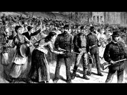
During an economic depression in 1874 over 7,000 workers and unemployed people demonstrated for 8 hour workdays and government works projects rather than charity in Tompkins Square in New York City. However at the request of the NYPD the city revoked their permit to meet the night before the meeting without informing the participants. Police, many on horseback, descended on the crowd indiscriminately beating men, women and children with clubs. 46 were arrested, the bail set at $1000 each; organizers were charged with incitement to riot. Unions and labor organizations were not protected by the law at this time. Workplace safety requirements and worker's compensation were virtually nonexistent in the 18th, 19th and early 20th century, so not only were demands for 8 hour workdays intended to allow workers to live more humane lives but also to reduce the staggering number of deaths and injuries suffered by the men, women and children who labored for 10-14 hours each day in mines, factories and railroads.
In 1882 the first US Labor Day was proposed by either of two union leaders, possibly after witnessing a labor festival in Canada. Pictured is a labor parade in New York's Union Square, 1882. Unlike the later International Worker's Day, or "May Day," Labor Day was about partying, resting, showing the spirit of workers and celebrating labor.
Pictured above is a 125th anniversary re-inactment of the Bay View Massacre of 1886 in which the Governor of Wisconsin ordered National Guardsmen to "shoot to kill" at a strike for an 8 hour workday. Of the crowd of men, women and children 7 were killed, including a 13-year-old child, and many more were injured.
A peaceful rally for an 8 hour workday turned violent when an unknown person threw a bomb. Police opened fire; several policemen and demonstrators were killed. The incident became internationally notorious when labor organizers were put on trial for conspiracy to throw the bomb, despite evidence that they did not. Four were executed that year. The Haymarket Massacre, as the incident became known, inspired the International Worker's Day, or "May Day," a separate event from Labor Day.
In 1887 in Thibodaux, LA, over 10,000 sugar cane workers-- about 90% of whom were Black-- struck for included a raise to $1.25 per day, biweekly payments, and payment in legal US tender instead of "pasteboard tickets," or company scrip that were good only at company stores. Following the appeal of plantation owners, including one Mr. McEnery who pled, "God Almighty has himself drawn the color line," local whites attacked the Black strikers; the death toll is unknown, ranging from nearly 40 to over 300, all of them Black men, women and children. The "Thibodaux Massacre" was one of the bloodiest labor struggles in US history. American, particularly Southern, union and labor activities would become fraught with racial resentment and discrimination within the movement while also marking some of the first major collaborations between whites and blacks, and between men and women, leaving a profound mark on lower-class society and exacerbating the fears of the elite.
The Homestead Strike, though particularly egregious, bore the hallmarks of that period of labor history: Pennsylvania steel workers struck and Pinkerton "detectives" as well as government forces and state militia were called out to serve the Carnegie Steel company. These private services were typically thugs-for-hire employed by companies to break strikes through beatings, intimidation and illegal means without the companies being held liable, as well as to guard the scabs who were brought in to replace union workers. The Homestead Strike, however, became an actual battle as strikers took up arms against the Pinkerton men, firing on them to prevent them from landing. The strikers briefly occupied the plant but militia regained control of the Carnegie Steel Mill. Carnegie and Frick, who were in charge of the mill, refused to negotiate with the union and the entire town was placed under martial law. A New York anarchist unrelated to the strike arrived and attempted to shoot and stab Frick; Frick survived. Charges were brought against union leaders; it was a serious blow to the labor movement.

Though I cannot find who painted this, this portrays legendary US labor hero Mary "Mother" Jones, who in 1903 worked with child laborers to organize a "Children's Crusade" proclaiming, "We want to go to School and not the mines!" Because the companies owned stock in all major newspapers Jones could not persuade any to publish information in the struggles of child workers, who were paid less than adults and many of whom had been maimed in factories. Seeking publicity, Jones and the children marched from Pennsylvania to President Teddy Roosevelt's home in New York. The President refused to meet with Jones about child labor but Jones had succeeded in bringing the issue to public attention. She would continue to advocate for child workers her entire life. By the 1910s and 20s states began to pass laws limiting child labor and requiring compulsory education, but child labor was not ended nationwide until the 1938 Fair Labor Standards Act. Because of the Great Depression, adults were willing to work for the same low wages as children and pressure from the private sector finally let up enough that Congress was able to pass a labor law. 
A photograph of some of the women workers' corpses on the sidewalk following the Triangle Shirtwaist Factory Fire in New York City in 1911. The factory locked women inside to prevent them from taking breaks. The factory caught on fire and the workers were trapped inside; many jumped to their deaths outside windows and down elevator shafts. The tragedy galvanized the public in support of workplace safety regulations. The following year women organized a massive strike. Though women were sometimes excluded from larger unions they typically formed their own.

Alexander Palmer led the "Palmer Raids," in 1919 and 1920, in which accused anarchists and leftist radicals, many of whom were immigrants, were put on trial and/or deported. The Palmer Raids demonstrate what had become, by this time, a volatile mix of industrial exploitation of desperate immigrants which pitted already stigmatized groups of European immigrants against poor native US workers and also against each other; radical leftist ideas brought to the US by the enormous wave of Southeast European immigration; a wave of jingoism and xenophobia exacerbated by World War I; and the beginning of the "Red Scare."
 
This poster by Chris Stain commemorates the Battle of Blair Mountain in 1921, another incident in which a strike became an actual armed rebellion. West Virginia coal miners were particularly oppressed by the "company town" system in which the coal mining company literally owned the town in which its employees and their families lived: the houses, land, and businesses. Workers were paid in company scrip rather than US currency which was good only at company stores, which took advantage of the captive customer base by hiking up prices. Coal miners and their families often became indebted to the company through the system, unable to leave the company town either because they were indebted or because they had no money to use in the outside world. So striking coal miners were particularly at risk. Baldwin-Felts agents, similar to Pinkerton detectives, were brought in to beat strikers and evict families from their homes. A coal company lawyer explained, “It is like a servant lives at your house. If the servant leaves your employment, if you discharge him, you ask him to get out of the servants’ quarters. It is a question of master and servant.” When Baldwin-Felts agents murdered the police chief of the town, a former laborer who was sympathetic to the miners, an armed rebellion of over 13,000 people ensued, known as the Battle of Blair Mountain or sometimes the "Redneck War."

Wikipedia has put together a nice timeline of labor history from the 1700s up to the 1980s. Enjoy!

Sunday, September 2, 2012

Rain

It rained here Tuesday or Wednesday, quite a lot. By coincidence my brand new waterproof beach/running shoes had just arrived the day before. How convenient. I wrapped my camera in several sandwich bags and headed out into the torrential downpour; at its highest the water reached nearly to my knees, a disgusting melange the ingredients of which only those familiar with Charleston will infer. I showered immediately afterward. It was immensely satisfying.

A man walks through ankle-deep water with a pink umbrella.

A pickup truck up to its fender in flood water drives through a flooded street.

A man with an umbrella walks through a deserted tourist attraction.

A firetruck slugs through a flooded street.

A street sign in a flooded street wisely warns, "Do Not Enter."

A man in a hat walks through the rain in front of a historic building.

Friday, August 31, 2012

Finally, a pen for ladies!

Bic has released a new pen for women: Bic Cristal For Her Ball Pens.

I'll let that sink in for a second.

The Amazon reviews for this product are the funniest thing I've read in a while. Really, check it out! HappyPlace has curated some of the best, and this may be my favorite:
"I bought this pen (in error evidently) to write my reports of each day's tree felling activities in my job as a lumberjack. It is no good. It slips from between my calloused, gnarly fingers like a gossamer thread gently descending to earth between two giant redwood trunks."
While the suggested retail is $5.99, you can purchase them at Amazon for an amazing $3.68. [Image: a package Bic Cristal For Her pens in an array of pastel colors. The ordinary yellow Bic packaging fades to lavender with flowers and a glowing effect around the pens. "For Her" and "Sleek Design" are written in splashy lavender cursive.]

Wednesday, August 29, 2012

Mask, by Wangechi Mutu

Wangechi Mutu, Mask, 2006. [Image: A collage involving two photographic images, roughly the same size. If they're both the size of notebook paper, one is pasted over the other an inch below and to the right, making a 3-D stacked effect. The image underneath is a greyish ceramic or stone African mask or sculpture, not sure what type. The image on top is of a sexy black woman with naked arms and legs, wearing bracelets. She's in some sort of glamorous photo studio with what looks like a gilded chair, paneled wall and hot pink marabou feather boa in the background. Her torso (where a leotard would be) is cut out to reveal half an eye, nose and spiked chompers, the latter near her pelvis. The cut out area extends up her neck to just below her eyes, like a turtleneck pulled all the way up or a bandit's or surgeon's mask. Long snakey pieces are affixed to the image mimicking hair (locks).]

Monday, August 27, 2012

Olga Orlova, by Valentin Serov.

Go check out this post on Gurney Journey about portrait artist Valentin Serov. Quoth the Ruskie,
"For my part, each time I appraise a person’s face, I am inspired—you might even say carried away—not by his or her outer aspect, which is often trivial, but by the characterization it can be given on canvas. That is why I am accused sometimes of having my portraits look like caricatures."
Detail, Portrait of Princess Olga Orlova by Valentin Serov. 1911. [Image: head, shoulders and torso of a middle aged white woman wearing an enormous Gilded Age / My Fair Lady black hat with an off-the-shoulder brown fur stole, a strand of pearls and some rings. She is pictured in profile with her face turned three quarters toward the viewer, leaning slightly forward and clasping the fur stole languidly to her chest. The hat and its translucent bits contrast lusciously with the pale pinkish background, the wall of an elegant paneled room. A painting in a big gold frame is in the top right corner. She leans from the bottom left hand corner to the center of the cropped image, her face marking slightly above center. The dark fur stole, tilted hat and dark painting create a diagonal thick dark line from bottom left to upper right. The oil painting is realistic and fluidly applied.]
Gurney's post reminded me of a remark I've been wanting to make but is too inconvenient and involved to say in passing in real life (but luckily I have a blog!). People at the Farmer's Market sometimes ask me about portraiture, often aspiring artists who are just starting out. Unfortunately I don't have any helpful advice to offer in a 20-second window to a complete stranger who is interested in learning portraiture, except for this:

If you're trying to learn about portraits by questioning a portrait artist, you're barking up the wrong tree. Pay attention to cartoons, animation, illustration, dance, acting, anatomy, the anthropomorphism of animals, fashion, literature*, graphic design and psychology. That will teach you a lot more about portraiture.

*Especially recommended for portrait-reckoning: anything by Jane Austen or the Brontë sisters; The Hours by Michael Cunningham; any story by Flannery O'Connor.

Saturday, August 25, 2012

Jesus Fresco Restoration

A church lady picks up some brushes and attempts to "restore" a 19th century fresco of Jesus. Hijinks ensue.

Friday, August 24, 2012

Secretaries Of The Cabinet, by Sir John Stanton Ward

Secretaries Of The Cabinet, by Sir John Stanton Ward. National Portrait Gallery, Britain. Something about this portrait is really humorous to me and I cannot put my finger on what it is. Any ideas? [Image: A scattered group of old white men in dark suits in a lavish neoclassical room with high ceilings and mahogany brown walls. Some sit, some stand; they appear to be debating something.]
ETA: Thanks to prodding from "lkspr," I realized that they look like serious little statesmen in an aquarium, which is what had appealed to my sense of humor.

Thursday, August 23, 2012

Some portraits by Lucien Freud

Double portrait by Lucien Freud

Eli and David by Lucien Freud

The Artist's Mother by Lucien Freud. [Image: Head and shoulders of an elderly white woman viewed at three quarters from slightly above. She wears a blue-black sweater and has short silver hair combed back from her worried-looking face. She stares straight in front of her, her lips slightly pursed. Plain pinkish-beige background. The brushstrokes in this piece, and all of his work, are highly sculptural, sometimes exaggerated so much that the person looks contorted, like they've been ever so slightly smashed between two plates of glass. The skin is always a mishmash of putty colors that is harsh and unforgiving to the subject.]

Wednesday, August 22, 2012

Braids, by Andrew Wyeth

Braids [portrait of Helga Testorf] by Andrew Wyeth, 1979. Tempera. [Image: head and shoulders of a young white woman turned to the left at three quarters. Her reddish light brownish hair is parted in the center and worn in two plain pigtails that fall just past her collar bone. She wears a medium grey-brown loose turtleneck sweater and sits in front of a dark black-brown empty background. Her eyes look straight in front of her and slightly down toward the left of the painting. The piece is horizontal and her face is centered, her body slightly to the right; an extremely simple composition that complements the plain beauty of the subject. The brushstrokes are so small and layered they are not visible; indeed the piece is more photorealistic than a photo, but unlike other photorealism it doesn't look like it was painted from a photograph; it was clearly painted in person. Each hair on her head is crisply and delicately painted. The extreme uniform crispness gives a stark serious feeling that matches the subject who, while classically beautiful, is portrayed so straightforwardly as to be harshly beautiful. She looks very Scandinavian.]

Detail, Braids by Andrew Wyath.

Tuesday, August 21, 2012

My rote copies of John Singer Sargent portraits

A few months ago I sketched these copies of Sargent portraits while working at the Farmer's Market. They took an hour or so each. I frequently draw while I'm waiting for people to get portraits in order to demonstrate why I'm there in that tent because the Market is such a sensory overload that if I'm not actually in the act of drawing a person using an easel, no one notices I'm doing portraits at all, despite the signs and finished portraits hanging everywhere. That's why I need to draw something that catches people's attention. Ideally I sketch it out quickly then get to the visually impressive stuff, spending a lot of time on showy details and high contrast that you can see from far away. And I have to draw the eyes first because no one pays attention if it doesn't have eyes. It's rather the opposite of how I usually draw, focusing on shapes and areas, textures and abstract things until the very end, constantly erasing and making changes. But hey, it's business. Had I drawn these they way I usually draw they'd probably have turned out better but I'd have fewer customers.

My charcoal copy of Sargent's Henry James. His left eye is too close to the center, head too close to the top of the page because I always draw the head comfortably close to the top and then need to go bigger once the rest of the face develops. Oh well, that's what happens when you sketch in public and foolishly don't step back to look at the drawing from far away. But I do like the shadows on his jowls and the bulbous part of his forehead.
Henry James by John Singer Sargent, 1913. [Image: realistic formal oil painting of a portly, oldish balding white man wearing a black suit jacket, black pin-striped vest, black bow tie and Gladstone collar. He leans back and looks slightly down at the viewer with a well-worn skeptical expression, his thumb hooked confidently into his vest pocket. The figure forms a blackish pyramid in front of a shadowy brown background, the only points of light being the hand, face and collar, lit with soft natural light from the top right.]
Henry James by John Singer Sargent; what is, I assume, a preparatory sketch for the painting. [Image is a charcoal sketch exactly the same as the painting but with James facing the other direction and his lower torso cropped out.]
A photo of the actual Henry James around a decade before  Sargent's portrait.
My charcoal copy of Sargent's Rodin. His torso is cropped below the neck and his beard disintegrates into loose hatch-marks. Blank background. The face is too wide, nose crooked and too short, mouth too high up, ear too small, eyes not in line with each other, hair too round and helmety instead of floppy, sideburns too far back and not enough depth on the middle-grey shadows so his face looks oddly porky. I also needed to raise the shadow between his eyes so he doesn't look so cartoonishly angry. It sounds silly but I wonder if the proportions are so distorted in these partially because I held the book on my lap and thus saw an image skewed by perspective. I also tend to draw people with too-short chins because my own chin is short and I think artists tend to learn from their own features. Other things-- too large eyes, too large irises and pupils that make people look like they're on ecstasy, too large heads, too big hair-- are probably influenced by cartooning, which is itself influenced by the psychological importance people place on these features resulting in portraying them as physically larger than they should be. Anyhow, I liked how the beard turned out, especially since it reminds me of Rodin's sculpting style.
Aguste Rodin by John Singer Sargent. [Image is a loose oil portrait of a middle aged white man with brown hair and a long bushy brown beard and mustache wearing a black utilitarian coat. He leans back into the frame as he looks at the viewer, appearing to be caught in the middle of a task. Though he looks at the viewer he appears distracted. The painting is dark, his face the only point of light in the top-middle of the canvas. The brushstrokes are looser in this painting than the others.]
My charcoal copy of Sargent's Mrs. Edward D. Boyt (Mary Louisa Cushing). Her face is too short, her neck too thick, her nose too short, right eye too far out, and hair too flat on top or wide on the side. People kept asking if it was a portrait of Aunt Bee from the Andy Griffith Show. Image is the same as the painting described below but in black & white with a blank background, cropped at her chest.
Aunt Bee and Barney Fife.
Mrs. Edward D. Boyt (Mary Louisa Cushing) by John Singer Sargent. [Image: A formal oil painting of a middle aged white woman sitting on a fancy settee with her fingers interlaced and one elbow on the armrest. She wears a gown with a black v-neck bodice and elbow-length sleeves, a skirt made of pale pink satin with a black net overlay with black polka-dots and some sort of tall pink hat or feather. The background is black and the ochre settee is shadowy, the lightest points being the face and feather and arms, followed by the light-ish skirt, creating a pinkish fleshy swoop from a thin feather point at the top middle-right to the thick hem of her skirt at the bottom left, which is intersected by the warm brown of the couch which goes from middle-left to lower right, creating a warm/cool X shape against black.] 


Monday, August 20, 2012

Atlanta: Richard Misrach at the High Museum

A few weeks ago, having reached a point of constant irritation and general stagnation, I decided to stop haunting the comments sections of blogs and leave town for a bit. I went to the most metropolitan place around here-- Atlanta-- in order to stay with my sister for a few days and see some freaking art.

So I went to the High Museum of Art and spent about six hours shuffling around with poor posture on solid concrete, concentrating so hard I felt a little psychotic by the time I left-- but it was certainly worth it. I'm pretty sure the reason no one really suggests the High is that it's $19 damn dollars to get in, because they're surely not scoffing at the collection itself.

Writing about what I saw would be just as grueling as seeing it if I didn't break it into separate posts, so today I'm going to write the first in a series, about Richard Misrach's photographs. From the High's website:

"In 1998, the High commissioned California-based photographer Richard Misrach to create a body of work as part of the Museum’s Picturing the South series.

Misrach studied the ecological degradation of a passage of the Mississippi River between Baton Rouge and New Orleans. This is an area where a number of petro-chemical industries are based and which is sometimes referred to as Cancer Alley.  Like the Western landscapes for which Misrach is best known, these photographs challenge viewers with environmental and political concerns while seducing them with evocative and lyrically beautiful large scale prints.  In focusing on the delicate state of the Mississippi River, Misrach’s work signals not just the environmental challenges facing the South but also the larger costs of our modern world at the dawn of the twenty first century. 

To mark the culmination and publication of this body of work in 2012, more than a decade after the project was initiated, a group of twenty-one large scale prints are presented here.  This is the first time that many of these important photographs have been shown to a broad public."

I am prohibited from reproducing the images here, unfortunately, but you can also see many of the images at the link above (though be advised that seeing them smaller and online is nothing like seeing them in person). I was able to find this image of a similar Misrach exhibit that will give you a feel for the size and presence of the photos:

A similar Misrach exhibit showing two people in a room with a large photo on each wall.
There were 19 about this size, 2 large ones (maybe 10 x 12 ft.) and 10-12 small contact prints (maybe 11 x 14 or 8 x 10 in.). Misrach left the black edge of the film showing neatly in his prints, revealing  through the markings a type of Kodak negative so large that even as an image decomposed into mist, the mechanics of the camera remain utterly crisp-- I couldn't see any film grain at all.

The prints themselves were seamless, richly colored ink-jets on gargantuan paper; the largest images were made of 2 mended together with a nearly undetectable seam. Each was framed in plain thin ebony behind glass which, because of its size, acted as a mirror that overlaid a reflection of the viewer and the gallery, making the viewer acutely aware that he or she is viewing images of heinous environmental destruction and the devastating impotence of poverty in the face of inhumane governmental and corporate disregard-- all from the safety and comfort of a pristine air-conditioned museum to which one has just forked over $19.

Far from appearing crowded, as the images do in small format online, the details were engaging and enveloping. Each photo had a presence that confronted the viewer with a quiet, mythic gravity.

The first room one enters features depictions of cities and communities-- some inhabited, some pathetic abandoned shells-- dominated by the overbearing presence of the petrochemical industry. The second room shows scenes of wilderness-- or what should be wilderness but is instead a series of obvious environmental disasters-in-progress that leave a sick feeling in the pit of one's stomach. The second room also features the double row of small contact prints.

The cover of Richard Misrach and Kate Orff's book Petrochemical America, which features one of the images from the High Museum of an oil pipeline running through a devastated body of water in LA. [Image: Horizontal color photograph of a dreary grey-green swamp or wetland with an oil pipe forming a perfect horizontal line across the bottom quadrant and an empty grey sky forming the top half. Leafless trees, many of them broken stumps, stand in grimy opaque slate-colored water.]

Race is a major theme that surprisingly goes unmentioned in the Museum's main wall text. However the only two people pictured are Black and several of Misrach's wall text that accompany the photos tell stories of African American communities that have been bullied, poisoned, abandoned or destroyed by Shell, Dow and other Cancer Alley companies and their government backing:

"Community Remains, Former Morrisonville Settlement, Dow Chemical Corporation, Plaquemine, Louisiana, negative 1998, print 2012

A rural African American community established since 1870 at a riverside settlement called Australia Point was displaced by the Army Corps of Engineers in 1932 in order to build a levee and relocated to Morrisonville. In the 1950s Dow Chemical expanded into the area, bringing widespread pollution in its wake. Later, the company installed special radios in homes so that the plant could inform people of highway evacuation routes in the event of a spill or accident. By 1989 Dow had decided to buy out most of the residents in the area, dispersing what was left of the original community in order to establish a ‘green’ buffer zone.” —Richard Misrach"
Though racism is certainly a national and international problem, Misrach's insistence on examining the issue situates the series explicitly and inextricably in Southern culture and its particularly substantial history of racial injustice. As the Mississippi River flows south it travels through a more typically stifled interracial culture that is similar to the rural area around The High's own Atlanta; then it flows south into coastal Louisiana where nearly every major war and massacre of the 18th and 19th centuries left its mark on the obviously complex culture and ethnic mix; and finally it empties into the Gulf of Mexico where the Caribbean islands lay bare the brutality of capitalism and white oppression, a stark and barbaric foundation of slave trade upon which US racial history is built. As one travels through the exhibit the nightmarish impact of social exploitation becomes increasingly clear until one enters the second room featuring the environmental devastation and a deeper foundation is exposed, that of the human nature of exploitation itself, the stripping of natural resources which enables the entire system to function. Though only two people are pictured in the entire exhibit, the echo of society and the human race in Misrach's work is deafening.

In fact the photos explicitly show the structure of society and nature of Southern culture through the conglomerate we've built to serve them. The work, such as Home, Destrehan, Louisiana, and Holy Rosary Cemetery and Dow Chemical Corporation (Union Carbide Complex), Taft, Louisiana, gives the distinct visual representation of exploitative industry as solid, orderly, huge, Godly and impenetrable, while what we would recognize as "humanity"-- schools, cemeteries, homes, basketball courts, front yards with ridiculous cast concrete decorations-- as tiny disorganized trash strewn around it, eking by and barely able to exist at all.

Illustrative of the poor in capitalist consumer culture is a photo of an abandoned shopping cart in an empty parking lot under hazy halogen lights that obliterate the background or any sense of location. The cart appears as a pathetic dot lost on a massive Cartesian Coordinate System, a symbol both of procuring the stuff people need to survive and of retail as a much-advertised but ultimately empty pastime.

Still other photos show roads that lead from petrochemical plants, quite literally to oblivion.

Misrach giving a lecture in front of his work. I'm not sure if these were the photos at the High or different work, but this is how the back wall of the second room appeared, with two rows of contact prints. [Image: Man who appears Caucasian and middle aged speaks into a microphone in front of his images, smiling]

The ugliness of the subject-matter and lack of people suggests an objective or perfunctory approach similar to some photojournalism. The visible Kodak markings also evoke a photojournalist's raw work. However Misrach also captures a lyrical haziness that turns Cancer Alley into some dark enchanted fairy tale. Also, unlike most photojournalism, the photos are obviously meant to be enormous and viewed behind glass. The sheer size lends itself particularly well to the rural photos in the second room, as it suggests the unknowable size and ultimate reach of each pictured catastrophe.

The very lack of people that makes the photos seem objective also creates a chilling narrative of the lack of humanity. It also makes the viewer focus on the incomprehensibly huge scale of the industrial situation. Misrach is toying with something I heard discussed in relation to the Bill and Melinda Gates Foundation: people psychologically cannot handle large scale empathy and concern. After becoming aware of more than a handful of individuals who are suffering, empathy begins to shut down as a person becomes overwhelmed. For exactly this reason most non-profits ask for donations by portraying two or three very personalized victims, yet the nonprofit itself must shift its focus away from individual stories and toward the entirety of the situation and begin crunching the numbers to make any large-scale difference. What action can make the most amount of difference to the largest amount of people?

In this work Misrach successfully evokes a concern that is about the entire scale of the situation, about enormous populations of residents and vast regions of the environment. He presents viewers with problems they definitely do not want to see by easing them in with a physically beautiful narrative that works slowly but unflinchingly, refusing to play down the horror or the blame. He's based in California, so being an outsider might be helpful in portraying this particular situation. Like Louisiana, South Carolina has an impoverished racially divided population and a few festering environmental disasters of our own due to large scale industry, and a part of having to live with it is, well, living with it. We're both red states whose populations are staggeringly unwilling to direct their outrage at those who are directly harming them and whose politicians are too busy golfing with CEOs to care. Unfortunately for us the very situation that demands an outraged response necessitates the complacency which allows it to continue. The outrage of poor whites is instead directed in a million subtle ways toward punishing poor blacks and immigrants, and the very poverty and voicelessness of African American communities is in turn used by large industries to pocket billions and leave behind an unlivable world for everyone. This is precisely the type of work I'd love to see more of.