-->

Monday, December 30, 2013

Upright Citizens: Necks, Shoulders & Spines in Portraiture


[This post has been edited for brevity]

Look at these weird babies! What do they have in common?

Bramantino, Madonna and Child
Bramantino, Madonna and Child, c. 1508 or before. [Image description: Realistic but stylized high Renaissance Italian painting of Madonna holding an apple out of Christ's reach, who is standing and being supported with her other hand. Her torso only is visible, cut off by a window-like frame, and behind her a mostly tan and greige background recedes with painstakingly perfect perspective lines to a village or castle skyline behind her painted in muted atmospheric tones. Madonna wears a dark green velvet and satin cloak and red tunic. Christ is naked but for Mary's hand placed just so. Next to them stands a tall spindly red-orange potted flower (a chrysanthemum, maybe?). The streamlined, simplified forms and soft shadows of Mary's eye sockets and nose, and the spherical shading of her jaw, create an Art Deco-like effect, but Christ's face isn't painted that way.]
This Baby Jesus's face is pretty realistic for a baby, but his head is simply out of proportion to his shoulders and body. Babies and toddlers, as we all know, have big old bobble-heads that dwarf their shoulders and bodies.

Duccio di Buoninsegna, Madonna and Child
Duccio di Buoninsegna (Italian, Sienese, 1255-1319). Madonna and Child [Image description: late medieval / early renaissance icon-style painting of Mary holding Christ, who reaches up to touch her veil. She is centered on a plain gold background and wears a black veil with 2-D looking gold line art wrinkles, but her skin and Christ's skin are softly contoured with semi-realistic taupe shadows. ]
This Baby Jesus reminds me of those inaccurate but oddly literal medieval interpretations of exotic animals which Europeans had never actually seen. Only this painter had apparently never seen a baby, but only heard them described as, "like an adult but bald, very small, and fat." Thus the head has inappropriately adult proportions to the neck and shoulders. Yes yes, I know painters in those days could have been representing Christ as adult-like to express his mature wisdom, but my focus in this post is on physically realistic portrayals. Renaissance paintings, after all, are not my specialty.* So pay attention to why, specifically, these children look so wrong.

*nota bene: I have no specialty.


Ambrogio Bergognone, Madonna and Child (not sure if this is actually Bergognone; allpaintings.com is the only site that attributes it this way). [Image Description: close-up of Madonna holding Jesus in front of a detailed da Vinci-like landscape. Brown earth, blue sky, peaches & cream skin and flushed pink cheeks.]

The Bergognone Baby Jesus's face is pretty proportional for a baby, but the neck is way too wide and the ears are tiny. The shoulder, though, is in proportion.

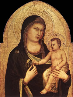
Giotto, Madonna and Child
Giotto, Madonna and Child, c. 1320-1330. [Image description: Mary holding Baby Jesus, both against a flat gold background in a Gothic arch surrounded by black. Both figures have stylized halos made of linear designs on the gold. The skin and clothes are stylized but shaded and contoured somewhat 3-dimensionally and realistically. Mary holds a plant (olive leaf?) that Jesus reaches for.]

Giotto's Baby Jesus also has a disproportionately small head in relation to the shoulders, and again, the tiny ears. The upper arms are not in proportion, either.

As realistic as (some of) these babies' faces were, the inaccurate neck and shoulders ruined the illusion. Now, here are some more realistic proportions where the head attaches to the neck and shoulders:

Luini, Madonna and Child
Bernardino Luini, Madonna and Child with Saint Catherine and Saint Barbara. c. 1522-1525. [Image description: three women stand in the background, their bowed heads forming a horizontal line dividing the top quadrant from the bottom three. Madonna, in the middle, holds Christ with one hand and does a blessing with the other. Christ stands on a stool and reaches toward an open book, presumably a holy text, sitting on a table with a red tablecloth with black stripes. The woman on the right holds a feather quill, on the left a quill and book. The style is late Renaissance and very realistic, fully contoured and chromatic with dramatic lighting (chiaroscuro) against a dark black background and deep shadows.]


Raphael, the Tempi Madonna, could not find date (early 1500s). [Image description; soft but realistic high renaissance style painting of Madonna standing and holding Baby Jesus with his back to the viewer, pressing her face to his cheek so his face is turned and visible. The sky is seafoam green, and a landscape horizon is barely showing around Mary's figure at the bottom third.]
The way this Baby Jesus's head connects with his neck and shoulders is not only proportional, it also tells a story about his gentle nature through the gesture of softly yielding to his mother's snuggle.

Now that you're thinking of the human head, neck and shoulders, I'll just go ahead and say they are as important in a realistic portrait as the face. Unlike babies, the rest of us have our lives written on our bodies, and the neck and shoulders in a typical bust portrait are the key to expressing this. The physical condition of the body-- muscular or soft, stocky or lanky-- is hinted at through the neck and shoulders. More telling are the person's habitual gestures of the body: tight or relaxed, meek or aggressive, withdrawn or wide open.

If you're still doubting that body shape and gesture are key to identifying a person, then you probably aren't near-sighted. Without my glasses I, on the other hand, can see only lumpy blurs of people at five feet away and farther. But I can still identify someone all the way across a gymnasium by the way they move and the general shape of the lumpy blur. Buster from Arrested Development had to have been lying about not recognizing Lucille 2 without his glasses; even as a "brown shape with points," only one person moves like Liza Minnelli, and that's Liza Minnelli.

And I'm not saying you have to finish the neck and shoulders to the same degree that the face is finished. Maybe you only allude to it with a sketchy line, maybe you can only see the curve of shoulders under a puffy coat and scarf, but what you're alluding to has to be correct. And everyone is different.

Consider, for instance, Nina Simone. Notice how her head leans forward with an intense yearning concentration on an imaginary horizon, every so often thrown back and to the side impatiently. Her chin recedes into her neck, creating the general appearance of a serious frown and accentuating the forward thrust of her face. The sides of her long neck descend in sinewy muscles into strong rounded shoulders, all in tune with her persona as a performer.


[Video Description: Black & white 1969 video of Nina Simone performing live, "To Love Somebody," at a piano. She wears a tall head wrap, dangling earrings and a halter top. She plays a lingering quietly soulful version of the song, then when she's done she leaps up from the piano bench, runs to the front of the stage, and raises her arms to the audience.]

Now, here are Miley Cyrus and Dolly Parton performing together. Dolly throws her body up and back from the hips, opening her sternum to the audience, keeping an erect neck and spine while bending and swaying at the knees. It gives her a brittle but ebullient appearance. Her neck and shoulders pull back. I suppose her posture could be the result of decades of filling large venues with her presence; or maybe it's from countering the weight of her considerable tatas. Or it could be her sheer steely perkiness. Miley, on the other hand, hunches forward from her lower shoulders through her neck, holds her face downward, and staggers forward on bent knees, creating the impression of being both closed within her own intense emotions, and reaching forward toward her audience. She sways and holds her joints bent so she always has the appearance of motion, or even a controlled artistic convulsion. She also holds her chin and jaw thrust forward and out, creating a confident and jaunty posture. Miley Cyrus learned to preform in an age of megascreens capturing her in close-up, so she can use this inward, reclusive posture to her advantage to express intensity and vulnerability. And performers her age have been informed by decades of the aggressive forward-hunch stance of shouting punks, metalheads and hip-hop performers. Her hunching posture assumes a boyish, athletic appearance due to her thin square shoulders and a long neck.


[Video description: long-hair family-friendly Miley performs "Jolene" live on an outdoor stage with a fringed, bedazzled Dolly Parton. Both hold personal microphones and sing to each other, taking turns so they play each other's rival, Jolene.]

Now take Don Knotts as Barney Fife. He looks like a turtle, and that's because he rounds forward in his lower-mid back (where a bra would fasten), and his shoulders are narrow and sloped, all creating the illusion of a rounded "shell." His thin neck attaches to the front of this structure rather than sitting tall atop his spine, and his receding chin and high, sloping forehead create a smooth curve from his collar bone to his crown, just as a turtle's head would be lifted forward. The posture allows his characters to appear bedraggled even though he was a very high-energy performer. Without the characteristic way his large ears lead to his tapered neck and thin, hunched shoulders, he wouldn't be Don Knotts.


[Video Description: Barney attempts to recite the Preamble to the Constitution as Andy has to feed him the lines word-by-word.]

Now contrast him with Mick Jagger. The man operates like an open Jack-in-the-box, as if his torso is a spring attached to his hips, full of coiled tension and always ready to snap back the other direction. Though like Barney his shoulders are thin-ish and narrow, he emphasizes his spring-loaded posture with the actual tension of skin-tight clothes, and his small shoulders generally appear square because of this same posture. He also differs from Don Knotts in that his head is extremely large for his shoulders and his big hair exaggerates it. To support his big old noggin, he has a thicker more muscular neck. He isolates his jaw forward and tilted up, as if the bottom of his mouth is filled with liquid he doesn't want to spill. The habitual upward tilt of his chin gives him an insouciant appearance and emphasizes the width and tension of his neck, reminding one of the tense throat of his screaming onstage persona.

Mick Jagger 1972, photo by Bob Gruen
Mick Jagger, 1972, photo by Bob Gruen, via MorrisonHotel, via AnthonyLuke. [Image description: Black & white action shot of Jagger performing live against a black background. His upper torso is shown in profile, leaning forward, arms reaching out to grasp the microphone, his head thrown back and turned toward the camera with his mouth open in mid-song and his eyes cast downward.]

Mick Jagger. Can't find the photographer, via artsmeme.com [Image description: black & white shot of Mick Jagger sitting in a casual suit shown from crotch upward, with one knee up and to the side, one wrist leaning on the knee, the other hand near his hip with his elbow out. A backward C-shaped curve is formed by the fly of his pants, the buttons of his shirt, his open jacket and lapels, his spine and neck, and extending through his head held at an angle. His mouth is open and brow kind of scrunched like he's thinking hard and in mid-speech.]

Ingenious blogger Scott Fertig noticed the similarities between the facial features of Don Knotts and Mick Jagger-- fish lips, pronounced folds at the barrel of the mouth, flat brows over lidded eyes-- and put Don Knotts' face on Mick Jagger's body. It's a perfect example of just how much difference the neck and shoulders make: nearly the same face but with a different neck, shoulders and posture, and he looks like a completely different person.

"Mick Knotts," via ScottFertig. [Image: Black & white photo of Mick Jagger posing with undershirt and low-slung jeans against a brick wall, one hand resting on the opposite shoulder with his arm across his chest. But his face has been replaced with Don Knotts's smirking face under Mick's feathered rock-star hairdo.]

Lest you believe these structures are only noticeable in easily caricatured weirdos like Don Knotts and Mick Jagger, I'll compare two conventionally beautiful Hollywood actresses who both play "every-woman" types in teen movie franchises: Kristen Stewart and Jennifer Lawrence.

Jennifer Lawrence's neck is nearly the same width as her face, and though long, is unusually thick for a Hollywood woman. It also sits squarely atop her shoulders and stretches straight up and down, the kind of posture our moms are always prescribing. Her head is centered atop her neck and her face is usually lifted and facing straight forward, giving her the appearance of a noble cadet. Her thick upright neck and posture are likely what makes her appearance credible as an athletic yet nobly idealistic participant in the Hunger Games. It also likely plays a part in her forthright public persona (people like to say, "she's so real!") The posture of personal integrity, for instance, makes it seem righteous when she flips the bird at a formal event, rather than sleazy.
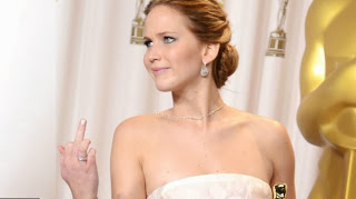
Jennifer Lawrence gives middle finger at Academy Awards
Jennifer Lawrence flips someone off at the Academy Awards.

Film still of Katniss from The Hunger Games
Film still from The Hunger Games.

Jennifer Lawrence at ComiCon
Jennifer Lawrence's typical posture.
Now, Kristen Stewart. Her neck is shorter but thinner. Her shoulders are also square but slightly narrower, hinting at the overall sporty-but-delicate look of her frame. Most importantly, though, is the way she holds her head forward and tilted. When caught candidly, the line between her shoulders are typically at an opposing angle to her head. She also holds her head forward but tipped back at an angle, as if weighed down by her curtain of hair. Her hair actually plays a part in a habitual Kristen Stewart gesture since she keeps it long and famously flips it all over to one side. Her jaw is sharply delineated from her neck and ends in a pointed chin that appears to jut forward with contrariness because of the forward thrust of her neck. The limp outstretched neck, jutting chin and jaw, and opposing angles give her a lazily rebellious look that, combined with her naturally down-turned mouth, I find appealing (but apparently rubs a lot of people the wrong way). Kristen Stewart, for instance, would come across as sleazy or disrespectful if she flipped the bird on the red carpet.

Kristen Stewart

Kristen Stewart leans forward in conversation
Kristen Stewart [Image Description: Stewart leans forward with her elbows on a table (out of frame), her mouth open mid-speech]

Here she is posing on the red carpet with a very typical posture for her. Notice how her jaw is jutting to the side but her head is upright, as if she is being pulled offstage in one of those old Vaudeville shows with a shepherd's crook around her neck. It is markedly different from any of Jennifer Lawrence's typical red carpet poses. An astute portrait artist would also note that her ears are unusually high up on her head; the size and position of ears help identify a person, too!

Kristen Stewart on the red carpet
Kristen Stewart at some red carpet thing

I find that even when you cannot really see the clear shape of the ears, neck and shoulders, the visual hints are still there:

-What kind of shadows do the chin and jaw cast on the neck? The deep shadow of a jutting shelf-like chin and jaw? or the soft shading and under-lighting of a chin that melts into the throat?

-What kind of shadow is formed at the base of the neck, where it attaches to the collarbone?

-How does the hair fall around the neck and shoulders? If it falls straight down from the head, the place where it lands on the neck and shoulders can help indicate that the head is in front of or straight above the collarbone.

-Do the ears, if covered, affect the structure of the hair in a way that hints at their position? Can you see the earlobes or earrings? How does the jaw attach to the ear? Is there a shadow?

-Where do the shoulders intersect with the neck and jaw (and how far down from the earlobes)? If they're slouching they should intersect close to the ears and jaw and the neck should appear in front of the shoulders. If they are back and down, they'll intersect with the base of the neck.

-Where is the collarbone? Imagine the base of the neck is a flat circular plane from the knob at the spine between neck and shoulders to the collarbone (the clean disc left by a guillotine, maybe?). When slouching, the spine-knob is thrust upward and the sternum down, pitching the imaginary disc forward and vertical. Thus the collarbone will be low and form a down-arrow shape. When sitting upright and level with the viewer, however, the disc is horizontally level and the collar bone is lined up right in front of the neck-knob and only slightly below the intersection of neck and shoulders.

-Do the shadows at the sides of the neck describe its width and breadth? Often hair will dangle around the neck, obscuring the sides. But the shadows it casts can be deep on a thin neck or shallow on a broad neck. Stiff collars can obscure the neck as well, but the way they fit around the neck, snugly or loosely, can be described by the shadows they cast. The degree of forward pitch of the collar can also be very descriptive of posture.

Finally, if you pay attention to the neck and shoulders before you start, you can manipulate the pose and angle so that any personally identifying characteristics of their posture can be highlighted. Take, for instance, the flower-stalk-like neck in the Bust of Nefertiti. Why draw her from this angle, with her hair hanging down in a wig (just imagine it)...

Bust of Nefertiti - front view
Bust of Nefertiti [Image description: a color photograph of the famous ancient Egyptian painted sculpture of Queen Nefertiti viewed from the front, with what appears to be a thin but average length neck and upside-down-trapezoidal hat]

...when you could choose this other angle, with her long neck exposed and a big hat creating a visual X marking the spot of her regal eyes?

Bust of Nefertiti - right side view
Profile view of the Bust of Nefertiti. [Image description: photograph of the same sculpture, taken from the side in profile. Reveals an extremely long neck pitched forward to an upraised jaw and chin. Viewed from the side, the hat extends up and back at an opposing angle to the neck, creating an imaginary intersection right at her eyes and a sense of elegant balance. The trapezoidal tulip shape of the hat contrasting with the long thin neck also creates the illusion of a flower on a stalk.]
And, for a different take, here's 1980s Arnold Swartzenegger. He had a famously thick neck and body-builder muscles; the protruding barrel of his mouth resolutely marked the spot where the wad of muscles stopped being neck and started being face. So why pose him like this...


Arnold Swartzenegger, c. 80's [Image Description: color photo of Arnold's face, shoulders and upper torso at a three-quarter angle facing the viewer. His shoulders are rounded forward and his face lifted and at a bowed angle, obscuring much of his neck.]

...when you could choose this angle and pose?

Film still from or promotional image for The Terminator. [Image Description: color photo of Arnold's face, shoulders and chest in character as the Terminator. He wears sunglasses an holds a gun straight up in front and to the side, echoing the width and position of his neck. He wears a wide-lapel leather coat with a popped collar that sits flush against the back of his neck and skull, creating a visual X at the lumpy barrel of his mouth. The sides of the coat's neck opening extend down over his chest, continuing and emphasizing the line of his neck. Lazers in the background radiate outward from a point visually marking his collar bone.]


Thursday, June 13, 2013

A Round of Poetry-Slam Snaps for the CIA!

Enjoy this article in The Independent (UK) about recent evidence of the CIA's heavy involvement in promoting American Abstract Expressionist art in the 1940s and 50s. What surprised me even more than the cultural promotion itself was that at one time the CIA was so full of art enthusiasts.

The writer, Frances Stonor Saunders, describes the newly-formed post-WWII CIA as "staffed mainly by Yale and Harvard graduates, many of whom collected art and wrote novels in their spare time, was a haven of liberalism when compared with a political world dominated by McCarthy or with J Edgar Hoover's FBI. If any official institution was in a position to celebrate the collection of Leninists, Trotskyites and heavy drinkers that made up the New York School, it was the CIA."

Saunders describes the main goal of the program as promoting the US as a haven of liberty and free expression, and New York as a major cultural center, in direct opposition to the heavy-handed, conformist USSR. Despite the legacy of truly radical Russian and early Soviet art movements, leaders in the USSR had quickly created an atmosphere where only the stereotypical "propaganda poster" artwork style we think of today was accepted and where literature was generally aspirational, utopian political writing in the Socialist Realism genre (though Saunders inexplicably passes up the opportunity to use the phrase, "boy meets tractor"). The CIA worked closely with mega-wealthy patrons in the US and abroad, such as Nelson Rockefeller, who readily lent them "Mummy's museum" i.e. the MoMA. People who worked for the CIA also held key positions on museum boards, as cultural promoters, such as Fodor's travel guide writers, and were instrumental in promoting travelling US symphonies, art shows and the like.

USSR propaganda poster of Stalin holding a happy kid
A Soviet poster in an acceptable style. [Image: A realistic but idealized poster of Stalin in official uniform holding up a happy blond toddler in front of a sunny blue sky with hints of those puffy Important-Moments-in-History-clouds. The baby wears a white romper, socks and Mary-Jane shoes and holds some white flowers in one hand and a tiny hammer & sickle flag in the other. Stalin looks stern yet avuncular and the whole thing resembles Mufasa presenting Simba in The Lion King. The paint (or lithograph?) style itself is crisp and thinly applied, vaguely reminiscent of prosaic 1950s US advertising illustration. It is slightly painterly, with just enough brush-stroke and strategic unfinished-ness to reference the tradition of European Academic painting.]
Willem de Kooning on the cover of Newsweek 1965
Willem de Kooning on the cover of Newsweek in 1965 photographed painting a semi-abstract nude woman. Now I'm wondering if this cover is CIA promotional handiwork. According to the article, the artists themselves had no idea of the involvement. [Image: color photo of an oldish white man in a paint-covered smock mixes paint with a giant palate knife on a giant palate in front of a giant (seven foot?) painting. The painting itself looks messy and violent because of the slashing red brush strokes as well as cartoonish because of the "childlike" crude outlined black eyes and red mouth and the exaggerated boomerang-shaped hips and breasts-- the only discernible features of the otherwise completely abstract collection of oversized pastel brush strokes. The Newsweek logo is printed across the top, with the headline, "Art in New York" superimposed on the painting with the small subheading, "Painter Willem de Kooning," all in black.]

Saunders doesn't mention that the CIA's promotion of AbEx has an obvious precedent in the US government's worldwide promotion of US movies, particularly in the 1910s and 20s when the silent medium was easily shared in any language and Hollywood gave the US a jump-start on worldwide cultural hegemony. I suppose it would also be comparable to the many governments which pour money into their Olympic teams, touring ballet companies and cultural performance troupes as a method of promoting nations. If "ping pong diplomacy" can prove culturally significant, it's hardly surprising that a government would promote its art world-wide as well.

It also makes a certain amount of sense that AbEx would be promoted. I've written before about the link between money, power and the actual form of AbEx art (the relevant part begins about halfway through just after the image and the ***). The art itself is monumental, housed in imposing museums that doubled as displays of wealth and power, creating the same sense of security-meets-fear as when one walks into the lobby of a fancy bank. And the paintings were purported to be universal, to cut through language and historical relativism to affect the viewer on an exciting "primitive" level. If you forget about the eye-rolling with which AbEx tends to be met even today outside of small art-loving circles, AbEx would be a wonderful tool of propaganda even as it was often seen as an act of rebellion. Going back to my previous linked post, the actual involvement of the CIA with Modernism adds another layer to the reactive socio-political motivations I ascribed to the beginnings of Post-Modernism.

What is puzzling, though, is that the job would fall to the CIA and not, say, some completely mundane and transparent Bureau of Culture and Diplomacy or the like. This was all well before the Robert Mapplethorpe kerfuffle when the so-called Moral Majority permanently hobbled the idea of the NEA and more generally the idea of the government subsidizing the arts at all. So why hide that certain people who work for the government also work in the arts? Why would one need to be a CIA operative in order to acknowledge that promoting Pollock might benefit the nation?  Have we really always been that backward? Saunders hints at the extreme unpopularity of AbEx among ordinary tax-payers presenting an obstacle, but shit, that never stopped the US government before.

Ultimately I had several reactions to this bit of news. First, it is so ridiculous. But reading this on the heels of the NSA spying and Edward Snowden "treason" talk (give me a fucking break, he's a whistle-blower not a traitor), it seemed almost quaint. Second, I want to know all the details: who was responsible for what, who knew and who didn't, which shows were endorsed and why, so many questions! Third, I wish Kurt Vonnegut had been able to include this stuff in Bluebeard. Because you know he would have. And fourth... well, the NSA thing again. We're supposed to trust them as Professionals Who Know What's Best and Are Protecting Us, but the more we (are allowed to) learn about secret operations by the various US bureaus, the more farcical their efforts appear. Bay of Pigs? Exploding cigars? Stong-armed art critics who couldn't even win over Congress? Hmmmm....

PS: Hey NSA, since you're reading this, between you and me if you decide to fire up that cultural promotion thing again I volunteer to tour the world on your dime painting portraits. Just consider it.


Friday, May 24, 2013

Anne Bonny


[This post has been edited for brevity].

From my Notable Charlestonians series, professional hellion Anne Bonny.
 
Anne Bonny by Ciana Pullen (detailed description in caption below)
Anne Bonny, by Ciana Pullen. A charcoal drawing of what I imagine Bonny would have looked like circa 1720. Drawn completely from imagination. [Image: realistic, somewhat detailed black & white charcoal drawing on a sepia-grey background of a young white pregnant woman leaning insouciantly against a ship railing. She wears a dress and man's coat, as well as a sabre and pistol holster slung over her belly. She wears a slouchy hat over her loose stringy hair, which was purported to be red. The ocean stretches behind her to the horizon and meets some advancing drizzly nimbus clouds.]


Sometime Charlestonian Anne Bonny (8 March 1702 – 22 April 1782) was a pirate. As a girl she moved with her family from Ireland to Charleston, SC, where she was noted as a “good catch” in the marriage department (we know only that she had red hair). However her notorious temper became infamous; on one occasion she stabbed a family servant with a table knife. Over the objections of her family she married a sailor, whom she soon abandoned. Much of what we know of her time in the Caribbean is from an early 1700s Dutch book called A General History of the Pyrates, which includes the one and only contemporary portrait of of Bonny, likely idealized or imagined:

Historical Illustration of Anne Bonny (detailed description in caption below)
Image: An antique black & white full-length engraving of Bonny pointing a gun. Her hair blows in the wind, she wears a sword, an ax, another pistol, and another sabre. Some of these weapons are hard for me to identify, but there are a lot of them strapped to her. She wears a hat and men's clothes, including long loose pants, boots, a saggy jacket that reminds me of a revolutionary soldier, and a loose blouse that, for whatever reason, bares her breasts. In the style of the day, her head is very small and her breasts are positioned really oddly. Her features look neither particularly pretty nor distinctive, but rather stereotypically eighteenth-century-ish. Several pirate ships sail in the background.]

Bonny had affairs with several others engaged in illegal smuggling, most notably “Calico Jack” Rackham (with whom she had a child in Cuba), on whose ship she was a frequent crew member. But most interesting was her affair with another female pirate, allegedly disguised a as a man, named Mary Read, also in Calico Jack's crew.

Skilled in combat, Bonny, Mary Read and one unknown pirate were the only crew to fight and defend their ship against attack in 1720, as the remaining crew were simply too drunk to fight, including Calico Jack himself. The crew were tried as criminals, but Read and Bonny “pleaded their bellies” and were excused from execution because they were pregnant. Bonny visited Calico Jack in his cell and reportedly uttered that she was “sorry to see him there, but if he had fought like a Man, he need not have been hang'd like a Dog."

It is unknown what she did upon being released-- return to her husband, resume piracy under a new identity-- but most likely her well-connected father secured her release and she returned to Charleston to give birth, presumably to Rackham's child. In 1721 she married a local man named Joseph Burleigh, and they had 10 children. She died “a respectable woman,” at the age of eighty.

The portrait I drew above is purely imagined based off her description and how I imagine a habitually violent, unwashed pregnant woman living off hardtack biscuits and liquor might have looked. Prints of the drawing are for sale on my Etsy store.


Wednesday, May 22, 2013

Portrait Artist on LSD (not me though)

[Video: text appears explaining that in 1955 a portrait artist was given a dose of LSD and some drawing supplies, then drew a series of sketches of the doctor over the course of several hours. The black & white drawings then appear in succession for the rest of the video. The first is simple and realistic with cross-hatching and a three-quarter profile view. Then they appear successively cubist; some recognizable profiles appear to be vibrating and composed of expressive shapes like a Kandinsky painting; some are simple, expressive contours; one is completely abstract and most like a Kandinsky, O'Keefe or early abstract expressionist painting; and gradually they become more realistic again.]

Saturday, March 23, 2013

Artist Is Shocked To Discover Postmodern Theory May Be Relevant To Real Life

I recommend Joshua Alston's thoughtful piece in The Feminist Wire, "Confessions Of A Black Morrissey Fan." I had some immediate thoughts about it but ultimately decided to leave Alston's comment section free of abstruse reflections from this particular long-winded White person. So I'm writing them here instead.

Alston brings up that classic predicament of enjoying art by an artist who personally is odious in some way, whether they violate one's core principles or they are bad, bad people. (I've written about this issue before). Though Alston doesn't mention it many such articles weigh the guilt of giving money and support to the odious artist through CD purchases and the like with the enjoyment the listener or viewer gets from the art. Many also point out that there are many other, better artists out there to whom one could devote time and money, people who could use the money and publicity. So there are typically three considerations for consuming art by odious artists:

1. The effect on the artist,
2. The effect on the viewer, and
3. The effect on (and existence of) the cultural climate in which the art exists and is consumed (i.e. the other artists, what the act of consumption means to the outside world, and even the cultural context in which one may try to judge how relevant the particular act of odiousness is).

For Alston, though, there is the added predicament of not only disapproving of the artist, but also being the object of the artist's aggression because he belongs to a class of people who are made out to be "The Other" by the artist's actions (Morrissey is "probably" racist according to Alston's analysis*, and Alston is a fan who is Black).

When I (a woman) consider the experience of consuming art made by egregious misogynists, of being The Other while involving myself with the artwork, it is different than, say, reflecting on Caravaggio's murderous personal life and thinking, "What an asshole. But this painting is nice." Because Caravaggio's crimes had nothing to do with me it is easy to assume the role of Any Given Viewer of his paintings. He intended his paintings to be seen by viewers, and I'm a viewer.

But when the odiousness is misogyny I am not Any Given Viewer. I am The Other and the object of alienation. And yet there I am, seeing and judging the artist's work as if I belonged in their very closest circle. It is akin to being accidentally invited inside someone's home when one knows one is not ordinarily welcome. As a viewer that can put one in a position of unexpected power, or it could feel eerie or gross. Even when the viewer puts aside their personal involvement and adopts a clinical interest it is impossible to have that no-questions-asked feeling of invitation into the direct experience of the art.

To put it another way, I said "[Caravaggio] intended his paintings to be seen by viewers, and I'm a viewer." However when an artist's othering mindset is shared by their culture, and often by the viewer's culture as well, they probably think of a generic "viewer" as automatically not inclusive of that Other. It's a type of attitude which many people are unaware of having in which they categorically speak of "people" and the Other as two separate groups. For instance, "All these immigrants are making it really hard for people to find jobs," ("people" isn't inclusive if "immigrant") or "What nobody understands is that when women say one thing they really mean another," ("nobody" means "no man").

So when the misogynist artist makes art for a "viewer," they don't mean me, and why would they?

It's also an attitude that precipitates the tendency of TV producers to cater to a generic "audience" of imaginary middle class white men, although that is beginning to change. Yet Others in the audience experience this alienation (often as skepticism) at the same time that they get swept along in the emotions and narratives that the artists intend to create, which ultimately distances the Other from the direct experience of getting swept up. The Other instead experiences "getting swept up" as relative to his or her feelings of alienation, and relative to his or her relationship to the artists within society.

A rare flipping of the "audience is automatically male" script: famous "sweater girl" Jane Russell enjoys the other side of the sexually objectifying gaze in Gentlemen Prefer Blondes. The scene is unusual in that, I assume, it was written for the benefit of women in the audience at the expense of male audience discomfort. [Image: A sporty white woman holding a tennis racket frolics through an array of muscled white men wearing tiny skin-colored swimsuits and sticking their butts up at her. In the background more Adonises in tiny swimsuits strike showy poses while "working out" on gym equipment.]

***

Which brings me, as always, to postmodern theory.

Friday, March 22, 2013

Website Re-Launch

I just re-designed and massively updated my website (not this one but the one where all my artwork is shown). It is byoooooootiful, and there's new work up:

http://cianapullen.com

Tuesday, February 12, 2013

Guess who?


Painting of man's legs in a bathtub. Description follows in caption.
Who could this be taking a bath? [A painting of a man sitting in a full bath tub with the faucet running, painted from his point of view and showing only his thighs, knees and toes above the water. A green stripe surrounds the tub, which is built into a corner, with a black "back-splash" forming a thick black line across the top right and a dynamic trapezoid on the left, due to perspective. The very top quarter consists of a beige wall with a white thing (towel?) on it and curtains, possibly bamboo, on the left wall, where soft natural light appears to be filtering in.]

Painting of man in shower. Description follows in caption.
Same guy, better angle. But who?! you may ask. [Image: amateur painting of a white grey-haired man in the shower. His body, shown only from behind and from the waist up, is somewhat beefy and completely naked, appearing to lean from the hips into the picture frame. His face is reflected in a small round mirror clipped to the shower head, which shoots small jets of water straight down the center of the image. Glass doors are visible just at the left edge; the rest of the picture is the wall of the shower, covered in large pink-beige stone tiles; the grout runs parallel and perpendicular to the edges of the painting. There are no really dark darks, even in shadow.]

Ladies and gentlemen, former President George W. Bush. The poor guy's email got hacked and these paintings he did are no longer private.

So, how do you feel?

I admit that my immediate thought upon unexpectedly glimpsing W in the shower, in the nude, was neither considerate nor edifying:


[video: an episode of The Simpsons where Marge is hired to paint Montgomery Burns's portrait. He moves into their house so she can get to know his "inner beauty," which is when she walks in on him in the shower.]

If you don't remember how this episode of The Simpsons turns out, the desperate Marge is unable to find any inner beauty in the inimitably evil Burns. Eventually the museum gala rolls around and the portrait is revealed:

Marge's portrait of Mr. Burns. Description in caption.
[Image: portrait of Mr. Burns naked, skinny and hunched over in front of a purple background in a spotlight]
The audience is shocked and appalled until Marge explains that she wanted to convey the humanity, the fragility of Burns. One museum-goer sums up, "He's evil-- but he'll die. I like it." People warm to it, acknowledging that Burns is straight-up evil, but the humanity and fragility helps them see the good in him.

I continued to draw this unflattering comparison as I read each response to Bush's paintings (all from left-leaning people). Basically, everyone found him completely irredeemable until he displayed his humanity and vulnerability in these somewhat pathetic (though not terrible) paintings.

Jerry Saltz showed off his turdlier side by writing about these as serious Whitney-ready art, dropping the bomb, "even from someone who obviously has zero natural talent" amidst his facetiously "glowing" review. Really, Jerry Saltz? You lose your license to be the Everyman's Critic when you behave like that.

Yet even as I was typing the description of the shower painting I found myself lapsing into serious criticism, catching myself just before I described W's naked torso as a pictorial simplification that melds the cartoonish plastic GI Joe figure with primitive paintings of Christ on the cross. GI Jesus: an apt description of his public persona while in office.

I also think it's interesting that each painting is so light and soft-- really, they're downright feminine. The famously transgressive pinks of de Kooning's paintings of nude women come to mind when I see the pink tile and pink body of one; the other reminds me of an ad for a spa. They're also very meditative; he and I may be similarly afflicted by doing our best thinking in the bathroom. One imagines W had little time for splashing around in the tub or leisurely showers during his 8 years in the White House; I think the world sighs its collective relief that he does now.

Much has been made of the content. People have suggested the tub is evocative of water-boarding, with the running faucet signifying guilt. Others, that he is attempting to cleanse himself from his deeds as President. Saltz writes, "These are pictures of someone dissembling without knowing it, unprotected and on display, but split between the promptings of his own inner drives and limited by his abilities. They reflect the pleasures of disinterestedness. A floater. Inert." It's worth noting, of course, that lots of amateurs and high school students paint bathroom scenes because the bathroom is just an interesting place, visually and psychologically. It could also be that he did these as assignments for a class or instructional book. Basically, I think this: that his stuff is amateur but not beginner, promising but not there yet, nice composition, interesting subject matter (though very probably by accident).

I've gotta admit, he took some risks and it sucks that his paintings got released to the public. But hey, at least it happened to a man and not, say, Hillary Clinton or, God help her, Michelle Obama.

Bush also made public (on purpose) this painting in memory of FDOTUS Barney:

Painting of a dog. Description follows in caption.
Barney, by George W. Bush. [Image: head and shoulders of a grey-black Scottish Terrier, I think, on a white background, signed "43." The dog turns to look at the viewer, and the brushstrokes describe the direction of the fur. It's not bad; technically, probably the best of W's paintings]
Poor Barney. Even though I have absolutely no recollection of this dog I miss him just a little now.


Monday, January 21, 2013

Quote:

Peter Schjeldahl, on the writings of Mondrian, Malevich and Kandinsky following MoMA's survey of 20th century abstract art:

"The simpler the art, the more elaborate the rationale."

Friday, January 18, 2013

Self Portraits by Mary Cassatt

One of my husband's family members passed away recently and we inherited some of her belongings. Because she was warm, interesting and fun she had a great collection of art books-- Rembrandt, Degas, a folding copy of 100 Butterflies, Cezanne, and van Gogh.  I'm currently making my way through the Degas, and the author pauses to described Cassatt and sing her praises as an extraordinary artist and dinner companion of acidic wit. She and Degas were great friends. Both were selective in their company and described as difficult to get along with and highly motivated. Cassatt's mom is quoted complaining about Degas procrastinating and ultimately dropping the ball on a magazine the artists had planned on launching to showcase prints of the modern world. "As usual," she grumbles.

Self portrait by Mary Cassatt. More detailed description follows in caption.
Self Portrait by Mary Cassatt. This is so cool because everything about her process of posing is visible-- it's obviously a straight mirror image of her at her easel-- while the painting style is also transparent with visible brush strokes and outlines.
Self portrait by Mary Cassatt. Detailed description follows in caption.
Self portrait by Mary Cassatt. The process for this one is a little less clear to me as she can't have been painting in that getup (all white, with gloves!). Did someone else pose for the body? [Image: Impressionist painting of Cassat, a youngish white woman, leaning with one elbow on a pillow or piece of striped brown and red furniture. She clasps her hands softly in front of her and looks to the right out of frame. She wears a white dress and gloves with a dark burgundy flowered bonnet. The background is solid sea-foam green mixed with cream., probably an interior wall. Her face and body form a thick white diagonal shape from top left to bottom right, somewhat triangular. The head is at the top two-thirds mark, her hands at the bottom third mark. Brush strokes and wrinkles form very subtle concentric circles around her head and shoulders.]
Photo of Mary Cassatt
A photo of Cassatt.

Thursday, January 17, 2013

Portraiture is dead, again.

Jeffrey Augustine Songco has a post up at the art:21 blog called "The End of Self Portraiture." The idea-- that self-portraiture is "dunzo" because it wasn't represented at Miami Basel*-- is pretty silly, but the run-down of the contemporary high-art self portrait is pretty good. I noticed the focus was on photographs, but painted self-portraits could also have been mentioned, such as Jenny Saville's.

I would add only one group: the melding of the self portrait with "identity politics," i.e. asking, who am I as a Cuban-African woman? or what gender am I? These sorts of issues are usually explored through self-portraiture, but as sort of an inside-out approach where the viewer is presented with how the artist is seen, rather than simply seeing the artist.

Self portrait as an African Chief by Samuel Fosso. Detailed description follows in caption.
Samuel Fosso, self portrait as an African chief. Photograph. Says Fosso of this self-portrait, "I am all the African chiefs who have sold their continent to the white me." [Image: Fosso, a youngish black man, sits in a chair in front of a backdrop of kente cloth panels, a yellow panel surrounded by black and white panels with large ovals on them. He holds several large sunflowers in one hand, the other draped regally over the arm of the ornate Western-style chair, which is upholstered with leopard print. He wears a leopard-print garment (sarong?) on his bottom half and is topless, but his chest is covered by a mass of gold necklaces. He wears bracelets and rings on his hands and a half-white half-carmel fur hat shaped like a ski hat. His eyes are obscured by thick white-rimmed glasses with narrow slits instead of large lenses. The pose is calm and formal yet relaxed.]


And then there is the vast army of self portraits by women who grapple with being seen, being objectified, and manipulating one's own image. I'm showing the legendary Ana Mendieta's work below which is old, but she was ahead of her time and this sort of stuff is still very current (I'll take any excuse to show her work).

Ana Mendieta, self portrait. Detailed description follows in caption.
Ana Mendieta, "Facial hair transplant," 1972. Photograph. [Image: head-and-shoulders photo of the female artist wearing a brown beard staring into the camera.]

Ana Mendieta, self portrait. Detailed description follows in caption.
Ana Mendieta, "Untitled, Glass on Body Imprints-- Face" 1972. Photograph. [Image: grainy black and white photo of Mendieta's face pressed against glass, her lips huge and distorted]

Those two groups are quite contemporary and relevant, but even without them, considering both the youth and the egos that emerge from art school every year, I just don't see self portraiture going anywhere. Even if Facebook and the like have challenged the fine art establishment to differentiate its portraiture from the common "selfie," particularly photographers, that's really more of a rebirth than a death of the self-portrait.

*Self-portrait artists: before you rend your garments and cast yourself into the sea, please consider that the Smithsonian's National Portrait Gallery , MoMA, New York City’s National Academy Museum, and The Whitney have all managed to caugh up major exhibits containing self-portraiture in or near 2012, to name just a few.

Wednesday, January 16, 2013

The Rachels, Music for Egon Schiele

[Video: a song by Rachel's from the CD "Music for Egon Schiele." Shows a still image of the CD cover while music plays, a black & white sepia-purple-toned Schiele painting of three small winter trees or saplings on a hill in front of a cloudy sky that is drawn as a series of horizontal lines, framed in dark mustard yellow.]


Drawing of houses by Egon Schiele; detailed description follows in caption.
A piece by Egon Schiele, I couldn't find the title of this one. [Image: a black & white line drawing on white paper of older European village-style town-houses on a hillside. The shapes in the top middle houses are filled in with scratchy yellow and brown paint and small areas of red. The linework begins in the top right and the groups of right angles tumble downward across the horizontal page. The final effect is of an unfinished sketch or possibly an unfinished quilt made of burlap.]


Kleinstadt, by Egon Schiele. Detailed description follows in caption.
Kleinstadt, by Egon Schiele. 1912-1913. [Image: dark square-shaped composition of houses in city blocks. The bottom third is solid black; the middle third is several rows of houses; the top third is another row of houses behind a street or canal which forms a horizontal line then veers off diagonally to the top left and is the same black as the bottom. All the shapes are outlined in black, with many lines appearing hasty or crooked. The shapes of the houses are filled in with blocks of muddy brownish colors-- red, green, ochre, thin white paint--and all roofs are black. The effect is of a quilt or collage.]

Sunflowers, by Egon Schiele. Detailed description follows in caption.
Sunflowers, by Egon Schiele. [Image: color painting done without black outlines showing a column of sunflower plants in front of a bluish-putty-colored sky. The plants, mostly large greenish brown leaves with a few flowers sagging over the top, are so visually packed into a rectangular area which takes up most of the picture plane that they seem to be a figure or monolith rather than a group of plants.]

Suburb, by Egon Schiele. Detailed description follows in caption.
Suburb, by Egon Schiele, 1914. The date of this piece, the beginning of WWI, makes the rows and red posts look like trenches and barbed wire to me. Hard to look past that, but worth it, as it's a beautiful composition. [Image: Squarish horizontal composition of houses and horizontal stripes of pale smoky blue and charcoal grey, possibly roads, bodies of water or rows of plants. The style is similar to the two house pieces above but completely colored in. As with the other two the lack or confusion of a horizon flattens the piece into a quilt-like arrangement. The houses themselves are muddy white, yellow and red, and the fields in front are dotted with thin bright-red posts.]

The Bridge, by Egon Schiele.
Egon Schiele, "The Bridge." [Image: A square composition of a bridge that stretches from the horizon toward and slightly left of the viewer where it exits the frame. To its left are empty spaces, maybe fields or river banks. All the shapes are outlined in black but filled in with monochrome icy wheat colors, making this piece less like a quilt, more like a Japanese woodblock print or old sepia photograph. The bridge is made of repeated gridded pylons and a a repeated grid of guard rails, topped with broad, flat linear rectangular structures that repeat four times into the distance and are echoed by a few telephone poles to the right. The top third and right half of the piece are simple flat shapes that balance out the busy criss-crosses and diagonals of the left.]


Boats on Ruffled Water, by Egon Schiele.
Egon Scheile, "Boats on Ruffled Water." [Image: vertical color painting of boats on water. Though linework is involved it isn't the quilted technique of the house pieces above. It looks much more like a straightforward Impressionist Monet or Whistler painting of boats at dusk, except that the reflections of masts and rigging on rippling water turn the bottom two thirds into an abstract pattern that Schiele emphasizes by keeping the linework sharp and even, creating what looks like texture by dragging a pencil through thick paint, but I can't be sure of that from the 2-D image. The boats are arranged to create a line cutting from the middle left to the horizon at the top right. The water is pale turquoise, the sky is soft sunset-pink,and the boat hulls are pinkish white, jade green and reddish brown.]