Peter Schjeldahl, on the writings of Mondrian, Malevich and Kandinsky following MoMA's survey of 20th century abstract art:
"The simpler the art, the more elaborate the rationale."
Monday, January 21, 2013
Friday, January 18, 2013
Self Portraits by Mary Cassatt
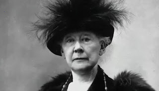
One of my husband's family members passed away recently and we inherited some of her belongings. Because she was warm, interesting and fun she had a great collection of art books-- Rembrandt, Degas, a folding copy of 100 Butterflies, Cezanne, and van Gogh. I'm currently making my way through the Degas, and the author pauses to described Cassatt and sing her praises as an extraordinary artist and dinner companion of acidic wit. She and Degas were great friends. Both were selective in their company and described as difficult to get along with and highly motivated. Cassatt's mom is quoted complaining about Degas procrastinating and ultimately dropping the ball on a magazine the artists had planned on launching to showcase prints of the modern world. "As usual," she grumbles.
 |
| A photo of Cassatt. |
Labels:
degas,
impressionism,
Mary Cassatt,
painting,
self-portrait,
Thursday, January 17, 2013
Portraiture is dead, again.
Jeffrey Augustine Songco has a post up at the art:21 blog called "The End of Self Portraiture." The idea-- that self-portraiture is "dunzo" because it wasn't represented at Miami Basel*-- is pretty silly, but the run-down of the contemporary high-art self portrait is pretty good. I noticed the focus was on photographs, but painted self-portraits could also have been mentioned, such as Jenny Saville's.
I would add only one group: the melding of the self portrait with "identity politics," i.e. asking, who am I as a Cuban-African woman? or what gender am I? These sorts of issues are usually explored through self-portraiture, but as sort of an inside-out approach where the viewer is presented with how the artist is seen, rather than simply seeing the artist.
And then there is the vast army of self portraits by women who grapple with being seen, being objectified, and manipulating one's own image. I'm showing the legendary Ana Mendieta's work below which is old, but she was ahead of her time and this sort of stuff is still very current (I'll take any excuse to show her work).
Those two groups are quite contemporary and relevant, but even without them, considering both the youth and the egos that emerge from art school every year, I just don't see self portraiture going anywhere. Even if Facebook and the like have challenged the fine art establishment to differentiate its portraiture from the common "selfie," particularly photographers, that's really more of a rebirth than a death of the self-portrait.
*Self-portrait artists: before you rend your garments and cast yourself into the sea, please consider that the Smithsonian's National Portrait Gallery , MoMA, New York City’s National Academy Museum, and The Whitney have all managed to caugh up major exhibits containing self-portraiture in or near 2012, to name just a few.
I would add only one group: the melding of the self portrait with "identity politics," i.e. asking, who am I as a Cuban-African woman? or what gender am I? These sorts of issues are usually explored through self-portraiture, but as sort of an inside-out approach where the viewer is presented with how the artist is seen, rather than simply seeing the artist.
 |
| Samuel Fosso, self portrait as an African chief. Photograph. Says Fosso of this self-portrait, "I am all the African chiefs who have sold their continent to the white me." [Image: Fosso, a youngish black man, sits in a chair in front of a backdrop of kente cloth panels, a yellow panel surrounded by black and white panels with large ovals on them. He holds several large sunflowers in one hand, the other draped regally over the arm of the ornate Western-style chair, which is upholstered with leopard print. He wears a leopard-print garment (sarong?) on his bottom half and is topless, but his chest is covered by a mass of gold necklaces. He wears bracelets and rings on his hands and a half-white half-carmel fur hat shaped like a ski hat. His eyes are obscured by thick white-rimmed glasses with narrow slits instead of large lenses. The pose is calm and formal yet relaxed.] |
And then there is the vast army of self portraits by women who grapple with being seen, being objectified, and manipulating one's own image. I'm showing the legendary Ana Mendieta's work below which is old, but she was ahead of her time and this sort of stuff is still very current (I'll take any excuse to show her work).
_1972.jpg) |
| Ana Mendieta, "Facial hair transplant," 1972. Photograph. [Image: head-and-shoulders photo of the female artist wearing a brown beard staring into the camera.] |
.jpg) |
| Ana Mendieta, "Untitled, Glass on Body Imprints-- Face" 1972. Photograph. [Image: grainy black and white photo of Mendieta's face pressed against glass, her lips huge and distorted] |
Those two groups are quite contemporary and relevant, but even without them, considering both the youth and the egos that emerge from art school every year, I just don't see self portraiture going anywhere. Even if Facebook and the like have challenged the fine art establishment to differentiate its portraiture from the common "selfie," particularly photographers, that's really more of a rebirth than a death of the self-portrait.
*Self-portrait artists: before you rend your garments and cast yourself into the sea, please consider that the Smithsonian's National Portrait Gallery , MoMA, New York City’s National Academy Museum, and The Whitney have all managed to caugh up major exhibits containing self-portraiture in or near 2012, to name just a few.
Labels:
Ana Mendieta,
art:21,
Jeffrey Augustine Songco,
Samuel Fosso,
self-portrait,
Wednesday, January 16, 2013
The Rachels, Music for Egon Schiele
Labels:
drawing,
Egon Schiele,
expressionism,
landscape,
music,
painting,
The Rachels,
Tuesday, January 15, 2013
Duchess Kate Middleton Gets Her Portrait Painted
 |
| A snapshot from the portrait's unveiling, showing the large size as compared with people in the crowd, and a brighter, warmer and crisper color palette. |
Anyway she commissioned this portrait and has gone on record saying she thinks it's "amazing." (Quipped Jeanne Becker, a Canadian TV commentator, “Interesting to hear that Kate thinks her new portrait is ‘amazing’. Shows she’s not vain.”) Middleton studied art history in college and, together with the director of the National Portrait Gallery, chose Emsley as the artist. Judging from his past work one can see why:
But as my comment policy proclaims angelically from the sidebar, "[...] any artist who has taken the time and considerable expense to plan, make, fix, remake, market, network, defend, and show their art-- no matter how shocking, expensive, or crude it is in appearance-- is deserving of consideration." So the following is my critique.
The portrait is a large square-shaped realistic painting of a young white woman (Middleton) from shoulders up on a navy background. The style is extremely detailed yet meticulously soft-edged. It brings to mind contemporary traditional Korean and Chinese official paintings which feature perfect tonal gradations and perfectly defined shapes:
 |
| An unknown couple stands in front of a huge official painting (mural?) of Kim Il Sung and Kim Jong Il. |
 |
| One of legion official Mao portraits. |
 |
| Mao, by Andy Warhol. [Image: three black-and-white screenprints of Mao's official portrait, each colored with different silly Easter-egg color combinations.] |
Returning to Middleton's portrait the (probably accidental) references to both iconic dictatorship and the hyer-reality of the simulacrum (and theoretical issues of mass reproduction) are quite witty. Middleton, though a monarch (I think?), is probably not that powerful, as rulers go: she wasn't uber-royal before marrying William, she is a woman in an antiquated monarchical system based on male heirs, she is objectified as (to put it crudely) a royal breeder, and most of all she is stripped of nearly all privacy and autonomy as the most public of public figures, ever on the verge of the public turning against her. Middleton smirking through these classic signifiers of authority could be read as a postmodern ironic twist on 20th century iconography of power, a "cult of personality" representation in a time when "cult of personality" has mostly vanished. Yet one could call the media frenzy over Middleton (and, by extension, Diana) a modern day cult of personality; in this modern version, rather than push his or her image onto the public, the public extracts images from the (seemingly reluctant) leader.
If one makes the associative leap from dictator-icon to Warhol's famous commentary on reproduction and media, Middleton would be an interesting parallel to Warhol's famous "Marilyn Monroe": she's a female symbol, a persona whose face is reproduced daily in media all over the world.
The painting's style could also refer to studio photography. Yet another postmodern irony: we've entered an age of photography, yet this painter was hired to do the same thing as a camera simply because of tradition and unadulterated posh-ness. We know from media reporting that the painting was composed of thin glazes of oil paint, and though Middleton sat for the artist twice he also used a series of photographs shot for the portrait. I'll leave it to those who are interested in the theoretical implications of photorealism to finish this thought because frankly I'm too lazy to do anything more that spit out the name, "Gerhard Richter."
Blue. There's quite a lot of blue in this portrait, particularly navy. Navy is the color of power, a hue typically recommended for business women who are trying to be taken seriously by their co-workers. It's also, obviously, the color associated with The Navy. Older associations between blue and power include blue and purple as colors reserved for royalty.
Blue is also the color associated with the Virgin Mary in Western iconography. Ties between British and English royal women, virginity, and the cult of Mary are many, the most obvious being Queen Elizabeth and Queen Victoria (of the respective eponymous eras).
Blue is also the color of abstract thought. I don't know if it is listed as such in any guidebooks to symbolism, but one cannot help but notice that blue is very strongly associated with technology and science, featured in many logos. It's often representative of spirituality (as opposed to Earthly existence), perhaps because the sky is blue. This portrait not only features blue clothing and background, it also seems to have a cool blue tinge to the entire composition. I've also noticed this practice in portraits from the late 1700s and very early 1800s together with a haziness and softness which seems to express the ideals of the humanist Enlightenment and Neoclassical era: that Man is a rational creature with a soul, that humankind is both capable of and destined to rise above our Earthly, carnal bodies, that our real self is our ideal, best self. People still use these conventions to represent loved ones who have died; the haziness and sky or clouds traditionally represent the immortal soul, with blue signifying heaven or angels. With this association in mind Emsley's representation of Middleton could imply an intellectual portrait of the abstract Kate, a personal, insightful endeavor which stands in direct opposition to the constant flow of tabloid commentary on Middleton's body, appearance, clothes and adherence to royal manners. To further bolster this interpretation of the artist's intent, there is the exclusion of anything below Middleton's shoulders and also the dark background which hints at Emsley's Middleton existing in some abstract intellectual void, a darkness which also implies a hushed calm.
However, I believe that if this is the artist's intent he as failed. The emphasis is still too much on Middleton's face. For example the straightforward evenly-lit mugshot position echoes typical magazine shots of models which allow for the visual dissection of facial features, each fully rendered to be consumed and judged by the viewer. This representative convention in fact serves as an invitation to judge, as in an advertisement for mascara or a list of top 10 most beautiful women. As an example of this sort of representation of women, this portrait fails to offer up Middleton's features in their best light.
That would not be a problem if Emsley had somehow prevented the portrait from being read this way, but he didn't. He should have known the enormous emphasis on Middleton's prettiness, but it appears he did not anticipate either that this portrait would fall short of the public's expectations of prettiness, or that it would be read as an exposition of prettiness. Were there movement, it would have counteracted this "map of the ideal female face" aspect, but movement is conspicuously absent from both subject and composition. Even the movement provided by the dynamic directional lighting in the Mandela and Simpson portraits has been discarded in favor of diffuse straight-on studio lighting, a move that confuses me given Emsley's dilemma of Middleton lacking wrinkles and imperfections. I think the real issue might be that because she is the Duchess Emsley was afraid to paint her wrinkles and imperfections; I think he should have gone farther in that direction, incorporating side lighting and highlighting her irregularities but he instead stopped short and stifled his expression thinking the soft-lens approach would be more flattering.
Given the statue-like stillness, the artist could have exploited the authority, stoniness, strength or unassailable nature of the statue, yet the straight-on or very-slightly-above position of the viewer makes Middleton the undeniable subject of the downward or level gaze. Though she smirks and holds her lips closed tightly as though sealing her thoughts inside herself, she is ultimately submitting to scrutiny-- a reality that is already evident in any paparazzi photo of Middleton and which this portrait fails to transcend.
Follow-up: Ha! Of course:
 |
| [Image: Middleton's portrait on left, the same portrait on the right but with the face of the famous recent botched or "restored" Jesus fresco, also commonly known as "Beast Jesus"] |
Labels:
femininity,
Kate Middleton,
painting,
Paul Emsley,
photo-realism,
portraiture,
prettiness,
Monday, January 14, 2013
Katie Henderson
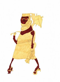
a piece up at Fashionista.com about Katie Henderson, a woman with Downs Syndrome who taught herself fashion illustration and now has a business selling her prints. There's a slide show at the end of the two-page article; you'll definitely want to click through.
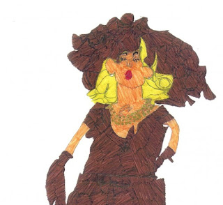
This detail from an illustration reminded me of another portrait I'd posted recently:
This detail from an illustration reminded me of another portrait I'd posted recently:
Subscribe to:
Comments (Atom)


