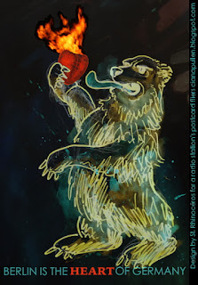
A Berlin radio station asked for a design expressing the slogan, "Berlin is the heart of Germany," for postcards to be distributed en masse around the city. Here is what I came up with:
Wednesday, September 28, 2016
Wednesday, August 31, 2016
Everyone in Marie Claire magazine
 |
| Some good practice! I flipped through Marie Claire (the French one) and drew everyone who appeared in its pages. French Marie Claire, btw, is way way better than the American one. |
Labels:
cartoon,
celebs,
Ciana Pullen,
Contour,
ink,
pen,
portraits,
sketch,
sketchbook,
St. Rhinoceros,
St. Rhinocéros,
Sunday, August 28, 2016
Charleston Airport
Labels:
airport,
Charleston,
Ciana Pullen,
pen,
sketch,
sketchbook,
St. Rhinoceros,
St. Rhinocéros,
watercolor,
Tuesday, August 23, 2016
Sketch of a bus
Labels:
bus,
Ciana Pullen,
Contour,
line drawing,
pen,
sketch,
sketchbook,
St. Rhinoceros,
St. Rhinocéros,
Monday, August 22, 2016
Mermaid
Labels:
cartoon,
Ciana Pullen,
drawing,
illustration,
mermaid,
sketch,
sketchbook,
St. Rhinoceros,
St. Rhinocéros,
watercolor,
Tuesday, August 16, 2016
Berlin, July 2016
 |
| I couldn't make out what her tattoos were when I saw her on the street, so I gave her a full sleeve of my favorite junk foods. |
Labels:
Berlin,
cartoon,
Ciana Pullen,
girl,
illustration,
ink,
pen,
sketch,
sketchbook,
St. Rhinoceros,
St. Rhinocéros,
watercolor,
Sunday, August 14, 2016
Digital artwork storage
I'm in the process of re-organizing my digital art files-- all the photos of my sketches, paintings, art photography, embarrassing art school experiments, all the high school stuff I used to apply to college. I have original high-quality images, small watermarked versions of them, and working GIMP files (like open-source Photoshop). EVERYTHING from about 1998 onward. That's currently about 7,500 items (some of them duplicates and different versions of the same image), but that excludes all the stuff I have yet to photograph (lots of sketchbooks and work in storage), the many portraits I sold and forgot to photograph, and all the stuff on slides and film, which are sitting in a storage facility on another continent. I'm so glad we're all done with slides.
There must be people out there who are as excited as I am about proper categorization and cross-referencing of files, so here's my system: every item is named by its date (year-month-day) then title, then material, then any pertinent info (such as "sketched-in-Budapest" or "sold_to_So-and-So"), then dimensions. For instance: 2012-2-14Portrait_of_Anne_Bonney-drawn-from-imagination_charcoal_14x20. That way they're automatically displayed by order of date, almost like a visual diary.
Then all files are tagged with color coded tags. I can select "display by tag" so all the colors are displayed grouped together (and still in order of date/name), and pieces with more than one tag show up twice. Or I can scroll down the list and visually differentiate.
red=illustration and any sketches I can use to build my identity as an illustrator (@St.Rhinoceros on Instagram, btw)
yellow=art photos and photo-collage
blue=paintings and drawings (except portraits and figure drawings)
purple=figure drawings
green=portraiture
orange=other (sculpture, prints, odd projects)
Both "small" and "sample" versions of most original files exist ("small" are low-resolution images I can easily send and display online; "sample" images are small and have watermarks and/or labels as part of the original image). They're named the same thing as the original file but with _small or _sample at the end so they're listed next to the original.
My main goal is to eliminate duplicates of the enormous original files, because my computer storage is almost at capacity and it doesn't need to be. I could store the images on an external drive, but I use them all the time and that would be inconvenient (but to be sure, they're backed up on a USB stick!). So if I need to create a file for a project, such as organizing images for a blog or an application for a gig, my plan is to make duplicates of only the small / sample images, and be confident that there is only one large original, and I know where to find it. I also hope to eliminate the process of creating a sample piece in GIMP only to discover I've already done so and stored the sample somewhere weird. I've edited the truly terrible pieces to be low-resolution so they take up less storage (and I cannot fathom ever printing them).
I'm torn, though, on the tags. I have the option of creating tags that have no color, just a title, in order to further categorize the work (in my case those tags would be several series titles, "good pieces," "sold" "destroyed" "missing" and several storage locations). But is this the best way to do it?
So, do you agree or disagree with my methods? Do you have any suggestions? And most of all, how do you store your own files?
 |
| The FBI's fingerprint cataloguing and storage facility, 1940s. Via MessyNessyChic, where you can find more photos of what amounts to a mind-bogglingly massive human computer made of women who were paid in war bonds which they were also encouraged to buy. They categorized the whorls and ridges of each print with a magnifying glass using the Henry System of fingerprint categorization. Each woman categorized up to 35,000 fingerprints per day, working 10 hours 6 days per week. Every soldier, person who'd been jailed, government worker and volunteer had prints on file. The facility held about 70 million prints in 1943. That's significantly more files than I'm dealing with right now. |
Labels:
administration,
archiving,
art storage,
cataloguing,
digital files,
FBI,
file storage,
filing,
fingerprint,
Henry system,
organization,
Saturday, August 13, 2016
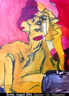
Contour
Labels:
acrylic,
Ciana Pullen,
Contour,
drawing,
figure drawing,
painting,
pen,
red,
sketch,
sketchbook,
St. Rhinoceros,
St. Rhinocéros,
yellow,
Thursday, August 11, 2016
Adventures in Space
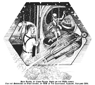
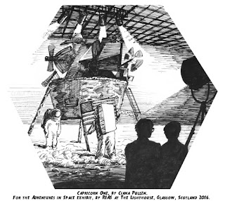
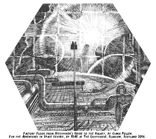
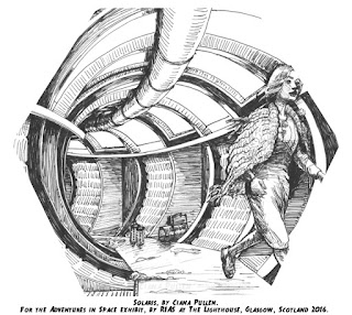
Back at the beginning of July I participated in an exhibit at The Lighthouse in Glasgow, Scotland called Adventures in Space. Jon Jardine put the show together as part of the Festival of Architecture, and it explored the influence of architecture and science fiction on each other. Ian Campbell did some large-scale illustrations of iconic sci-fi cityscapes and buildings, while Douglas Prince, Piotr Sell and I worked with Jon to make black & white hexagonal illustrations of everything from Futurama to Metropolis. All in all I did around 30 illustrations for the show. RIAS (Royal Incorporation of Architects in Scotland) sponsored the show and flew us illustrators to Glasgow for the opening. I got to bring Tom along and have a mini-vacation. We had no idea how much we'd love Scotland! It's right up there next to Paris on my list of places to return one day.
The show is up now through October 2, so if you're in the Glasgow area, stop in and see it.
The show is up now through October 2, so if you're in the Glasgow area, stop in and see it.
 |
| Two illustrations I did for Explorers on the Moon and Destination Moon (both Tintin comics). |
 |
| I did the illustration in the top left in the style of the original illustrations in War of the Worlds from the early 1900s. Also, the Impossible Voyage illustration on the bottom right. |
 |
| The Forbidden Planet, one of my favorite of the illustrations I did for this show. |
 |
| Actually drawing this made me appreciate how short Zapp Branigan's tunic (?) really is. |
 |
 |
Wednesday, August 10, 2016
Album art
Labels:
album art,
Ciana Pullen,
die quietly,
drawing,
illustration,
pen,
St. Rhinoceros,
St. Rhinocéros,
Monday, August 8, 2016
Man on the U-Bahn
Labels:
Berlin,
black,
Ciana Pullen,
drawing,
ink,
pen,
sketch,
sketchbook,
St. Rhinoceros,
St. Rhinocéros,
Sunday, August 7, 2016
Dog
Labels:
animals,
black and white,
Charleston,
Ciana Pullen,
dog,
drawing,
ink,
pen,
sketch,
sketchbook,
St. Rhinoceros,
St. Rhinocéros,
Friday, August 5, 2016
Thursday, August 4, 2016
FKK in the Tiergarten
Labels:
Berlin,
cartoon,
Ciana Pullen,
FKK,
illustration,
nudism,
sketch,
sketchbook,
St. Rhinoceros,
St. Rhinocéros,
Tiergarten,
watercolor,
In the cafe at the Literaturhaus, Berlin
 |
| Sketch of my husband sitting in front of a giant painting in the very fancy interior of the Literaturhaus, Berlin. Signed St. Rhinocéros |
Labels:
Berlin,
Ciana Pullen,
illustration,
ink,
Literaturhaus,
pen,
sketch,
sketchbook,
St. Rhinoceros,
St. Rhinocéros,
Website relaunch
My main site is back up! It's been a long time coming-- I learned a lot of html and css, and my husband spent many hours working with my design to make it functional. In addition to the site I have a new Instagram handle to share illustration work: @St.Rhinoceros
Labels:
Ciana Pullen,
site relaunch,
St. Rhinoceros,
St. Rhinocéros,
Wednesday, June 1, 2016
Buster Gets Out!
I'm excited to announce I've illustrated a children's book called Buster Gets Out! now for sale in my Etsy store and on the BookPatch online bookstore. Lucienne Stec and Thomas L. Stec, my husband's parents, wrote the story and it was a fun collaboration!
"Violet and her cat Buster are the best of friends. But one Fall day when Buster escapes into the yard, Violet must search high and low to find him!" Here are a few of the illustrations from the book:
"Violet and her cat Buster are the best of friends. But one Fall day when Buster escapes into the yard, Violet must search high and low to find him!" Here are a few of the illustrations from the book:
 |
| An illustration by Ciana Pullen from Buster Gets Out! by Lucienne Stec and Thomas L. Stec. |
 |
| An illustration by Ciana Pullen from Buster Gets Out! by Lucienne Stec and Thomas L. Stec. |
 |
| An illustration by Ciana Pullen from Buster Gets Out! by Lucienne Stec and Thomas L. Stec. |
 |
| An illustration by Ciana Pullen from Buster Gets Out! by Lucienne Stec and Thomas L. Stec. |
 |
| An illustration by Ciana Pullen from Buster Gets Out! by Lucienne Stec and Thomas L. Stec. |
Sunday, May 8, 2016
Untitled by Ciana Pullen
 |
| Untitled, by Ciana Pullen, 2013. Acrylic on paper. |
Thursday, May 5, 2016
Yelling, by Ciana Pullen
Yelling, by Ciana Pullen, 2000. India ink, drawn from a photograph of an orchestra conductor and a photo of Katharine Hepburn.
Labels:
abstraction,
black and white,
Ciana Pullen,
cubist,
ink,
Katharine Hepburn,
man,
painting,
Wednesday, May 4, 2016
Seated Woman, by Ciana Pullen
Labels:
brown,
Ciana Pullen,
drawing,
figure drawing,
girl,
life drawing,
nude,
pastel,
realism,
sepia,
sketch,
woman,
Friday, April 29, 2016
Caliban, by Ciana Pullen, 2007.
 |
| Caliban, by Ciana Pullen. 2007. Acrylic on canvas, 24 x 36." |
Labels:
acrylic,
Caliban,
Ciana Pullen,
painting,
portrait,
Shakespeare,
The Tempest,
Subscribe to:
Posts (Atom)

