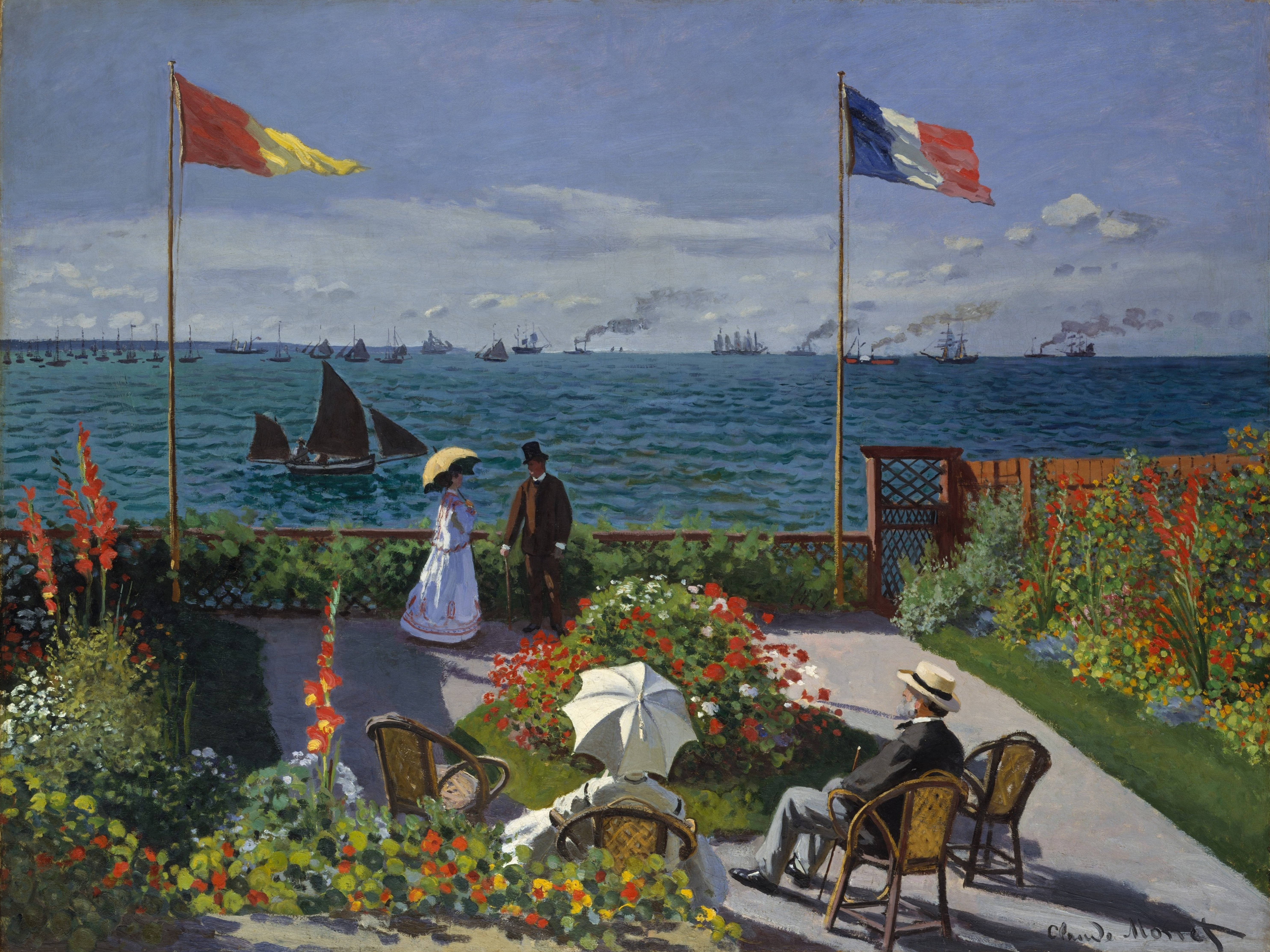
When I was 19 my awesome design teacher Pat Autenrieth told my slack-jawed, worn-down class after two hours of fruitless mandatory critique that the most insightful thing to say is sometimes the first stupid thing that pops into mind. I've found that to be REALLY true, especially if you can phrase it to sound thoughtful. And the reverse is true, too: I say something I believe to be majestically insightful, but once I've said it I realize how simple and stupid it is. Here's one that happened today:
While reading about
Whistler and his 'impressionist' paintings of the 1880-90s and seeing the illustrations of his work alongside
Degas', Millais', Monet's, and
Cezanne's, I began thinking of the atmosphere or, literally, the overtones in each style: how Whistler's work looked brooding and the skin of the paintings were so ethereal and fragile that the style indicated the impermanence of the physical world.

Millais and Monet, with their bright, thick impasto paintings, seemed so solid, confident and innocently factual. Cezanne had that same objective daytime certainty about his late work but the thinness of the paint also seemed to hint at deeper thought. Degas' paintings had a dark side to their mood, too; though the paint was applied thickly and with confidence in certain key spots, much of the canvas remained covered with gauzy layers of notation-type brushstrokes. Then I realized that the entire basis of my deep thoughts about this work was that a) Degas and Whistler painted lighter color over d

ark backgrounds, thus they seemed brooding and spiritual while Millais, Monet, and Cezanne painted dark over light or at least obscured their backgrounds with thick paint, therefore they seemed physical, empirical, simple. And b) thin, sketchy paint seems to imply thought, whereas thick paint seems to imply physicality, either because it's sculptural, and therefore physical, or because it's (in my opinion) more classically masculine.
This second point is funny to me because, according to (I think!)
Waldemar Januszczak in Techniques of the Great Masters of Art when describing the birth of Impressionsim, the old French Academy pushed painting in the direction of drawing, reasoning that drawing represented an intellectual transaction suitable to an artist (who had, just the century before, begun to be seen as a gentleman instead of an artisan), while bright color, thick paint, and painterliness were linked with craftsmanship and the lower classes of muralists and folk artists. That is, in part, why so many academic paintings of the mid- and late-19th century were
  so monochromatic, dark, thinly painted, and oddly unrealistic (as in having a staged or imaginary appearance). The painter was encouraged to draw, then paint an underpainting as if it were a drawing: in brown-black, shading and building up shadow, only adding color at the end. And things could look unrealistic because certain things, such as trees, naked ladies, and facial features had well-known idealized conventions and, as Plato reckoned, the ideal of something is truer and more worthy than its unintellectual concrete manifestation. I scoffed at these assumptions with postmodern narrow-mindedness then years later, in a moment of being quite impressed with myself and my big brain, I thought exactly the same thing. (It's worth noting that I learned more about Impressionist art history from this book on technique than I did from any art historical sources. It's a shame that art historians who aren't also artists are missing such a big part of the picture).
I can't make any sweeping judgments here, and I'm still arguing with myself on this one, but it seems that nowadays the prestige of drawing versus painting has switched. After the great action-painting Modernist superstars like Pollock and de Kooning, artistic and intellectual maturity was redefined as being a bit of a painter-barbarian. At the same time, meditative painters like Rothko were celebrated as creators of monumental work on canvas. Now, painting and all the painterliness it entails has been irrevocably identified as a sort of monument to Culture. These artists also produced fantastic drawings and etchings, but those just seem to be surfacing in books and exhibitions this past decade. Many artists now seem to use drawing to achieve a primitive look, calling upon modern society's associations of drawing with comic b
 ooks, children's art, and crudeness (for example, the wonderful and poetic Daniel Johnston). It is still seen as a more direct notation of the mind than painting, I think, but the main difference between this 19th century French attitude toward drawing and that of today's post-Freud culture is that they assumed that the product of an unfettered mind would be intellectual and ideal; today, the general assumption is that the unguarded mind is perverted and crude.
Here are some accounts of Whistler's newfangled techniques from the website of traditional still-life painter Paul Raymond Seaton (who also has some great tips for how to paint, along with a funny section called "woe is me!" where Millais taints that great PreRaphaelite classic among teenage lit-nerds, "Ophelia," by describing the flies, annoying swans, wild roaming bull and "no tresspassing" rules that were a pain in the ass while he painted on location at the stream.) http://users.breathe.com/paulseaton/pages/tips&tricks1.htm
"The canvas had a grey preparation made with black and white mixed with turpentine. He did not use a palette,but had a table near him on which he mixed the tones he was going to use. This was a very important part of his practice; before actually painting his picture he mixed with great care a quantity of the tones he would require.... He had a mixture of oil and turpentine in a saucer standing on the table. Using this as a medium, he covered thinly the whole canvas with these prepared tones, using house-painters' brushes for the surfaces, and drawing lines with round hogshair brushes nearly a yard long.... His object was to cover the whole canvas at one painting- either the first or the hundredth. ...When a thing was incomplete he did not try to patch it; he did it all over again and again and again-till it was finished-or wrecked, as often happened, from the sitter getting tired, or growing up or growing old. ...He would put the mixtures in little gallipots of water round the table that served as a palette, so that he could depend upon taking up the same tone another day." [From "The Art of Portrait Painting" by John Collier,Cassel & Co,London,about 1910(?)]
And because it's worth knowing, here's how John Singer Sargent painted (taken from the same site):
He drew with his brush, beginning with the shadows, and gradually evolving his figure from the background by means of large, loose volumes of shadow, half-tones and light, regardless of features or refinements of form, finally bringing the masses of light and shade closer together, and thus assembling the figure. He painted with large brushes and a full palette, using oil and turpentine freely as a medium. ..."Always use a full brush and a larger one than necessary," John told Frederick Sumner Platt, the collector and amateur painter in August 1890. "Paint with long sweeps, avoiding spots and dots ('little dabs'). Never think of other painters' pictures ... but follow your own choice of colors with exact fidelity to nature." ...He painted briskly, covering a lot of ground. ...Details, he was convinced, would take care of themselves. He once advised a student: "Do not concentrate so much on the features. Paint the head. The features are only like spots on an apple." [From 'John Singer Sargent' by Stanley Olsen,B&J,London,1989]