A little late with this link, but here is an interview with David Bowen, an artist who uses natural systems like wind and flies to manipulate mechanical systems like lights and moving parts. He participated in ReceiverFest at Redux, which I so regretfully missed (they'd better do it again in 2012 if the world has not ended!).
I know the author, Rebekah Drysdale, from Tivoli Studios in Charleston but perusing her writing on Daily Serving was the first time I ever heard her critical analysis or thoughts on conceptual and non-object-based art. Charleston needs more of this and I'm glad she's posting.

Tuesday, April 26, 2011

Monday, April 25, 2011
Re-Nude: Part 3 (collages n stuff)

These may look like drippy paintings but they are collages by Conrad Guevara. The top one is called, "Rear Action," and the one on bottom is "Make It Rain." The fact that I don't get excited about exploring the History and Meaning of Painting through art that fetishizes painting makes me a really bad postmodernist (or a great post-post-modernist?) But where I fail Guevara steps up, and he seems to pose an intriguing question:
Lichtenstein famously made a gigantic steel sculpture that represented an Abstract Expressionist brushstroke, presented in Lichtenstein's famous cartoon-dot-and-outline style. It was a sculpture of a cartoon of the ideal painterly expression, oh-so-ironic. What if he had conceived of that piece today, informed by punk graphic art, Tokyo pop art, the Etsy marketplace, and feminist art?
While Lichtenstein was making art for galleries, public squares and modern mansions, many artists today are designing artwork for ease of shipping, for digital sharing, and for a young, middle-class, apartment-dwelling crowd. The contrast is similar to the difference between Northern (German/Dutch) and Southern (Italian) Renaissance painting. While Michelangelo and da Vinci were making theatrical, larger-than-life murals and sculpture for the tombs of royalty and to decorate the Church and the villas of great families, in the North painters like Durer, Vermeer and van Eyck were supplying the newly-created middle class with art. Their paintings were much smaller, often of domestic themes that ordinary people could relate to, and more affordable. They were more contemplative as well. Durer even had great success as a print-maker because because he could make simple artwork that was even more affordable to the middle-class.
To answer the question, Lichtenstein's commentary on the state of painting today may have looked more like these collages. The materials are (I think) colored paper and magazine pages on an acrylic background, affixed to a canvas (as in "Make It Rain") or framed ("Rear Action"). The size is appropriate for a small house or apartment, and the materials (photographic magazine pages) are familiar to an audience of ordinary people, as are the pretty candy colors and references (banal pornography and now-familiar drippy Abstract Expressionist art like that of Jackson Pollock).
The use of materials is very witty, too: printed magazines and photography have largely replaced painting and hand-made or -printed illustrations as a mode of mass artistic expression. Using a magazine to mimic paint is balls-to-the-wall ironic. But my favorite critique of "The Brushstroke" is the comparison to a spray of semen. My mind immediately went there with the "drips" covering the face of the model in "Rear Action." It is SUCH an accurate way to describe the macho post-war culture of Abstract Expressionism. I always wondered why critics like Lichtenstein stopped so short of the obvious: the Big Ideal Painterly Expression championed by Clement Greenburg and New York AbEx collectors was a sublimation of male orgasm, full stop.
And that's as far as I'm willing to go down the "Is Painting Dead?" rabbit hole.
Here's another collage. It's called, " I Love You, I Know," by Angela Chvarak. The title immediately reminded me of the scene in The Empire Strikes Back with Han Solo and Leia right before he gets frozen. Then the hands in the collage reminded me of Luke's hand that gets severed, since my mind had already gone down that road. But I re-grouped and took another look.

It bears an uncanny resemblance to a piece I did in art school:
 We were supposed to work along the theme, "God or Goddess," if I recall. That may be Mila Kunis' head, but I didn't know that at the time so ignore that and don't think of Meg Griffin or Black Swan.
Anyhow, Chvarak's piece looks like a flower in full bloom with arms for stamens, with a background of collage and graffiti-like paint radiating outward from the flower. In this context, "I Love You, I Know," makes sense because flowers can pollinate themselves. The piece could be a metaphor, then, for loving one's self (or, more literally, masturbation, since we cannot impregnate ourselves). It seems like more of a female construction of masturbation or sexytimes not only because flowers are symbolic of women but because women's "alone time" is often portrayed as special, sensual, an indulgent retreat from the world complete with lit candles and a bubble-bath; whereas men's "alone time" is usually portrayed as a gross, thoughtless indulgence, the way you might eat your way through an entire bag of chips out of boredom.
I don't have much to say about Chvarak's piece but it is one of my favorites. It's very fun to look at.
*If you enjoyed this work you might also like Wangechi Mutu, Robert Rauschenberg
Thursday, April 21, 2011
The Inevitable Preggobelly!
Check out ClinicEscort's tumblr, The Inevitable Preggobelly, showing the images that publications choose to accompany articles about abortion. ClinicEscort suggests several appropriate illustrations: doctor's offices, serious conversations between a man and woman, a woman, or the typical lab-coat medical imagery. Yet the illustrations are of mostly white women's pregnant bellies "minutes away" from birthing a baby, while nearly all abortion happens in the first trimester (when pregnancy isn't really showing). She also points out, though, that the headless, legless womb photos are dehumanizing for the women portrayed. They erase the woman involved in the pregnancy by showing only her pregnant belly, thereby framing abortion in terms of the fetus and not the woman. As a visual suggestion, it seems to work.

I think this is really important to keep in mind in terms of portraiture: revealing people in a certain way can sometimes make that person invisible. I think that is what many women grapple with when they do self-portraiture and depict their own bodies in artwork: how to reveal, versus objectify. Personally, I still aim for that romantic notion of depicting a personality, a history and an energy instead of merely a face when I do a portrait. It can be impossible to know, though, if I'm hung up on something I see in them that erases what is really there.
I think this is really important to keep in mind in terms of portraiture: revealing people in a certain way can sometimes make that person invisible. I think that is what many women grapple with when they do self-portraiture and depict their own bodies in artwork: how to reveal, versus objectify. Personally, I still aim for that romantic notion of depicting a personality, a history and an energy instead of merely a face when I do a portrait. It can be impossible to know, though, if I'm hung up on something I see in them that erases what is really there.
Sara Schneckloth & Patrick Nugent at Toro y Moi
My husband and I drove up to Columbia to see Toro y Moi play. Since it was part of the Indie Grits Film Festival there was an accompanying video piece by Sara Schneckloth and Patrick Nugent projected on the wall while Toro y Moi performed. Schneckloth, who teaches drawing, had created a huge line drawing that was stapled to the wall, while Nugent had created a video that, when projected onto the drawing (and was painstakingly calibrated), appeared to make the drawing come to life in an animation that interacted with the music. Nugent said they were only about 20% done with the project and were showing "all they had ready." He already had something crazy like 19 layers of film (sort of like digital film overlays that you put together like a puzzle in an editing program). If this is only 20% I'd love to see the finished product, because what they had was gorgeous. I stupidly took no photos of it, but Schneckloth has some frames from the video/drawing up on her website, from what I take to be an earlier showing of the piece. Schneckloth described the process and it sounded like Nugent asked her to create the drawing, then she handed it off to him and he used it as a literal framework for the video. The finished piece had a trippy, organic feeling reminiscent of cellular biology, intestines and 90s grunge music videos.
The only other time I've seen a video projected onto a concrete surface that was a part of the video, was a short film by David Lynch. He projected what must have been an actual celluloid film onto a white sculpted surface with three tortured looking faces affixed to it. The content of the film was animations that involved the faces. The animated film was always changing while the faces, of course, were static.
Still, this piece was very different from Lynch's film. I associate Schneckloth's drawing style with an overarching movement in contemporary art of fetishizing the act of drawing. I see it in every indie film that has hand-drawn block letters in the credits, and in artwork that pushes doodling and amateur drawing beyond the limits of notebook pages and into galleries. I see Schneckloth's particular style as an homage to mark-making, a glorification of drawing for drawing's sake. Within the context of an increasingly digital world and an artworld that has come to accept simpler visual expression, a labor-intensive abstract drawing like Schneckloth's seems to flout modern design conventions in favor of engaging manually in the act of creating.
So I was surprised that this hand-done piece was used to create a digital video installation. As far as digital video editing goes, this seems as hands-on as possible, though the two media still seem at odds even as they flawlessly coordinate. It is certainly a technical stunt that introduces and suggests new uses of technology and I was duly impressed. But it is also an example of the digital side of this duo bending over backward to conform to the old-fashioned analog drawing.
The band, Toro y Moi, is also a digital/old-fashioned mix. They use Ableton Live software, which is a computer program for mixing sound and creating digital music that can be manipulated live or saved and replayed. My husband, who uses the software, thought they'd be using laptops and digitally manipulating the music more during the performance. Though they did use it some the performance was mostly live players on guitars and keyboards. The singers sometimes mimicked echo effects in real-time by repeating the end of words, and lots of other elements of the music were informed by digital alteration.
I had a great time and when we got back home the next day I promptly got sick. I guess sleep deprivation + beer +hipster club germs + devouring pizza with my hipstery germy hands = disease.
The only other time I've seen a video projected onto a concrete surface that was a part of the video, was a short film by David Lynch. He projected what must have been an actual celluloid film onto a white sculpted surface with three tortured looking faces affixed to it. The content of the film was animations that involved the faces. The animated film was always changing while the faces, of course, were static.
Still, this piece was very different from Lynch's film. I associate Schneckloth's drawing style with an overarching movement in contemporary art of fetishizing the act of drawing. I see it in every indie film that has hand-drawn block letters in the credits, and in artwork that pushes doodling and amateur drawing beyond the limits of notebook pages and into galleries. I see Schneckloth's particular style as an homage to mark-making, a glorification of drawing for drawing's sake. Within the context of an increasingly digital world and an artworld that has come to accept simpler visual expression, a labor-intensive abstract drawing like Schneckloth's seems to flout modern design conventions in favor of engaging manually in the act of creating.
So I was surprised that this hand-done piece was used to create a digital video installation. As far as digital video editing goes, this seems as hands-on as possible, though the two media still seem at odds even as they flawlessly coordinate. It is certainly a technical stunt that introduces and suggests new uses of technology and I was duly impressed. But it is also an example of the digital side of this duo bending over backward to conform to the old-fashioned analog drawing.
The band, Toro y Moi, is also a digital/old-fashioned mix. They use Ableton Live software, which is a computer program for mixing sound and creating digital music that can be manipulated live or saved and replayed. My husband, who uses the software, thought they'd be using laptops and digitally manipulating the music more during the performance. Though they did use it some the performance was mostly live players on guitars and keyboards. The singers sometimes mimicked echo effects in real-time by repeating the end of words, and lots of other elements of the music were informed by digital alteration.
I had a great time and when we got back home the next day I promptly got sick. I guess sleep deprivation + beer +hipster club germs + devouring pizza with my hipstery germy hands = disease.
Tuesday, April 19, 2011
Re-Nude: Part 2
*My apologies for the shitty photography.
Continuing what I loved about Re-Nude, here is part of Jenna Lyles' series, "Fempire / Night Vision."

I didn't immediately love this. Actually, when I first saw this hasty-looking display, I exclaimed, "What the crap?" But then I was drawn in by this glittery weirdness:

You're looking at strips of holographic stretch fabric that you might have seen on an ice-dancing or stripper costume from 1994, sewn down only on the top edge and hanging in loose strips. Above that is black fabric with a chain-mail-type texture exposing a grid of sheer black mesh beneath vinyl-type overlay. Mounted over that is a developed Polaroid with a blank image. To the left, between the fabric sections, are three repeated copies of a photo of a woman in a red wig and cosplay-esque purple lingerie, in a cartoonish "sneaking" pose. The photos are sewn on with orderly zig-zag machine stitching. The whole piece is sewn down to a raw-edged irregular scrap of canvas about the size of a notebook page and stapled to the wall on the top edge only.
The piece is obviously very playful and flashy, like a toy. But it isn't candy-colored and well-packaged like a lot of neo-Pop art and Tokyo Pop. It looks like a kid made it (sort of), but it doesn't fall into the category of cutesy childhood fetish hipster art, like the endearingly awkward, big-eyed, wolf-hide-wearing, lost-little-girl illustrations on Etsy. It incorporates crafty elements, like exaggerated stitching and use of cloth but seems divorced from homemaking, stuffed sculpture or clothing design.
What we have, then, feels very uneasy. My first instinct was to suggest that the artist either make the pieces smaller and more precious/sculptural, or large and numerous enough that they feel like a visual assault. But I keep coming back to the size and presentation because they don't resolve themselves and that experience feels challenging and fresh. And although the fabrics are wonky and unfinished, and the photos look homemade, the regular stripes and grids anchor the piece while the repetition of the colorful photos create an exciting rhythm. The small size also makes the piece seem half-hidden and private, like a radical fantasy told in a quiet voice. Functionally, the canvas is a tiny playground for the tiny redheaded heroine.
She shows up in all the pieces in the series, usually duplicated:

"Fempire:" I take it to mean, "female empire." So the canvases, as her playground, could be that empire. She could be suggesting that a woman's empire is an imaginary realm that she crafts for herself and rules like a superhero. Totally empowerful, right? But why the stripper clothes and fabrics, and why the implied male gaze? Why does she repeat the images of the woman, which usually serves to cheapen the image and efface the original, a la Andy Warhol's Marilyn? Could she be taking the opposite approach, that repetition glorifies the individual through syndicating and branding oneself? From a marketing perspective, the model has put her best foot forward by decorating herself, then has reproduced that image and displayed it in a dazzling peacock-like array.
What's more, the woman doesn't seem to rule the space, exactly. She seems to be involved in some sort of covert guerrilla tactics, which would imply oppression and fighting back. Is she trying to take back her own psychic space? Is she experiencing conflict about her own sexual fantasy? The fabrics-- purple lame, sparkly black fishnet and black lace-- suggest sexuality that caters to a male gaze. Is this the "fempire," the power of pleasing others? And is this the conflict she is engaged in? The other fabric, canvas, at first suggests a traditional artist's canvas. But in the context of covert guerrilla tactics it suggests military warfare as well. The juxtaposition of the sparkly fabric and the canvas, then, brings to mind the quote, "love is a battlefield," but also suggests common realities in which female sexuality and sex work incur violence, and where warfare breeds prostitution and sexual violence toward women.

"Night Vision." She actually wears what could be night vision goggles here. I also think the title, "night vision," refers to the nighttime fabrics that would be seen in a club or bedroom. The split title seems to reinforce the notion of conflict between female sexual domain and violence. It could simply be a reference to the conflicting urges to be vulnerable and open, versus guarded and strong when it comes to sex.
I just looked up Jenna Lyles after writing this post and it turns out she co-organized Tick Tock Blume, a small Kulture Klash type festival with the theme, "time," and her co-organizer was... Liz Vaughan, the subject of my last post and my other favorite artist from Re-Nude. Wow.
More on what I loved from Re-Nude coming up in another post!
*If you like the artwork above you might also enjoy work by Hannah Hoch, Wangechi Mutu
Edited to add: My husband has this to say about these pieces: "...I like it. It looks like a Trapper-Keeper."
Continuing what I loved about Re-Nude, here is part of Jenna Lyles' series, "Fempire / Night Vision."

I didn't immediately love this. Actually, when I first saw this hasty-looking display, I exclaimed, "What the crap?" But then I was drawn in by this glittery weirdness:

You're looking at strips of holographic stretch fabric that you might have seen on an ice-dancing or stripper costume from 1994, sewn down only on the top edge and hanging in loose strips. Above that is black fabric with a chain-mail-type texture exposing a grid of sheer black mesh beneath vinyl-type overlay. Mounted over that is a developed Polaroid with a blank image. To the left, between the fabric sections, are three repeated copies of a photo of a woman in a red wig and cosplay-esque purple lingerie, in a cartoonish "sneaking" pose. The photos are sewn on with orderly zig-zag machine stitching. The whole piece is sewn down to a raw-edged irregular scrap of canvas about the size of a notebook page and stapled to the wall on the top edge only.
The piece is obviously very playful and flashy, like a toy. But it isn't candy-colored and well-packaged like a lot of neo-Pop art and Tokyo Pop. It looks like a kid made it (sort of), but it doesn't fall into the category of cutesy childhood fetish hipster art, like the endearingly awkward, big-eyed, wolf-hide-wearing, lost-little-girl illustrations on Etsy. It incorporates crafty elements, like exaggerated stitching and use of cloth but seems divorced from homemaking, stuffed sculpture or clothing design.
What we have, then, feels very uneasy. My first instinct was to suggest that the artist either make the pieces smaller and more precious/sculptural, or large and numerous enough that they feel like a visual assault. But I keep coming back to the size and presentation because they don't resolve themselves and that experience feels challenging and fresh. And although the fabrics are wonky and unfinished, and the photos look homemade, the regular stripes and grids anchor the piece while the repetition of the colorful photos create an exciting rhythm. The small size also makes the piece seem half-hidden and private, like a radical fantasy told in a quiet voice. Functionally, the canvas is a tiny playground for the tiny redheaded heroine.
She shows up in all the pieces in the series, usually duplicated:

"Fempire:" I take it to mean, "female empire." So the canvases, as her playground, could be that empire. She could be suggesting that a woman's empire is an imaginary realm that she crafts for herself and rules like a superhero. Totally empowerful, right? But why the stripper clothes and fabrics, and why the implied male gaze? Why does she repeat the images of the woman, which usually serves to cheapen the image and efface the original, a la Andy Warhol's Marilyn? Could she be taking the opposite approach, that repetition glorifies the individual through syndicating and branding oneself? From a marketing perspective, the model has put her best foot forward by decorating herself, then has reproduced that image and displayed it in a dazzling peacock-like array.
What's more, the woman doesn't seem to rule the space, exactly. She seems to be involved in some sort of covert guerrilla tactics, which would imply oppression and fighting back. Is she trying to take back her own psychic space? Is she experiencing conflict about her own sexual fantasy? The fabrics-- purple lame, sparkly black fishnet and black lace-- suggest sexuality that caters to a male gaze. Is this the "fempire," the power of pleasing others? And is this the conflict she is engaged in? The other fabric, canvas, at first suggests a traditional artist's canvas. But in the context of covert guerrilla tactics it suggests military warfare as well. The juxtaposition of the sparkly fabric and the canvas, then, brings to mind the quote, "love is a battlefield," but also suggests common realities in which female sexuality and sex work incur violence, and where warfare breeds prostitution and sexual violence toward women.

"Night Vision." She actually wears what could be night vision goggles here. I also think the title, "night vision," refers to the nighttime fabrics that would be seen in a club or bedroom. The split title seems to reinforce the notion of conflict between female sexual domain and violence. It could simply be a reference to the conflicting urges to be vulnerable and open, versus guarded and strong when it comes to sex.
I just looked up Jenna Lyles after writing this post and it turns out she co-organized Tick Tock Blume, a small Kulture Klash type festival with the theme, "time," and her co-organizer was... Liz Vaughan, the subject of my last post and my other favorite artist from Re-Nude. Wow.
More on what I loved from Re-Nude coming up in another post!
*If you like the artwork above you might also enjoy work by Hannah Hoch, Wangechi Mutu
Edited to add: My husband has this to say about these pieces: "...I like it. It looks like a Trapper-Keeper."
Monday, February 7, 2011
Words vs. Images
I'm linking to a post from Echidne's blog about how images are used in news and media to sway public opinion much more effectively than words and verbal analysis. She is frustrated and concerned that images create a knee-jerk gut reaction regardless of whether it is accurate or not, and that thoughtful follow-up analyses cannot compete. That must be very frustrating for a writer like her. Echidne adds in the comments,
I will add, though, that there is such a thing as thoughtful analysis in the form of an image. It's called "art." And it's pretty cool. It's a shame that as the world turns more and more toward imagery, visual art is the least publicized of any art form I can think of-- literature, dance, music, film. There is no Oprah contemporary visual arts club, for instance. Or People Magazine coverage of who wore what to the Turner Prize festivities.
To address the question of whether imagery can "mislead in the other direction," i.e. why don't the good guys make this knee-jerk imagery: they often do. And it is immediately dismissed by both lefty artists and fundy conservatives as "shock art." I think no one even takes note when the Fox Newses of the world make shock art because of this "boys will be boys" permissive attitude toward the political right and the tabloid media. You know, we expect them to suck and they do.
I will also add that the number one complaint I get from the black-and-white thinkers of the world who want to know, "why can't I understaaaaaaand modern art???" is that the message in visual art isn't clear, like it is with writing. They seem to strongly prefer a written analysis to an analytical piece of visual art. Socially conservative mindsets push the idea that imagery should be a gut reaction, whether of comfort or shock, by publicly mocking modern analytical artwork any way they can, by pushing an attitude of staunch refusal to think, at all, about what any piece or modern art might mean, no matter how simple or well-explained. People are rarely deliberately obtuse without reason, and I believe the same conservatives who use imagery to great effect are also intimidated on a deep level by its power.
My own skills are not so strong in the image-creation part, especially if I can't use my voice for it. I'm also not at all certain how one fights images which mislead. Is it only possible to do it with other images which mislead in the other direction? Or what?I agree that such imagery is used in misleading ways (ahem, the campaign to show only weird-looking photos of Hillary Clinton in '08). It's such a big problem that I'm not going to open that can of worms.
I will add, though, that there is such a thing as thoughtful analysis in the form of an image. It's called "art." And it's pretty cool. It's a shame that as the world turns more and more toward imagery, visual art is the least publicized of any art form I can think of-- literature, dance, music, film. There is no Oprah contemporary visual arts club, for instance. Or People Magazine coverage of who wore what to the Turner Prize festivities.
To address the question of whether imagery can "mislead in the other direction," i.e. why don't the good guys make this knee-jerk imagery: they often do. And it is immediately dismissed by both lefty artists and fundy conservatives as "shock art." I think no one even takes note when the Fox Newses of the world make shock art because of this "boys will be boys" permissive attitude toward the political right and the tabloid media. You know, we expect them to suck and they do.
I will also add that the number one complaint I get from the black-and-white thinkers of the world who want to know, "why can't I understaaaaaaand modern art???" is that the message in visual art isn't clear, like it is with writing. They seem to strongly prefer a written analysis to an analytical piece of visual art. Socially conservative mindsets push the idea that imagery should be a gut reaction, whether of comfort or shock, by publicly mocking modern analytical artwork any way they can, by pushing an attitude of staunch refusal to think, at all, about what any piece or modern art might mean, no matter how simple or well-explained. People are rarely deliberately obtuse without reason, and I believe the same conservatives who use imagery to great effect are also intimidated on a deep level by its power.
Saturday, January 22, 2011
Portraiture right now.
It's difficult to get a grip on what an artistic era is really about, to sum it up and notice big trends until some time has passed. When I look around at this decade's paintings and sculpture, there's such a variety of art in top galleries and museums, but I'm just starting to notice what isn't there: portraiture. I'm excluding, for the moment, self-portraiture because the exploration of self is huge right now: heritage, the self in society, one's self as a marginalized person, one's own subconscious, etc. And there are some celebrity portraits too, but those are often by artists who have never met that celebrity, and I think their intent is usually to reference what that celebrity stands for, not to provide any insight into that person. What I'm not seeing is artwork that focuses on a separate, individual person for the sake of exploring that personality.
After Modigliani, Andrew Wyeth, David Hockney, Lucian Freud, Alice Neel... I come up a bit short. And when artists such as Elizabeth Peyton do focus on portraying others exclusively the thinking art world takes note of this idiosyncrasy and declares it ironic on some level.
After the seventies or so I have to look to photography to find many searching, insightful or dedicated portraitists. William Eggleston, Cindy Sherman (self-portraits, I know), Emmet Gowin, Arnold Newman, Nan Goldin, Annie Leibovitz. Most of the big headlines and controversies of photography have involved portraits: Sally Mann's kids, Diane Arbus inspiring ever photography student who ever set foot in an art school for at least the last fifteen years.
I would have guessed that because portraiture isn't shown often in top venues right now, it means issues of portraiture are simply no longer considered relevant in fine art-- but those same issues figure prominently in contemporary photography. I wonder if the difference lies in the way the two art forms are sponsored and by whom they are created and displayed. Paintings got bigger and more dramatic during the AbEx years, and then came PoMo installations and shows that take up entire galleries. I think painting and sculpture are seen as public events nowadays, whereas photography is still associated with ordinary people and family photos, as well as magazines that cater to ordinary people and with Myspace and Facebook usage. That makes photography seem smaller-scale in terms of production cost, therefore less is at stake. Perhaps that makes it more acceptable for photographers to simply portray a specific person, rather than make grand observations of society at large or explore one's own psyche in such a specific way as to be nearly universal and thus accessible to the public.
Then again maybe portraiture is no longer as esteemed in the eyes of the art world. There is, of course, the unsavory association with making a living. And perhaps as an interest in others, a form of art that is literally like a communication between two specific people (portraitist and subject), portraiture is seen as feminine, in contrast with grander, less personally specific themes of society, abstracted human experience, and massive abstract forms, which could be construed as masculine. And, being feminized, portraiture is not as valued today. Or portraiture could have fallen by the wayside during the Abstract Expressionist Movement, when a completely abstract portrait would, I'd argue, be possible but would certainly present problems for both artist and viewer. Portraiture would have continued to be sidelined by Conceptualism-- conceptual portraits are possible but also problematic-- and again by Pop Art because the movement's focus on pop culture would preclude a focus on individual non-celebrities.
I don't for a moment think portraiture is over. The genre is too basic, too essential to art history and human expression, to be abandoned. It's still alive and kicking outside of the elitest of white boxes but I expect the comeback to be from outsider art that makes its way into the art world.
After Modigliani, Andrew Wyeth, David Hockney, Lucian Freud, Alice Neel... I come up a bit short. And when artists such as Elizabeth Peyton do focus on portraying others exclusively the thinking art world takes note of this idiosyncrasy and declares it ironic on some level.
After the seventies or so I have to look to photography to find many searching, insightful or dedicated portraitists. William Eggleston, Cindy Sherman (self-portraits, I know), Emmet Gowin, Arnold Newman, Nan Goldin, Annie Leibovitz. Most of the big headlines and controversies of photography have involved portraits: Sally Mann's kids, Diane Arbus inspiring ever photography student who ever set foot in an art school for at least the last fifteen years.
I would have guessed that because portraiture isn't shown often in top venues right now, it means issues of portraiture are simply no longer considered relevant in fine art-- but those same issues figure prominently in contemporary photography. I wonder if the difference lies in the way the two art forms are sponsored and by whom they are created and displayed. Paintings got bigger and more dramatic during the AbEx years, and then came PoMo installations and shows that take up entire galleries. I think painting and sculpture are seen as public events nowadays, whereas photography is still associated with ordinary people and family photos, as well as magazines that cater to ordinary people and with Myspace and Facebook usage. That makes photography seem smaller-scale in terms of production cost, therefore less is at stake. Perhaps that makes it more acceptable for photographers to simply portray a specific person, rather than make grand observations of society at large or explore one's own psyche in such a specific way as to be nearly universal and thus accessible to the public.
Then again maybe portraiture is no longer as esteemed in the eyes of the art world. There is, of course, the unsavory association with making a living. And perhaps as an interest in others, a form of art that is literally like a communication between two specific people (portraitist and subject), portraiture is seen as feminine, in contrast with grander, less personally specific themes of society, abstracted human experience, and massive abstract forms, which could be construed as masculine. And, being feminized, portraiture is not as valued today. Or portraiture could have fallen by the wayside during the Abstract Expressionist Movement, when a completely abstract portrait would, I'd argue, be possible but would certainly present problems for both artist and viewer. Portraiture would have continued to be sidelined by Conceptualism-- conceptual portraits are possible but also problematic-- and again by Pop Art because the movement's focus on pop culture would preclude a focus on individual non-celebrities.
I don't for a moment think portraiture is over. The genre is too basic, too essential to art history and human expression, to be abandoned. It's still alive and kicking outside of the elitest of white boxes but I expect the comeback to be from outsider art that makes its way into the art world.
Monday, January 17, 2011
Tamara de Lempicka
 Auto-Portrait. I'm pretty sure this is a photo of the original, but this is a really popular painting to copy. I can see why; she's clearly a bad-ass.
 Tunic.
 Mrs. Bush. 1929. I think the knees in this are incredible. I also thought the skyscrapers in the background were kind of funny; she's like Ms. Modern Phallus.
 Portrait of a Man. Notice the Michael Jackson glove.
 Madame Boucard. She looks a little jowl-y, and de Lempicka has clearly idealized her a bit, to great effect. I can't help but wish I could see de Lempicka's take on this aging face without idealizing it, though; there would be fantastic planes and shapes for her to work with. I've seen a few portraits of older people, but they are in a less geometric style.
 Kizette on the Balcony, 1927. Oil on canvas.
 Femme dans Dentelle ("Lady in Lace).
 Duchess of La Salle, 1925. This must have sent the oldsters with their Victorian morals screaming for the hills. I admire how she changed the placement of the buildings, which are usually rising like triumphant phallic symbols behind the subject. In this case they are at the Duchess's feet and a Baroque-style drapery surrounds the top of the figure. The Duchess appears in command of the past, and present, and her sexuality.
 St. Moritz. It reminds me of Ingmar Bergman. Her understanding and exaggeration of eye sockets is amazing.
 Grand Duke Gabriel.
 Compte Vettor Marcello, 1933. (proto-"blue steel")
 Irene et Sa Seur. 1925.
 Telephone II. I think this is incredible. She looks so ridiculously girlish, like a grown-up Shirley Temple, and I think she might be wearing a sailor-suit of some sort to top it off. But she must be the most sinister, sexual Shirley Temple ever. The telephone, though, is what I can't get over. It reminds me of depictions of teenage girls from the fifties to the eighties or so sitting on their beds yakking into an oversized receiver and being OMG GIRLS. But the phone in this is menacing and black like a gun or masculine machine of some sort. It's more like a scene from a spy movie.
***
Tamara de Lempicka was born to an upper-class Polish family. She saw a man while out at the opera when she was just 15 and staked a claim to him as her future husband; three years later, they married. (I shudder to think who I might have ended up with if I chose my husband at 15.) They moved to Russia but then got stuck in the Russian Revolution and, being well-to-do, her husband was imprisoned. She apparently bribed and flirted his way out of jail, then they went to Paris.
Bohemian Paris in the 1920s sounds AWESOME. She slept with everyone: famous men, famous ladies, artists, actors, royalty. Her husband got fed up and left, but she rebounded with several very avant-garde lesbians. She painted the portrait of a Baron's mistress, then replaced her as the Baron's mistress, and eventually when the Baroness died de Lempicka and the Baron married and went to New York. There she met famous artists like De Kooning, Stieglitz, and Georgia O'Keefe, and probably had awesome sex with them all, and was a wildly successful portrait artist, till the late 1930s when her style changed and she abandoned commercial portraiture.
Her studio and professional conduct were apparently notable as well. People ask me about my studio, and I have to explain that it's more like a work-space, a stall in a warehouse and not a show-room of any sort. De Lempicka, on the other hand, was a glamorous celebrity who kept a large studio in the city that was part stylish lounge, part work-space. She painted in gorgeous clothes with a smock over them and most of her subjects were socialites and royalty.
I really admire her attitude as a portrait artist. Her subjects are in charge of the canvas, completely inhabiting every inch of space, even when they assume a traditional romanticized female "fainting limp-necked waif" posture. Someday I hope to keep a studio like that and command the type of presence she commanded in it. I'm also happy to see her work is getting more and more exposure. I think she's on her way to being an Andy Wyeth or M. C. Escher type of figure: enjoying wide popularity outside of the art world, and respect from within it. She wasn't very innovative, after all; this has watered-down elements of Fernand Leger's cubist style ("tube-ism;" I always hated his work) as well as watered-down elements of the hardcore cubists. She takes some color and atmosphere from deChirico, as well as his references to Classical Greek imagery, but doesn't push the envelope of subject-matter like the Surrealists. And then she borrows from the German New Objectivists, but her work isn't a deeply unsettling comment on post-war society. I think the attitude toward society generated by her paintings is most like an energetic, optimistic WPA mural. But every artist borrows; what she ends up with seems to work.

Edited to add: Wow, this appears to be a continuously popular post! so, all of you de Lempicka fans will probably enjoy this as much as I did.
Wednesday, January 12, 2011
Exit Through the Gift Shop: Banksy
 Mister Brainwash, limited edition print for a London show.
 Mister Brainwash (aka Thierry), Marilyn-Spock.
[Alert: every spoiler possible plus a bad attitude] I guess the movie is old news to everyone else, but I just saw Exit Through the Gift Shop last night. Banksy directed this documentary about a French man living in LA who decided to make a documentary about world-famous street artists like Banksy, Space Invader, Shepard Fairey and (I reluctantly mention) Borf. But the French-LA man, Thierry, was not a film-maker, and when he showed his weird-ass experimental film to Banksy, who had trusted this man with his secret identity, etc., Banksy felt that his trust had been broken. So Banksy made a film about Thierry instead.
We see Thierry the humble roadie following the famous street artists, filming and helping and putting his ass on the line. We see his wife (!) and kids (!) at home worrying about how to make ends meet while Dad roams the streets of Paris with a bunch of punks. We see him explain how he got into filming with a sad and genuinely touching story about how his mom died when he was a kid and now he wants to capture everything because he worries it will escape him as did his mother. The street artists are interviewed, Thierry the lovable imp entertains us, and then Banksy reveals: Thierry had ripped them off, fooled them into thinking he was a filmmaker. I thought, "Oh Thierry, you stupid jackoff. Look at your stupid film." And then we see Thierry go and mount his own uppity art show. Suddenly he thinks he's an artist. He takes out a second mortgage on his house to hire local starving artists to make pieces based on his instructions. They make a LOT of artwork. He gets a show, and markets it. REALLY well. The guy is, as it turns out, a good showman, and a risky but confident businessman. "Oh Thierry," I thought, "You uppity Frenchman. You're practically stealing the work of REAL artists like Banksy and Shepard Fairey and SELLING it at a massive profit! That's capitalism for ya--whoa, you just made over a million at your first show! Bastard. It's like the emperor's new clothes. Everyone around you knows it."
But at that moment I remembered, "Hey, Banksy directed this thing. Could it be a little... biased?" I considered the interviewees: wouldn't Banksy's friends share his opinion? Wouldn't low-paid artists resent their rookie boss? Wouldn't Thierry's fans sound like morons, since most random people off the streets of LA sound like morons? Hmm. And look how Banksy focuses on how Thierry (gasp!) didn't make the work with his own hands. And look how he shows Thierry thinking about (gasp!) making a living. Look how he's pretending to be an artist.
Wait a minute, though: didn't Thierry just spend years as a sort of apprentice to the best of the best? Hasn't he been making videos his entire life? And wasn't his work they just showed really witty and entertaining?
When the film opens Banksy explains that Thierry wanted to make a film about him but Thierry was just more interesting than Banksy, so the film was about Thierry instead. But now I'm thinking it was a little more malicious than that, more like, "Hey let's turn the camera back around on that traitor Thierry and see how he likes it!"
By the end of the film I had formed some opinions on both men. Thierry seems maddeningly irresponsible, charming, egotistical and full of joi de vivre. He seems like a real artist who thinks had about what he creates, like the director of a play. I enjoyed how he mixed graffiti with a very Warhol-looking pop-art language. He, perhaps unwittingly, mixed two bitingly ironic forms of art into a vernacular that is very appropriate and sincere for a man his age, his socioeconomic status, his town of LA. Wouldn't it deserve a big old eye-roll if a relatively well-off middle-aged white dad decided to go undercover and become a anarchy-touting graffiti artist?
And Banksy. That man is way too rich, famous and adored by the entire fucking world to play the underdog. The irony of a graffiti artist who uses other people's property without asking and makes it his own, having his precious trust broken by an fan who isn't as experienced as he let on is a little much. And he's counting on an audience of seventeen-year-olds and seventeen-year-olds-at-heart who won't think too deeply about this. People who are just waiting to be told by someone they trust, "this is great art. This other stuff isn't." People who think they're rebellious but hold surprisingly conservative opinions: Artists should be too idealistically pure to make money. Art is only real art if the artist made it by hand. Ideas in art are fine, but only if contained in impressive displays of craftsmanship. Real artists are self-sacrificing geniuses of truth who look like a dictionary definition of a rebel. They're just waiting to be told that what they already believe is right. And they desperately want to be in on Banksy's joke.
At the end, both men seemed extremely common: adult children in the Neverland of an Art World already oversaturated with man-children.
11 Portraits of Paris Hilton. Just because.
 Karen Kilimnik, Marie Antoinette Out for a Walk at her Petite Hermitage, France 1750.
 Jane E. Porter, Paris Hilton Painting: What's a Soup Kitchen?
 Justin Lear
 Jonathan Yeo
 Self Portrait from jail, according to BoingBoing. (I love that she used a straight-edge for the lines in this piece!)
 Ralph Ueltzhoeffer
Too bad I couldn't re-post some of the other portraits.
Oh, and I found this review of Karen Kilimnik's awesome installation:
"Karen Kilimnik's artistic persona is that of a daydreaming, scatterbrain American teenager eating unlimited amounts of candy among the splendours of, say, the Wallace collection. Installed for this exhibition within a series of specially constructed 18th-century (ish) rooms, her paintings - such as a portrait of Paris Hilton as Marie Antoinette - hang in what looks like Walt Disney's idea of a stately home. Fashionable art writers approve of Kilimnik's excesses of superficiality and surface. Like teachers showing favouritism towards an extremely pretty - but dumb - pupil, critics have given her top marks. But go and see for yourself. Neal Brown"Infantilizing? check. Misogynist? check. Pompous? check. Oh wait, my bad-- male artists are totally described as dim-witted, childlike, superficial sex-bombs scheeming for attention while breaking their diet. All the time. Sometimes I hate the internet.
Ishbel Myerscough


Tuesday, January 11, 2011


My favorites from the Gibbes Museum
 Edward Greene Malbone, Louisa Charlotte Izard. 1801.
 Unknown artist, Sophia Jane Withers. 1805.
 Thomas Sully, Sarah Reeve Ladson. 1823.
 John Russell. Juliet Georgiana Gibbes. 1803.
 Samuel F. B. Morse, Emma Doughty, 1820.
 Thomas Sulley, Catherine Mierckin. 1814.
 Thomas Sully, Charles Izard Manigault. 1817.
 Sir Thomas Lawrence, Portrait of Lady Caroline Lamb. c. 1805
 Unknown painter, Charles Pinckney. 1740
The Gibbes had portraits from around 1700 - 1950, with a special "contemporary Charleston" section from around 1970-1995. In the 1780-1850 room I was reminded of Virginia Woolf's description in Orlando of the change between the Enlightenment-era 1700s to the 1800s: as if everyone was suddenly bundling up to protect themselves from a stealthy dampness. As if the 1700s were airy, exciting, idealistic and illuminated by the crystalline light of reason. Then came the stuffy, materialistic, pragmatic 1800s. The difference between the centuries in portraiture was dramatic. My favorite era, though, was the Napoleonic Era, around 1805-1820ish. It was delicate, idealistic and effeminate; but the stiffness of the 1770s had gone out of style and an effortless rural style was in vogue, due to the threat of decapitation levied on the more metropolitan aristocrats during the French Revolution. The subjects from this time looked like flawed human beings, relaxed but portrayed as their ideal selves. Forty years later, everyone looked selfish, constipated, and defensive. Portraiture seemed to mostly suck until 1910 or so.

I think the Napoleonic portraits are the stuff that is relevant now, that we draw from as traditional portraitists or rebel against in order to move forward: realistic, attractive, elegant. The subject as a distinct person has been called into question by artists such as Andy Warhol, who used depictions of people as an allusion to the cultural celebrity fetish, and by many photorealists, who depict people as visual objects. But the Romantic idea of an individual subject, and portraying the "essence" of the subject, though considered quaint by many, is still a part of some very important contemporary work. These Napoleonic portraits bring to mind contemporary artists such as Jenny Saville and Elizabeth Peyton.

Suprise!

Ladies, would you let an artist paint your portrait if his art was notoriously misogynist? Whether or not Edvard Munch's art is misogynist is, of course, up for debate but I've always gotten the distinct impression that women in his artwork belong with death, destruction and teh eeeeeevil s-e-x. I mean, even his painting of the Virgin Mary is really... vampy. Like she's having a naughty Lord-gasm. So imagine my surprise when I came across this thoughtful, insightful and lucid portrait. Her body is portrayed skillfully as an expression of an attitude rather than a decoration; her face is a very appropriate balance between an invitation to admire and a window into her thoughts. I also admire the mix of her passive gaze "off-screen" and her solid, almost swaggering stance.
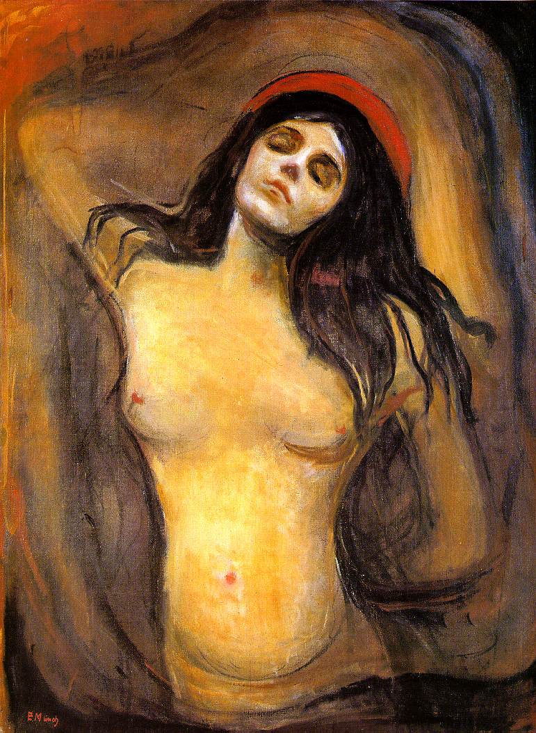

Edvard Munch, Birgitte Prestoe. c. 1924.
Wednesday, January 5, 2011
New Year's Resolutions!
1. To be able to complete at least one push-up by 2012. I gave this a good try last year and although I achieved two granny-style push-ups in a row at one point, I ultimately failed.
2. Leave the house more.
3. Be braver about asking people and scheduling people to do non-commercial portraits.
4. Eat more vegetables.
5. Make at least $1000 more than in 2010.
6. Have my work in at least TWO shows.
7. Don't look down at the ground when I'm out in public. I'm not in DC anymore; I don't have to avoid eye contact!
2. Leave the house more.
3. Be braver about asking people and scheduling people to do non-commercial portraits.
4. Eat more vegetables.
5. Make at least $1000 more than in 2010.
6. Have my work in at least TWO shows.
7. Don't look down at the ground when I'm out in public. I'm not in DC anymore; I don't have to avoid eye contact!
Monday, December 6, 2010
What's a little jab at the legitimacy of your worldview between friends?
I was put on the spot at a party in order to defend modern art's legitimacy AGAIN. Um, do people not know it's impolite to follow up the question, "what do you do," with the demand to prove that a) art--and by association my PROFESSION--is not a hoax, b) the subject of my degree is not something their child could do, c) that artwork is, in fact, worth its monetary value and not some grand scheme to line the pockets of that massive army of filthy rich artists we all know is taking over the world. "But why can't I understaaaaaaand it?" they always want to know. Somehow the reply, "Because you're not very smart," is not on the table. The question sets me up for failure: what am I going to do, explain every single meaning of every twentieth century art movement to some jerk at a party?
Art Criticism and Politics
I just wanted to share this awesome post by Amanda Marcotte at Pandagon. It's a simple look at how the "this isn't art because my kid could do it" people fit into the larger conservative/liberal social context. Bonus points for bringing art criticism into music criticism; there needs to be so much more crossover!
Tuesday, October 12, 2010
Ramon Novarro


A lovely portrait of silent film "Latin lover" Ramon Novarro by Angel Zarraga. I wish American culture today weren't embarrassed by the idea of male beauty.
(I cannot find who the photographer was for the second portrait. Sorry!)
Subscribe to:
Posts (Atom)