Back at the beginning of July I participated in an exhibit at
The Lighthouse in Glasgow, Scotland called Adventures in Space. Jon Jardine put the show together as part of the
Festival of Architecture, and it explored the influence of architecture and science fiction on each other. Ian Campbell did some large-scale illustrations of iconic sci-fi cityscapes and buildings, while Douglas Prince, Piotr Sell and I worked with Jon to make black & white hexagonal illustrations of everything from Futurama to Metropolis. All in all I did around 30 illustrations for the show.
RIAS (Royal Incorporation of Architects in Scotland) sponsored the show and flew us illustrators to Glasgow for the opening. I got to bring Tom along and have a mini-vacation. We had no idea how much we'd love Scotland! It's right up there next to Paris on my list of places to return one day.
The show is up now through October 2, so if you're in the Glasgow area, stop in and see it.
 |
| Two illustrations I did for Explorers on the Moon and Destination Moon (both Tintin comics). |
 |
| An illustration I did for Rossum's Universal Robots, top (a play from the 1920s about robots who become sentient and run amok), and the Amazing Stories sci fi magazines from the 1920s through 40s (bottom 2 illustrations, after the Frank R. Paul cover illustrations). |
 |
| I did the illustration in the top left in the style of the original illustrations in War of the Worlds from the early 1900s. Also, the Impossible Voyage illustration on the bottom right. |
 |
| The Forbidden Planet, one of my favorite of the illustrations I did for this show. |
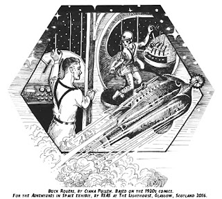 |
| A cobbled-together interpretation of several Buck Rogers comics from the 1920s. The early comics have gorgeous line work, and still have that Victorian influence. On one hand, Wilma is way cooler than in later versions, and on the other the premise was ragingly racist. The pre-Atomic Age spacecraft designs were wild. They were all wood paneled and seemingly inspired by antique scuba gear. The ship in this illustration is an exact copy from one of many in the comic, while the rest is something I made up in the original style. |
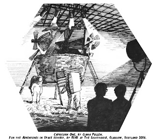 |
| I haven't seen Capricorn One, and I probably won't, but the plot as described on Wikipedia is long and winding and involves O.J. Simpson. This scene shows shady government operatives forcing unwilling astronauts to film a fake moon landing in an airplane hangar in the desert. I regret not outfitting one of the mystery men in silhouette with a cigarette, as a nod to The X-Files. |
 |
| A character from Fahrenheit 451 who chooses to die with her books when the firemen come for her. Fire, as it is captured in daylight on film, just doesn't look right in a black & white line drawing, so I completely made up the flames and smoke, and had a lot of fun with the line work. |
 |
| The space-babe from Forbidden Planet and Robbie the Robot. I gave the "garden" studio set a much-needed visual upgrade. Unfortunately none of the interior architecture was iconic enough to make a recognizable illustration, but the Professor and his daughter live in what is basically a ranch style house in outer space with really awesome interior decor. |
 |
| An interpretation of the original Mary Shelly Frankenstein novel. Glancing back over the original plot (which had been completely replaced in my mind by the über-melodramatic Kenneth Branagh version), I was surprised how much the famous android's monologue at the end of Blade Runner had in common with Frankenstein's creature's confrontation with his creator. |
 |
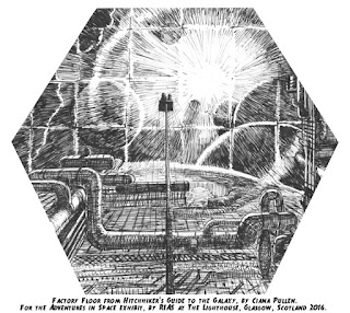
| Actually drawing this made me appreciate how short Zapp Branigan's tunic (?) really is. |
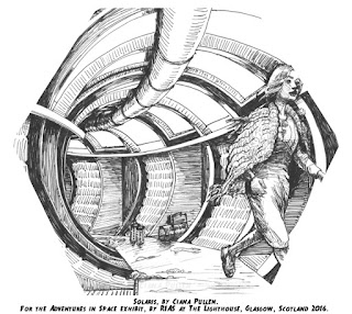 |
| This exact scene doesn't exist in Solaris (the 1972 version), but I love the way Andrei Tarkovsky had people move through his scenes, so I added the female character gliding off the edge. I have yet to watch Solaris (it's on my list!), but I admired the decision to clothe the requisite Space Hottie in a macrame cardigan and comfortable ponytail. I guess that might have been a Soviet thing. |
 |
| The original cover illustration showed their backs from above, and the rocket they see before them. I changed this illustration to show their faces but, mostly, to better showcase this amazing dog space suit. |
 |
| I made this composition up, but it was cobbled together and done in the style of the first illustrations for the 1898 novel War of the Worlds. They're absolutely beautiful, strangely terrifying, disarmingly inventive, and well worth the image search. |




1 comment:
Hey! I wanted to carve out time to really peruse this post, which of course took me a while since I am behind on life in general. OMG THIS IS SO COOL!!!! So much good stuff here, but the Forbidden planet drawing is may favorite. I love the dramatic use of black plus the art nouveau feeling plus robot!
I'd love to hear more about your trip to Scotland sometime too. I visited Edinborough and the lowlands in college and loved it. I was really surprised by how friendly and warm the Scots were, especially in comparison to the more quiet/introverted Brits I had been around in Bath.
Post a Comment