Final image:

Showing posts with label women. Show all posts
Showing posts with label women. Show all posts
Monday, April 15, 2019
Aquarius, April 2019: I draw your horoscope
From my April 2019 horoscope project, where I illustrated a common thread in the online horoscopes for each sign.
Final image:
Final image:

Wednesday, December 6, 2017
Women in Architecture
Places Journal ran this article by Despina Stratigakos about the massive erasure of women in architecture, both historically and ongoing. It's an interesting read, and a frustrating one. There is no art form quite so married to political power, wealth and elitism as architecture, simply by virtue of what and who is needed to build a building. It's impossible to imagine architecture ever divorcing itself of the rich and powerful, so it is inexplicable to my why anyone would feel threatened by a more democratic approach to its study. But now that I've said it, I'd like to imagine architecture suddenly running rogue, with school basketball teams commissioning monumental museums and the lady behind the counter at Walgreens taking a day off to commission a public park and monument in the old industrial waterfront.
Thekla Schild, an early 20th Century German architect.

Saturday, February 1, 2014
Septima P. Clark
Happy Black History Month! Here is a portrait I drew from my Interesting South Carolinians series of Septima Poinsette Clark:
“I have a great belief in the fact that whenever there is chaos, it creates wonderful thinking. I consider chaos a gift.”
Civil rights legend Septima Poinsette Clark (1898 – 1987) began as a teacher in a small African American school on Johns Island near Charleston, SC. Because she was black she was not allowed to teach in Charleston, but while teaching in Johns Island she developed ways of using everyday materials such as Sears catalogs to teach literacy.
Across from Clark's school was a white school, where only three students attended and the teacher made $85 per week. Meanwhile Clark was teaching principal for a school of 132 black students; she made $35 per week while the other two teachers made only $25. Galvanized by this discrimination she returned to Charleston to teach at the Avery Normal Institute, helping to win a legal victory for black people to have the right to become principals at Charleston's public schools in 1920. Clark continued to fight for equality for educators and was eventually fired because of her refusal to renounce membership with the NAACP, lost her pension and was black-balled from every school in the Charleston area. So threatened were other black educators with losing their jobs that they would not even be photographed with her.
After studying with W. E. B. du Bois Clark earned a bachelor's degree in 1945 and became involved with the Highlander Folk School in rural Monteagle, TN. There she put her innovative Johns Island teaching techniques to use conducting literacy workshops across the South. Because Jim Crow laws prevented illiterate citizens from voting, Clark's short 1- and 2-week courses were designed to be taught with minimal resources, often hidden in back rooms of shops because of the threat of racial violence, with the goal of passing voting literacy tests and setting foundations for communities to further their own learning. By 1969 Clark's program helped to register over 700,000 people to vote, including Rosa Parks just months before the famous Montgomery Bus Boycott.
Clark became the first woman appointed a leadership position in the Southern Christian Leadership Conference, but she would struggle with sexism from within the civil rights movement, speaking out against it and retiring from the organization in 1970. She then sued for back payment and pensions from her job with the Charleston Public School System and won, going on to serve two terms on the Charleston County School Board. She was awarded a Living Legacy Award by President Jimmy Carter in 1979.
 |
| Ciana Pullen, Portrait of Septima Poinsette Clark, 1898 - 1987. Charcoal on paper, drawn from several different photographs and based around 1965. [Image description: realistic black and white charcoal bust portrait of an older black woman holding a pencil in mid-thought and looking abstractly outside of the left picture frame. She wears silver-tipped black cat-eye glasses, a white shirt with popped lapels, and a dark jacket or cardigan with a large fold-over collar. Her natural salt-and-pepper hair is brushed back from her large forhead and hangs in wisps at the nape of her neck. She sits leaning into the image frame from the right edge, with her head in the middle-right of the upper half of the drawing, her hand holding the pencil loosely with a bent wrist in the lower left corner. Diffused natural light illuminates her from the left, as if through a window.] |
“I have a great belief in the fact that whenever there is chaos, it creates wonderful thinking. I consider chaos a gift.”
Civil rights legend Septima Poinsette Clark (1898 – 1987) began as a teacher in a small African American school on Johns Island near Charleston, SC. Because she was black she was not allowed to teach in Charleston, but while teaching in Johns Island she developed ways of using everyday materials such as Sears catalogs to teach literacy.
Across from Clark's school was a white school, where only three students attended and the teacher made $85 per week. Meanwhile Clark was teaching principal for a school of 132 black students; she made $35 per week while the other two teachers made only $25. Galvanized by this discrimination she returned to Charleston to teach at the Avery Normal Institute, helping to win a legal victory for black people to have the right to become principals at Charleston's public schools in 1920. Clark continued to fight for equality for educators and was eventually fired because of her refusal to renounce membership with the NAACP, lost her pension and was black-balled from every school in the Charleston area. So threatened were other black educators with losing their jobs that they would not even be photographed with her.
After studying with W. E. B. du Bois Clark earned a bachelor's degree in 1945 and became involved with the Highlander Folk School in rural Monteagle, TN. There she put her innovative Johns Island teaching techniques to use conducting literacy workshops across the South. Because Jim Crow laws prevented illiterate citizens from voting, Clark's short 1- and 2-week courses were designed to be taught with minimal resources, often hidden in back rooms of shops because of the threat of racial violence, with the goal of passing voting literacy tests and setting foundations for communities to further their own learning. By 1969 Clark's program helped to register over 700,000 people to vote, including Rosa Parks just months before the famous Montgomery Bus Boycott.
Clark became the first woman appointed a leadership position in the Southern Christian Leadership Conference, but she would struggle with sexism from within the civil rights movement, speaking out against it and retiring from the organization in 1970. She then sued for back payment and pensions from her job with the Charleston Public School System and won, going on to serve two terms on the Charleston County School Board. She was awarded a Living Legacy Award by President Jimmy Carter in 1979.
 |
| The Avery Normal Institute where Clark once taught, 19th century and today, 125 Bull Street, Charleston, near MUSC. The institute itself was a landmark historic Black learning institute and later a center of activism. Today the Avery Institute is owned by the College of Charleston and functions as a museum, archive and research center for African American history and culture. photo via. |
 |
| The site of Clark's home, now demolished, on Henrietta Street in Downtown Charleston, SC., next to Francis Marion Square. Coincidentally, I park my car here in the vendor's lot for the Charleston Farmer's Market, which is where I drew the portrait of Clark and sell prints of it, and never noticed the placard until I saw it online researching this post. via perservationsociety.org. |
 |
| Septima Clark, via Charron & Cline, Southern Cultures. [Image description: Black and white photo of an older-middle-aged Clark in three-quarter profile, her head bowed and looking out of frame.] |
 |
| Septima Clark with students in a literacy / voting workshop, via The Self-Rescuing Princess Society. [Image description: black and white snapshot of a group of older Black men and women sitting at a table looking at booklets with Clark sitting in the center speaking. They're in a plain old-fashioned room.] |
 |
| Civil Rights figures (from left to right): Ms. Towles (I Googled but could find no information on this person), Rosa Parks, Coretta Scott King, Septima Poinsette Clark, and Annelle Ponder (a teacher at a Freedom School in Mississippi and local field secretary for the SCLC, via God's Long Summer by Charles Marsh). Photo from the Lowcountry Digital Library, via The Self-Rescuing Princess Society. [Image desciption: A black and white snapshot of the women described, all dressed in 1960s formal attire, standing in a line smiling.] |
 |
| Portrait of Septima Clark, taken by Brian Lanker. The story of the photographer and this photo can be found via 37 Paddington. [Image description: Black and white artistic photo of Septima Clark's head and shoulders in profile. Her figure is lit brightly against a black background, her chin rests on the knuckle of the forefinger of her relaxed hand. She wears her white hair in three thin cornrow-type braids over her head stretching in U-shapes from ear to crown to ear, making for a clean-lined profile of her head. She appears serious with heavily lidded eyes peering down out of her upwardly tilted face, gazing straight ahead.] |
 |
| A 2007 historical marker on Johns Island (a rural coastal island just outside Charleston, SC) about Clark and the Progressive Club, a civil rights era community center, via Gullah/Geechee Nation. Today you'll also see the Septima Clark Parkway running across Downtown Charleston from the bridge from West Ashley to the Ravenel Bridge to Mt. Pleasant. It's usually called "The Crosstown." |
Saturday, October 27, 2012
Artistic Process and Scotch Tape: An Epic
I.
Though my guilt-fear, rendered humdrum through bad habits,
dictates this day I'll purge from My Big Binge,
I am on strike for a barrier that prohibits
time from slipping through my stumpy digits.
The moral stand-off lapsed in early hours
per a dentist and hygienist with a syringe,
who, as scheduled, drilled and filled my chompers
and in doing freed my overburdened arbiters.
Still rolling on catharsis-high, though illusory
yet lucid too and fighting nagging voices
and numbed so thick my jaw denied its misery
I floated down the road for retail therapy
at a thrift store where I like to search
pragmatically among the picked-through pieces.
I tongued my fillings, my jaw began to pinch
so I headed home for lunch.
The soreness and sick feeling of responsibility
both came flooding back at the same time.
I packed a beer and am headed over shortly
to my studio where if I'm good I'll possibly
do some shit and maybe even cross from my list
the real shit from my clients who I treated like slime
who have waited much too long and now are pissed;
in my churning mental mill, they are the grist.
II.
It's night now and I've left and come back
from my friend's house where I rent his spare bedroom
to fill with a big easel, empty frames, canvases, a storage rack
and chopped up women's magazines in a slippery stack,
a china vase sprouting rolled-up art-school projects
still unfinished, manilla folders in the corner of the room
packed with collage material: a ziplock baggie that protects
several thousand one-inch cut-out squares of pictures of skin; each connects
via a wrinkle, they're scotch taped into abstract collage components
that I someday plan to link together and meld to vinyl backing.
But that'll take a while so they're mostly still in quadrants
on top of four other folders filled with remnants
of my research, accomplished esoteric acumen
from another project sitting halfway in the making
labeled, "Black women," "black men," "white women, and "white men,"
for a painting series about media tropes that are usually hidden.
Tonight I re-shot some photos of a tiny cut-out lady
standing duck-faced over a nest of bridal tulle
from which a strand of pearls spilled, held steady
with hidden cardboard anchored with a penny.
She stands on the keyboard of my Macbook, which I've transformed
with a picture of a hardwood floor from Elle
in front of the screen, which shows Holbein's Henry VIII, adorned
with a "curtain," a scarf that's brightly zigzag patterned.
Henry cuts a commanding figure: at his feet a pile of gold
made from candy-bar wrappers; at his groin, through illusion,
the woman's head. The photo is less pedantic, less ribald
that what I've described; the starkness is anulled
by the sensual chiaroscuro effect of the warm side lighting,
the cutesy diorama offset by academic allusion
and a slickness that allows for different materials mixing
without a "crafty" look-- at least that's what I'm hoping.
These folks belong to an ever-growing series
of photos that explore the messages sent
in media and ads about gender: cool clothes, hot bodies,
why they're desirable, the interwoven histories
of sexual domination, capitalism, colonialism,
and how those power struggles inform our present
how the old recognizable symbols of misogyny, racism
have shifted shape, surviving to postmodernism.
I wasn't sure at first what I could possibly say
about a society in which one's benefits obscure struggle
of others, concerns which my blinders keep at bay,
something I'll never fully un-learn, but may
through empathy comprehend as I am able
based on my own experiences of trying to label
what I'm not supposed to, with no words to assemble
because others claim the rights to language. So I settle
on removing what They say from any context that justifies
degradation, objectification, toxic role play drivel
such as beauty mags, pop videos, what-to-buy's,
that cut insidious paths into our personal lives.
III.
I'm hoping the juxtaposition of Henry and Tiny Lady
and the various materials will create new contexts for each other:
the king with gold, the woman with the reproductive situation, maybe
horrified or chickenheaded, the curtain hinting at a British colony
all together in an uneasy coexistence. The secondary associations,
of Henry's wives, slavery, wealth, sexual shame, controlling one another,
are meant to be stirred up and left to stew. But in previous iterations
I used gray pearls, so I'm re-shooting with white for clearer implications.
But the freshwater necklace isn't large enough to cover the cardboard
that holds her upright, so I made the impromptu pink nest
which I rather like. But she keeps tipping forward
which turns her face into a reflection on Henry's scabbard.
I like the light in front so the gold glitters,
but that casts a coldish glare on all the rest
and when I move it to the side the shadow renders
the foil dull but it's her face that matters.
More Scotch tape. Low light f-stop, trouble focusing, she's indiscernible;
Henry'll have to be blurred; we all know what he looks like.
The curtain slips, I add binder clips, fluff it; now my Macbook is visible
I move the light-- perfect!-- the gold wrappers topple.
I'm squatting on the floor so I lay on my stomach,
Because the composition begins to look trite.
I prop up on my boobs so my arms have free movement,
and shoot different angles, keeping the head-crotch alignment.
I take a break and crack open the beer. Something's wrong,
it's too busy, too flat, I'm not taking advantage
of the Henry the VIII in lit pixel effect, the curtain is hung
at a really weird angle, so I have to crop out where the pearls are too long.
I watch some TV, Dr. Phil is just ending.
A woman is listening to experts on stage.
I'm tired and ready to go, but I'm buzzed
so I cannot drive anywhere for the time being.
I go back to the camera and it falls into place:
A strong composition if I scoot her upstage
It's the contrast by shining less light on her face
with the glowing groin, echoed in white in the necklace.
Re-arrange the pearls into a nice pleasing "J,"
snap some pictures, then I note with outrage
that my battery power is fading away.
It expires, and I am done for the day.
Though my guilt-fear, rendered humdrum through bad habits,
dictates this day I'll purge from My Big Binge,
I am on strike for a barrier that prohibits
time from slipping through my stumpy digits.
The moral stand-off lapsed in early hours
per a dentist and hygienist with a syringe,
who, as scheduled, drilled and filled my chompers
and in doing freed my overburdened arbiters.
Still rolling on catharsis-high, though illusory
yet lucid too and fighting nagging voices
and numbed so thick my jaw denied its misery
I floated down the road for retail therapy
at a thrift store where I like to search
pragmatically among the picked-through pieces.
I tongued my fillings, my jaw began to pinch
so I headed home for lunch.
The soreness and sick feeling of responsibility
both came flooding back at the same time.
I packed a beer and am headed over shortly
to my studio where if I'm good I'll possibly
do some shit and maybe even cross from my list
the real shit from my clients who I treated like slime
who have waited much too long and now are pissed;
in my churning mental mill, they are the grist.
II.
It's night now and I've left and come back
from my friend's house where I rent his spare bedroom
to fill with a big easel, empty frames, canvases, a storage rack
and chopped up women's magazines in a slippery stack,
a china vase sprouting rolled-up art-school projects
still unfinished, manilla folders in the corner of the room
packed with collage material: a ziplock baggie that protects
several thousand one-inch cut-out squares of pictures of skin; each connects
via a wrinkle, they're scotch taped into abstract collage components
that I someday plan to link together and meld to vinyl backing.
But that'll take a while so they're mostly still in quadrants
on top of four other folders filled with remnants
of my research, accomplished esoteric acumen
from another project sitting halfway in the making
labeled, "Black women," "black men," "white women, and "white men,"
for a painting series about media tropes that are usually hidden.
Tonight I re-shot some photos of a tiny cut-out lady
standing duck-faced over a nest of bridal tulle
from which a strand of pearls spilled, held steady
with hidden cardboard anchored with a penny.
She stands on the keyboard of my Macbook, which I've transformed
with a picture of a hardwood floor from Elle
in front of the screen, which shows Holbein's Henry VIII, adorned
with a "curtain," a scarf that's brightly zigzag patterned.
Henry cuts a commanding figure: at his feet a pile of gold
made from candy-bar wrappers; at his groin, through illusion,
the woman's head. The photo is less pedantic, less ribald
that what I've described; the starkness is anulled
by the sensual chiaroscuro effect of the warm side lighting,
the cutesy diorama offset by academic allusion
and a slickness that allows for different materials mixing
without a "crafty" look-- at least that's what I'm hoping.
These folks belong to an ever-growing series
of photos that explore the messages sent
in media and ads about gender: cool clothes, hot bodies,
why they're desirable, the interwoven histories
of sexual domination, capitalism, colonialism,
and how those power struggles inform our present
how the old recognizable symbols of misogyny, racism
have shifted shape, surviving to postmodernism.
I wasn't sure at first what I could possibly say
about a society in which one's benefits obscure struggle
of others, concerns which my blinders keep at bay,
something I'll never fully un-learn, but may
through empathy comprehend as I am able
based on my own experiences of trying to label
what I'm not supposed to, with no words to assemble
because others claim the rights to language. So I settle
on removing what They say from any context that justifies
degradation, objectification, toxic role play drivel
such as beauty mags, pop videos, what-to-buy's,
that cut insidious paths into our personal lives.
III.
I'm hoping the juxtaposition of Henry and Tiny Lady
and the various materials will create new contexts for each other:
the king with gold, the woman with the reproductive situation, maybe
horrified or chickenheaded, the curtain hinting at a British colony
all together in an uneasy coexistence. The secondary associations,
of Henry's wives, slavery, wealth, sexual shame, controlling one another,
are meant to be stirred up and left to stew. But in previous iterations
I used gray pearls, so I'm re-shooting with white for clearer implications.
But the freshwater necklace isn't large enough to cover the cardboard
that holds her upright, so I made the impromptu pink nest
which I rather like. But she keeps tipping forward
which turns her face into a reflection on Henry's scabbard.
I like the light in front so the gold glitters,
but that casts a coldish glare on all the rest
and when I move it to the side the shadow renders
the foil dull but it's her face that matters.
More Scotch tape. Low light f-stop, trouble focusing, she's indiscernible;
Henry'll have to be blurred; we all know what he looks like.
The curtain slips, I add binder clips, fluff it; now my Macbook is visible
I move the light-- perfect!-- the gold wrappers topple.
I'm squatting on the floor so I lay on my stomach,
Because the composition begins to look trite.
I prop up on my boobs so my arms have free movement,
and shoot different angles, keeping the head-crotch alignment.
I take a break and crack open the beer. Something's wrong,
it's too busy, too flat, I'm not taking advantage
of the Henry the VIII in lit pixel effect, the curtain is hung
at a really weird angle, so I have to crop out where the pearls are too long.
I watch some TV, Dr. Phil is just ending.
A woman is listening to experts on stage.
I'm tired and ready to go, but I'm buzzed
so I cannot drive anywhere for the time being.
I go back to the camera and it falls into place:
A strong composition if I scoot her upstage
It's the contrast by shining less light on her face
with the glowing groin, echoed in white in the necklace.
Re-arrange the pearls into a nice pleasing "J,"
snap some pictures, then I note with outrage
that my battery power is fading away.
It expires, and I am done for the day.
 |
| A detail from the photo with gray pearls that didn't make the cut. [Image: to the right a young white woman in a high fashion floral jumpsuit and Bridget Bardot hair and makeup leans over a strand of pearls. Brightly colored chevron fabric hangs on the left in partial shadow. A screen showing Henry VIII is visible in the background, but only his leg, hands and torso. The woman leans over childishly and grasps her cheeks in possible surprise, worry or horror. |
Friday, August 31, 2012
Finally, a pen for ladies!
Bic has released a new pen for women: Bic Cristal For Her Ball Pens.
I'll let that sink in for a second.
The Amazon reviews for this product are the funniest thing I've read in a while. Really, check it out! HappyPlace has curated some of the best, and this may be my favorite:
I'll let that sink in for a second.
The Amazon reviews for this product are the funniest thing I've read in a while. Really, check it out! HappyPlace has curated some of the best, and this may be my favorite:
"I bought this pen (in error evidently) to write my reports of each day's tree felling activities in my job as a lumberjack. It is no good. It slips from between my calloused, gnarly fingers like a gossamer thread gently descending to earth between two giant redwood trunks."
 |
| While the suggested retail is $5.99, you can purchase them at Amazon for an amazing $3.68. [Image: a package Bic Cristal For Her pens in an array of pastel colors. The ordinary yellow Bic packaging fades to lavender with flowers and a glowing effect around the pens. "For Her" and "Sleek Design" are written in splashy lavender cursive.] |
Monday, August 6, 2012
Wherein I measure Audrey Hepburn's eye sockets
This ever-popular post has been updated in 2017 to make my writing more clear and understandable, and to include a few extra examples from pop culture.
I often hear people gripe that ideal female beauty is based on teenaged girls, or that society puts pressure on grown women to look like teenagers. And I hear "scientific" minds back this up with explanations that men are naturally attracted to very young girls, citing the (theoretical) biological advantages of impregnating a virgin. I also hear people complaining that there is only one standard of female beauty, which is defined in accordance with what men find attractive. That "beautiful" = "ideal" = "sexy." Sounds pretty straightforward, right?
However, when I compare images of iconically beautiful women, I see something else: the idealization of pre-pubescent features-- of childhood, not adolescence. Second, I also see ideals split roughly along gender lines between "pretty" and "sexy"-- that is, the female ideal of female beauty is different from the male ideal of female beauty. Here I'll make these two case using images and facial proportions, then speculate about the social implications. Since beauty ideals are ever-changing and culturally specific, I'll stick to mainstream icons in post-1950s Western (mainly US) culture.
Some disclaimers: Since I'm talking about trends over large populations, of course I'm generalizing very broadly. I'm not discussing the many men and women who don't fit in with these trends, including gay people and people who aren't attracted to the Hollywood standard. I'm also limiting myself to what's commonly available in pop culture (straight, mostly white). Third, I'll be dissecting the appearance of several celebrities, but I'm not trying to tear them down. I think they're all gorgeous.
First, I'd like to gently remind everyone of what adolescence actually looks like:
The signs of adolescence are commonly associated with males being able to see that females are becoming fertile. They're usually discussed in pop culture as things like thinness, smooth poreless skin, full lips. But if we pause and appeal to common experience (and the photos above), we'll notice that some common demarcations of adolescence are in fact:
In contrast, children also have signs that they haven't yet reached puberty. Obviously, they're short; but also,
You can see childlike proportions taken to exaggerated extremes in anything designed to be "cute:"
The theoretical male desiring to impregnate a newly fertile female should seek the adolescent physical attributes listed, no?
Yet few women pursue these attributes when they get dressed or do makeup-- the beauty industry pushes anything but. And few grown men seem particularly drawn to these. Most women and girls probably aspire to the appearance of a poised film star, a toned pop singer, a sultry sex symbol or a lithe dewy-faced model-- some of whom are teens, but who tend not to look very "teenaged." The ones who escaped actually looking adolescent.
I'd venture that the #1 sexual fans of actual adolescent girls, are other adolescents.
Now that I've pointed out the complications of claiming adolescence as the visual ideal in modern Western society, I'll illustrate which iconic beauties have large female fanbases, and which have large male fanbases (some of them have both).
Women tend to be fans of these ladies, whose adult features mimic pre-pubescent proportions:
Audrey Hepburn.
Audrey Hepburn may have her legions of male admirers, but it is women who have really carried the torch of fandom. She has been described as androgynous, fairy- and elf-like, elegant and timeless. She was famously thin, petite and small-chested with a long skinny neck. I'll break this down:
-While she was quite thin and petite, her oversized head (as compared with an average head) drew attention to her small body, giving her a doll-like look (in contrast with typical fashion models who are also quite thin but look more like mythical Amazons in comparison). She shared this in common with children up to around age 8 who have enormous heads in relation to their bodies.
-If you drew lines from her jaw to her temples-- up the sides of her face-- they would angle out slightly. Hepburn also shared this in common with pre-pubescent children.
-Her eyes were wide-set and disproportionately large, like a child's.
-Her mouth was small in proportion to her eyes. Her upper lip was also prominent, which was exaggerated with makeup in the 1950s nearly to the point where she had a lipstick moustache.
-The crown of her head was wide.
I often hear people gripe that ideal female beauty is based on teenaged girls, or that society puts pressure on grown women to look like teenagers. And I hear "scientific" minds back this up with explanations that men are naturally attracted to very young girls, citing the (theoretical) biological advantages of impregnating a virgin. I also hear people complaining that there is only one standard of female beauty, which is defined in accordance with what men find attractive. That "beautiful" = "ideal" = "sexy." Sounds pretty straightforward, right?
However, when I compare images of iconically beautiful women, I see something else: the idealization of pre-pubescent features-- of childhood, not adolescence. Second, I also see ideals split roughly along gender lines between "pretty" and "sexy"-- that is, the female ideal of female beauty is different from the male ideal of female beauty. Here I'll make these two case using images and facial proportions, then speculate about the social implications. Since beauty ideals are ever-changing and culturally specific, I'll stick to mainstream icons in post-1950s Western (mainly US) culture.
Some disclaimers: Since I'm talking about trends over large populations, of course I'm generalizing very broadly. I'm not discussing the many men and women who don't fit in with these trends, including gay people and people who aren't attracted to the Hollywood standard. I'm also limiting myself to what's commonly available in pop culture (straight, mostly white). Third, I'll be dissecting the appearance of several celebrities, but I'm not trying to tear them down. I think they're all gorgeous.
First, I'd like to gently remind everyone of what adolescence actually looks like:
 |
| Stephanie from "Full House" |
 | |
| Tia and Tamera Mowry of "Sister Sister" |
 |
| Anonymous girl from an internet meme (poor kid). Text reads, "Blurt out to guy, 'I love your long flowing hair' / Too Embarrassing to speak to him again." |
 |
| Jennifer Aniston headed to Prom |
 |
| Anonymous woman from BadYearbookPhotos.com |
- a face with an adult skeletal structure that is slimmer than in childhood with the exception of fat deposits surrounding the mouth and chin ("baby fat");
- intense facial expressions, breathlessness and exaggerated movements;
- greasy blotchy skin, large pores and zits;
- hunching shoulders;
- baby fat and/or gangliness;
- snaggle-toothedness;
- large meandering eyebrows;
- fully-formed defined nose;
- bushy arm pits and thick dark leg hair;
- and being very loud in groups.
In contrast, children also have signs that they haven't yet reached puberty. Obviously, they're short; but also,
- the early development of their large brains and skulls gives them heart-shaped faces with very large eyes, forehead and crown of head in relation to their nose, mouth, chin and jaw;
- they have big bobble heads in relation to their small necks, shoulders and bodies;
- they have squishy cheeks;
- small straight teeth, many of which may be missing;
- all of their body hair is downy and not noticeable;
- their skin appears poreless, even, matte, and untroubled (except for their mouths and nostrils which always seem to look like they've just eaten jam that they're allergic to);
- their noses tend to be small and ski-sloped because their cartilage hasn't yet developed into bone;
- they tend to have small rosebud shaped mouths with especially full upper lips, which will morph as their jaws grow larger in puberty;
- they have squeaky voices.
 |
| Candace Cameron (DJ from Full House) as a child and as an adult. Notice how her adult face appears longer, her eyes closer together, her nose longer and pointier, her mouth wider, her forehead less prominent, her cheekbones wider in relation to the top of her skull, her head smaller in proportion to her shoulders, and her cheeks slimmer. Coincidentally she has puffed the top of her hair which mimics a large childlike cranium. |
 |
| Mary Kate and Ashley Olsen as children. Heart shaped faces with wide foreheads, small ski sloped noses with soft squishy nostrils, large heads in relation to shoulders and bodies, wider set eyes, up to no good. |
 |
| Mary Kate and Ashley Olsen as adults. Notice the distance between their eyes, the tips of their defined noses, and the corners of their mouths-- much longer than as children. Also notice the smaller size of the head in relation to the shoulders. Their necks are longer, thicker and more muscular than in childhood. These women have not styled themselves to appear childlike in proportion, perhaps because these former child stars have a vested interest in appearing adult. Though both women have made their eyes appear larger and evened out their skin-tone and texture with makeup, the dark smudging of the lower lid gives a sunken, narrow and elongated appearance rather than a perky or innocent wide-eyed look. I'm guessing they've also contoured their faces (i.e. adding faux shadows with lighter and darker skin makeup) to emphasize their adult-looking narrow temples and hollow cheeks. No volume is added to the hair at the crown of the head (where children's heads are larger). |
 |
| Jodie Sweetin (Stephanie from Full House) as a child. |
 |
| Jodie Sweetin as a very young teenager. Though she still looks childlike you can see that her adult bone structure is basically in place by puberty. Her face is now longer and slimmer, but she has the hallmark adolescent fat deposits around her mouth and chin. Her neck is longer and thicker than in childhood and her shoulders wider. |
 |
| Jodie Sweetin as an adult. |
 |
| Anything kawaii is going to involve wide set eyes, large foreheads, big bobble heads and small noses. These are a bunch of Sanrio characters. |
 |
| To be cuter, lapdogs are bred to have big heads, small short muzzles like button noses, and big wide eyes. |
***
The theoretical male desiring to impregnate a newly fertile female should seek the adolescent physical attributes listed, no?
Yet few women pursue these attributes when they get dressed or do makeup-- the beauty industry pushes anything but. And few grown men seem particularly drawn to these. Most women and girls probably aspire to the appearance of a poised film star, a toned pop singer, a sultry sex symbol or a lithe dewy-faced model-- some of whom are teens, but who tend not to look very "teenaged." The ones who escaped actually looking adolescent.
I'd venture that the #1 sexual fans of actual adolescent girls, are other adolescents.
Now that I've pointed out the complications of claiming adolescence as the visual ideal in modern Western society, I'll illustrate which iconic beauties have large female fanbases, and which have large male fanbases (some of them have both).
***
Women tend to be fans of these ladies, whose adult features mimic pre-pubescent proportions:
Audrey Hepburn.
 |
| Audrey Hepburn's head and neck viewed from front and back. |
 |
| Audrey Hepburn, probably practicing ballet, with her hands on her hips viewed from the side. |
-While she was quite thin and petite, her oversized head (as compared with an average head) drew attention to her small body, giving her a doll-like look (in contrast with typical fashion models who are also quite thin but look more like mythical Amazons in comparison). She shared this in common with children up to around age 8 who have enormous heads in relation to their bodies.
-If you drew lines from her jaw to her temples-- up the sides of her face-- they would angle out slightly. Hepburn also shared this in common with pre-pubescent children.
-Her eyes were wide-set and disproportionately large, like a child's.
-Her mouth was small in proportion to her eyes. Her upper lip was also prominent, which was exaggerated with makeup in the 1950s nearly to the point where she had a lipstick moustache.
-The crown of her head was wide.
Monday, April 30, 2012
Dove takes over "reality:" we are all above average now.
[Video: a black & white Dove soap commercial from the 1950s. A young blond-ish white model with an updo, full makeup and bare shoulders demonstrates in a velvety voice why Dove is better than ordinary soap as the camera lingers on her flawless complexion.]
According to Coco & Crème, Dove-- the moisturizer and knockoff salon shampoo juggernaut-- has conducted a groundbreaking
When most women were asked to describe their looks and their body, the most common answer was simply 'average.' “Only 2 percent of women are saying, ‘I’m beautiful’ and only 1 in 10 are saying, ‘I feel attractive,’ a Dove spokesperson said. “That’s just not where we want to be.”Ok, am I going crazy? Because the majority of women identifying as "average," seems like the only logical possibility here. Because that's how averages work. Most people are average. Average means "most people." When you offer people the choice of, "average" along with "beautiful," the clear implication is that "beautiful" means you think you're objectively above average in the looks department. And 1 in 10 women being above average-- "attractive"-- and 2 out of 100 being way above average-- "beautiful"-- seems about right to me. How many of us look anything like Megan Fox or Halle Berry? 2% actually sounds generous to me, considering the vast number of women who are older, fatter, zittier, lumpier, stockier, ganglier, and/or wrinklier than those two. And who set the bar for beauty so high in the first place? Dove, and other companies like them.
[Video: a 1993 Dove bodywash ad. It's lit in blue, giving it a sexy night-time Boyz II Men music video look. "Moonlight Sonata"-sounding piano music plays while a purring female voice describes the product. A tall, thin, young, conventionally hot white naked model demonstrates the product in her slow-motion shower.]
In fact, those sorts of companies intentionally endorse body types that are extremely rare as the only beautiful people. And then they are shocked, shocked! to find-- in their own manipulative study-- that the vast majority of women who don't have that rare type don't identify as "beautiful." I guess we'll just have to buy a bunch of Dove beauty products to catch up. "That's just not where we want to be," says Dove. I call bullshit: that is exactly where they want to be.
 | ||||||
| Older (early nineties?) Dove print ad. [image: top half is a blonde blue-eyed white model's face who looks a little like Kathy Ireland smiling slyly, wearing makeup and lit softly. Lines are super-imposed over her face breaking it up into sections that are numbered. Below, text reads, "Touch these 4 spots. If even one is dry, it's time for Dove." Smaller text underneath is unreadable, then there's a picture of Dove soap.] |
 |
| [image: 1960s print ad featuring a sequence of four pictures of a white blond-ish model in makeup with a towel on her head in a bright pink bathroom smiling as she lathers half her face with Dove and the other half with ordinary soap, then pouting as she touches the rinsed ordinary side and exclaiming with delight as she touches the Dove side, then a picture of Dove soap. Text reads, "Lend us half your face and we will prove Dove doesn't dry your skin the way soap can." |
 |
| A 1960s print ad featuring a smiling white model with brown hair and full makeup, manicure and up-do lathering up her naked shoulders, neck, face and hands with Dove suds and gazing lustily at the bar of Dove she holds, as if about to deliver a kiss. Text underneath reads, "Soap dries your skin but / Dove creams your skin while you wash" followed by smaller text and a picture of Dove soap] |
 |
| [image: a still from a black & white 1950s TV ad showing a smiling blonde white model with full make-up, manicure and polished hair caressing her face with the words, "Dove Creams" superimposed.] |
 |
| [image: a 1960s Dove print ad featuring a classic white model with brown hair and full make-up "washing" her face with Dove. Below a sequence of photos shows her rinsing off the soap and being shocked and delighted to reveal smoother skin, then pictures of Dove soap.] |
 |
| [image: over a solid baby-blue background, text reads, "Dove hair therapy: Dove Hair Rehab, [illegible] with Marie Claire." Pictures of Dove shampoos next to a thin young white model with thick shiny straight brown hair blowing in a magical wind, smiling with surprise at her own gorgeousness.] |
 |
| [image: black & white photo of a naked thin young tan white brunette model throwing her head back, smiling contentedly and clutching her hands to her heart. She's covered in suds in the shape of an off-the-shoulder fur coat that mimics an old-time Hollywood diva in her bed-chamber. Illegible text and pictures of Dove bodywash across the bottom.] |
 |
| [image: a grinning young white woman in a black tube top who is maybe a size 16 is pictured striking an exaggeratedly glam confident pose. Next to her text reads, "What do you think?" then underneath, next to empty check-mark boxes, "oversized?" and "outstanding?"] |
 |
| [image: a gigantic cropped close-up of a little girl who is a red-head with freckles, staring into the camera with a level gaze. Overlayed text reads, "Hates her freckles."] |
 |
| [Image: bottom half of image features 6 women of different races in white underwear standing in a line on a white background lit with studio lighting. They are grinning the slightly embarrassed grins of girls caught being silly and imitating models. They range from about size 6 to size 14. Large text reads, "Real women have real curves" followed by smaller illegible text] |
 |
| [image: a redheaded young white woman covered in freckles with bare shoulders stares slightly down at the camera with a smirking yet vulnerable expression. Next to her face are two empty check-boxes with the options, "flawed?" and "flawless?" |
 |
| [image: same deal as above, but features a flat-chested young thin black woman with a short afro and the options read, "half empty?" "half full?"] |
 |
| [image: in front of a cappuccino-grey background a chubby black woman in her 60s sits with her shoulder to the camera and her knees pulled into her chest, turning to smile shyly at the camera. She is completely naked, revealing stomach rolls. She's lit with soft studio lighting and her hair blowing. Text is overlayed reading, "beauty has no age limit / pro-age: Dove."] |
 |
| [image: a little girl of South-East Asian ethnicity is shown in cropped close-up like the red-headed kid above, with level gaze. Overlayed text reads, "wishes she were blonde."] |
Why does it follow that being average in the looks department is devastating to a woman's self esteem? I mean, I'm not stupid, I know why-- Patriarchy, our society, our consumer culture-- but this assumption is continuously unquestioned. Why do we constantly link self esteem in women with feeling beautiful, in the sense of being objectively attractive? Why is it not okay to state the truth about one's looks? Why is it unfathomable that a woman could feel unattractive (or average) and also feel perfectly fine about herself? After all, plenty of women who do feel attractive have terrible self esteem. What if it were ok for a woman to simply be average in appearance (as most, in fact, are)? What if it were normal to portray unattractive or average looking women living it up? What if unattractive or average looking women were considered viable movie stars at the same rate that beautiful women are currently? What if the "real women" frolicking in their panties in the new Dove ads weren't advertising beauty products but instead advertising a fun new water-park, or a social club for exhibitionists, or an athletic event, something where "real women" can live it up and feel great that is unrelated to improving their looks?
Lots of women are objectively un-pretty. Period. I didn't say they are worthless or unloved or helpless or involuntarily celibate or grappling with their own emotional agony. I said they are not pretty. So if self esteem is linked to feeling pretty, and those women know perfectly well they aren't pretty, what then? Could it be that being average looking, or even ugly, is not the end of the world? If women weren't taught in a million little way that they are synonymous with their looks, would it be so devastating to feel unattractive? Is it possible that our positions on the beauty-versus-self-esteem continuum is not the problem, that the problem is, in fact, the constant conflation of self-worth and beauty for women? In other words, the problem isn't that we're playing the game and failing to win, it's that we're playing the game at all.
To be clear, I don't fault women who play the game self-beautification (including myself). It has simply never occurred to many women that there's any other option, for one. And if they have considered the other option, it looks so bleak: fuzzy legs, hair that isn't flowing or exhibiting "multi-dimensional color," un-sexyness, surrendering to the same old body you were born with, practical shoes, less attention from men, less attention from other women, constantly getting judged as a clueless woman who simply doesn't understand beauty, a walking "before" picture with no after, giving up the intoxicating fantasy that there's a wonderful new life awaiting the prettier version of you. That's no fun. Our entire culture portrays the un-winnable game of beauty as a worthwhile past-time-- the only worthwhile past-time. In the sense of being un-winnable, you may win some "battles," i.e. feel good sometimes through self-beautification, but you are guaranteed to lose the "war." But when self-esteem through self-beautification is portrayed as the only game in town, I certainly see why women try to play it, and I admit that for lots of people that's the best decision to make about how to live in our reality. I also have no problem with the original article I linked to, which takes the "census" at face value. My beef is with the game itself and the industry behind it.
And where is the concern that men don't feel attractive enough? If it's so damn important to feel beautiful, why is there no ad featuring a little boy staring plaintively into the camera with the words, "hates his unibrow," and the understated logo of TweezerMan in the bottom corner? No one would look at such an ad and think, "That little boy is in for a world of heartbreak!" or "Wow, TweezerMan really understands mens' struggles." They'd probably say, "so what?" and laugh, because the boy in the picture will grow into a man who is valued by society as more than the sum of his facial hairs. His beauty just isn't that big a deal. People are concerned about men, though. The media has been overflowing with concern that men aren't getting paid enough, that they're getting left behind in the "man-cession," that they're suffering high rates of heart disease, that they're not graduating from college at the same rate as women, that they are plagued by violence. No one has clutched their pearls and cried out, "Most men say they feel "average looking!" Oh, no! Only 2% identify as 'hawt!' That is not where we want to be! Think of the children!"
I promise this is related to portraiture but I don't know how to tie it in in any pithy, or even logical, way. But this is something I really do think about every time a woman sits for a portrait. I know what she's expecting-- an understated homage to her beauty that may, as an afterthought, reflect her personality-- and these issues are something I grapple with. The farther I get down this rabbit hole of resenting the beauty industry, the more difficult it is to depict, let alone identify, what the woman probably values as her pretty assets, because I'm getting more out of touch with the commonly agreed upon standards of beauty. I want to depict character, what makes the person interesting, and that usually conflicts with a pretty, feminine portrait that the customer very likely wants. The customer is always right, she's the one who has to live with the portrait, and I don't want to make her feel bad. I'm feeling a little stuck. What do you think about all this?
ETA: I originally included notes about Dove chocolate in this post, but it's actually a different company. Unilever owns Dove soap; Mars owns Dove chocolate. Even though the logos are virtually identical and feature pitchers of cream pouring themselves into a finished product. My bad.
Tuesday, April 10, 2012
The Last Psychiatrist on "Hunger Games:" feminist or not?
[Hunger Games movie SPOILERS!]
After I wrote about Hunger Games blogstress Ariel (who totally knows I love to spew opinions) asked me what I thought of The Last Psychiatrist's take on Hunger Games. TLP makes the case that while HG is (apparently) being hailed as a great feminist movie it is in fact anti-feminist in that the plot happens to the female protagonist rather than her taking actions (i.e. kills) and making decisions (i.e. kills), which takes away her agency. TLP likens HG to Cinderella in the sense that it is a fairy tale in which a passive girl is chosen as princess. Mentioning the recent outrage on feminist and anti-racist sites that many hardcore HG fans had reacted negatively when black actors were cast as Thrush and Rue, TLP calls this issue a sideshow meant to distract from the larger problem of Katniss' lack of agency. In closing:
This is the kind of criticism that steps back and dispassionately surveys a phenomenon-- my favorite kind. But the big glaring problem with this post is that TLP didn't step back far enough. Again, I saw the movie but didn't read the books; but since TLP's post is mostly about the movie, which stands on its own, I'm going to respond, focusing on how the movie portrayed things.

Many HG fans have already beat me to it in TLP's comment section pointing out that Katniss did in fact make kills: cutting down the wasp's nest while her would-be killers slept below, shooting Rue's killer through the heart, and shooting Cato (depicted as a mercy killing) as he is devoured by mutant dogs. TLP waves these kills aside as not pro-active, as well as waving aside her decisions-- volunteering for the games, suicide berries, affecting love for Peeta so they can both win-- as not really hers to make since the god-like author and Hunger Games officials whisk away consequences for the last two.
I actually accept TLP's argument waving aside these kills-- the movie did portray them as non-proactive which is status quo dramatic female protagonist behavior (see my criticism of the American Dragon Tatoo's plot twist [SPOILER] where Lisbeth pulls out a gun to shoot the baddie in the end but-- whoopsie-- the car bursts into flame on its own. Such killing-but-not-really tactics remind me of boobs with the nipples blurred out: they are now somehow different and acceptable cause they're not technically explicit... but we still get to see boobs, or as per the analogy, violent revenge). But pro-active killing is MURDER. Is that what TLP would prefer? Would that make the movie more feminist? A major goal of feminism is that we're able to lead our lives apart from the see-saw of coercive domestic / institutional violence and our reactions to it.
Another major goal of feminism is to treat women not as pseudo-children or pawns in the game of Men, but as a vast assortment of autonomous people whose decisions to each live as she sees fit are unremarkable to the rest of society. But unfortunately every decision a woman makes in the public eye is seen as an invitation for scrutiny-- a much higher level of scrutiny than for (white) men. From tabloids to cliques, from churches to offices, women are subjected to a special public opinion poll-- should she have done/said/worn that? Would you have done it differently? What did she do wrong? How could you improve her? How does her behavior serve others? Not only is this directed at women from men, but also from other women-- known as "internalized misogyny." It can be a problem even among groups of Feminists. Leaving aside legitimate complaints of failures to include marginalized groups of women from within the movement, feminists tend to hold each other and their allies to an extremely high level of expectation of perfection. Even while Rush Limbaugh and other outsiders call women who use contraception "sluts," special ire is reserved for those within the movement. But because there are as many ways of being a woman as there are women and thus many ways of interpreting and advancing feminism, each feminist (or ally) tends to have his or her own idea of what other feminists should be doing. So the goal posts are always changing, the flame wars are raging and women are picked apart-- just like in the rest of society. Considering that people and their ideas are flawed this is bad news for celebrating feminist icons, organizing, blogging, and legislating. This isn't intended as a take-down of feminism, which has been pretty damn effective in its time, but rather a critique of how internalized misogyny can play out within the movement. And therein lies the problem with the post: TLP didn't step back far enough to consider this.
Rather, the possibility of imperfect feminist activity seems to raise a flag and pique TLP's inner critic; they have done it wrong. HG has depicted a teenaged girl surviving, something that has clearly rung true for thousands of teens who actually don't have that much agency, a tactic employed by centuries of oppressed wives, prostitutes, daughters, workers, slaves and moms. But to TLP that is the wrong way to do womanhood. HG has chosen to examine oppression, coercion and lack of agency, to present a girl as a complicated character who sometimes fails, -- but for TLP it is not feminist unless we see a perfect woman in a choice-y utopia. HG offers Katniss a chance to use traditionally feminine skills-- networking, empathy, childcare, physical endurance and beautification-- while remaining mainly androgynous, to subvert an arena valuing brute strength, competition and violence, and bring it to a grinding halt (as opposed to using her feminine wiles and skills to achieve dominance or approval within the Patriarchy *cough-LegallyBlonde-Evita-GentlemenPreferBlondes-cough*). Despite the starkly coercive nature of the rules of the Hunger Games rendering both the decisions to kill and to flee as void of agency, TLP would have preferred Katniss succeed on masculine terms of the arena-- on TLP's terms.
Consider the reactions if the film weren't associated with women. Harry Potter similarly "lacks agency" by being acted upon and saved, constantly. Likewise conscientious objectors have been depicted historically as having made that decision, with draft-dodging being a choice. The Shining was about a man lacking agency (being sort of possessed). Good Will Hunting featured a guy buoyed by fate and outside pressure, his only decision being to fall in love. No one asked, "What is Will teaching boys?" Because "girls" en masse are the ones in danger of being narrowly pigeon-holed by negative media messages. And because of this they must be shown only a narrowly prescriptive version of themselves on-screen. Wait, huh?
While these criticisms of HG could have broadened the discussion if they'd come from a place of respect toward other women and feminists, TLP's critique is not an empathetic one for the feminists at Jezebel, the young HG fans or, tellingly, women in general:
Sure, when people claim some absurd thing is feminist because it's "empowering," you've gotta raise your eyebrows and raise your voice. When feminism is co-opted by the status quo it's galling. Feminism allows people to make choices but not all choices are feminist, it's true. However TLP's view of what is feminist is so narrow that it crosses the line into authoritarian.
*I find it pretty short sighted of TLP to imply that the racism is a minor disingenuous distraction to the real problem of the movie not catering to TLP's idea of feminism. Both issues seem to be on the same level of slap-in-the-face-but-not-the-end-of-the-world, so why would the racism not be a real issue for feminists of color? Or every feminist? It's not like women of color don't care about racism until it can be used to throw wrenches into the works of mainstream feminism.
After I wrote about Hunger Games blogstress Ariel (who totally knows I love to spew opinions) asked me what I thought of The Last Psychiatrist's take on Hunger Games. TLP makes the case that while HG is (apparently) being hailed as a great feminist movie it is in fact anti-feminist in that the plot happens to the female protagonist rather than her taking actions (i.e. kills) and making decisions (i.e. kills), which takes away her agency. TLP likens HG to Cinderella in the sense that it is a fairy tale in which a passive girl is chosen as princess. Mentioning the recent outrage on feminist and anti-racist sites that many hardcore HG fans had reacted negatively when black actors were cast as Thrush and Rue, TLP calls this issue a sideshow meant to distract from the larger problem of Katniss' lack of agency. In closing:
That's why The Hunger Games is such a diabolical head fake. [...] It has managed to convince everyone that a passive character whose main strength is that she thinks a lot of thoughts and feels a lot of feelings, but who ultimately lets every decision be made by someone else-- that is a female hero, a winner. [...] in order to allow you to like an anti-feminist story, it is necessary to brand it as a vampire story or a female Running Man. Regardless of how you phrase it, the purpose is to get you to like this kind of a story. It wants you to think this is the next step in female protagonists. But it's a trick: nothing has changed since the royal ball.
That these "adolescent girl" stories-- Twilight and THG-- have women who are essentially lead by men, circumstance, and fate-- whose main executive decision is "do I love this guy or that guy"-- is a window on our culture worth discussing. [...] That Jezebel is distracted by the racial angle here strikes me as an unconsciously deliberate avoidance of the larger issue. Oh, the audience is racist, that's the problem.
This is the kind of criticism that steps back and dispassionately surveys a phenomenon-- my favorite kind. But the big glaring problem with this post is that TLP didn't step back far enough. Again, I saw the movie but didn't read the books; but since TLP's post is mostly about the movie, which stands on its own, I'm going to respond, focusing on how the movie portrayed things.
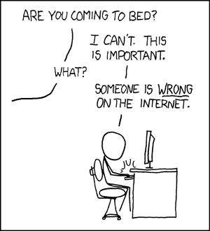
Many HG fans have already beat me to it in TLP's comment section pointing out that Katniss did in fact make kills: cutting down the wasp's nest while her would-be killers slept below, shooting Rue's killer through the heart, and shooting Cato (depicted as a mercy killing) as he is devoured by mutant dogs. TLP waves these kills aside as not pro-active, as well as waving aside her decisions-- volunteering for the games, suicide berries, affecting love for Peeta so they can both win-- as not really hers to make since the god-like author and Hunger Games officials whisk away consequences for the last two.
I actually accept TLP's argument waving aside these kills-- the movie did portray them as non-proactive which is status quo dramatic female protagonist behavior (see my criticism of the American Dragon Tatoo's plot twist [SPOILER] where Lisbeth pulls out a gun to shoot the baddie in the end but-- whoopsie-- the car bursts into flame on its own. Such killing-but-not-really tactics remind me of boobs with the nipples blurred out: they are now somehow different and acceptable cause they're not technically explicit... but we still get to see boobs, or as per the analogy, violent revenge). But pro-active killing is MURDER. Is that what TLP would prefer? Would that make the movie more feminist? A major goal of feminism is that we're able to lead our lives apart from the see-saw of coercive domestic / institutional violence and our reactions to it.
Another major goal of feminism is to treat women not as pseudo-children or pawns in the game of Men, but as a vast assortment of autonomous people whose decisions to each live as she sees fit are unremarkable to the rest of society. But unfortunately every decision a woman makes in the public eye is seen as an invitation for scrutiny-- a much higher level of scrutiny than for (white) men. From tabloids to cliques, from churches to offices, women are subjected to a special public opinion poll-- should she have done/said/worn that? Would you have done it differently? What did she do wrong? How could you improve her? How does her behavior serve others? Not only is this directed at women from men, but also from other women-- known as "internalized misogyny." It can be a problem even among groups of Feminists. Leaving aside legitimate complaints of failures to include marginalized groups of women from within the movement, feminists tend to hold each other and their allies to an extremely high level of expectation of perfection. Even while Rush Limbaugh and other outsiders call women who use contraception "sluts," special ire is reserved for those within the movement. But because there are as many ways of being a woman as there are women and thus many ways of interpreting and advancing feminism, each feminist (or ally) tends to have his or her own idea of what other feminists should be doing. So the goal posts are always changing, the flame wars are raging and women are picked apart-- just like in the rest of society. Considering that people and their ideas are flawed this is bad news for celebrating feminist icons, organizing, blogging, and legislating. This isn't intended as a take-down of feminism, which has been pretty damn effective in its time, but rather a critique of how internalized misogyny can play out within the movement. And therein lies the problem with the post: TLP didn't step back far enough to consider this.
Rather, the possibility of imperfect feminist activity seems to raise a flag and pique TLP's inner critic; they have done it wrong. HG has depicted a teenaged girl surviving, something that has clearly rung true for thousands of teens who actually don't have that much agency, a tactic employed by centuries of oppressed wives, prostitutes, daughters, workers, slaves and moms. But to TLP that is the wrong way to do womanhood. HG has chosen to examine oppression, coercion and lack of agency, to present a girl as a complicated character who sometimes fails, -- but for TLP it is not feminist unless we see a perfect woman in a choice-y utopia. HG offers Katniss a chance to use traditionally feminine skills-- networking, empathy, childcare, physical endurance and beautification-- while remaining mainly androgynous, to subvert an arena valuing brute strength, competition and violence, and bring it to a grinding halt (as opposed to using her feminine wiles and skills to achieve dominance or approval within the Patriarchy *cough-LegallyBlonde-Evita-GentlemenPreferBlondes-cough*). Despite the starkly coercive nature of the rules of the Hunger Games rendering both the decisions to kill and to flee as void of agency, TLP would have preferred Katniss succeed on masculine terms of the arena-- on TLP's terms.
Consider the reactions if the film weren't associated with women. Harry Potter similarly "lacks agency" by being acted upon and saved, constantly. Likewise conscientious objectors have been depicted historically as having made that decision, with draft-dodging being a choice. The Shining was about a man lacking agency (being sort of possessed). Good Will Hunting featured a guy buoyed by fate and outside pressure, his only decision being to fall in love. No one asked, "What is Will teaching boys?" Because "girls" en masse are the ones in danger of being narrowly pigeon-holed by negative media messages. And because of this they must be shown only a narrowly prescriptive version of themselves on-screen. Wait, huh?
While these criticisms of HG could have broadened the discussion if they'd come from a place of respect toward other women and feminists, TLP's critique is not an empathetic one for the feminists at Jezebel, the young HG fans or, tellingly, women in general:
That's the system, it wants you to participate in your own marginalization so you don't dare unplug. It's exhausting being a chick. I mean girl-- woman. Jesus. (5)or
Though this is an example of the feminist agency problem, you should note carefully that the "society" that forces this false choice on women is actually other women, not men, and it starts with the overly invested way mothers reproach their daughters to "dress like a lady." Certainly the original energy for this madness comes from men, from "the patriarchy", but if every man was executed tonight nothing would change tomorrow. It's on autopilot. Case in point: this story of a girl robbed of agency was written by a woman.
Of course, if this racism was attached to a Transformers movie you can be sure that Jezebel would pronounce all of the Transformers audience racist. But in this case, it's only some of the audience who are racist, because progressive Jezebel likes The Hunger Games, and they're not racist. How can they be? They're post-feminists, i.e. the racism for Jezebel is merely an opportunity to criticize the bridge trolls who live in Central Time, just in time for the elections.
[...] What's interesting is how Jezebel seized on the racial controversy, but completely avoided the one bludgeoning them in the face for two hours: this is a book for females, written by a female, with femalist themes, gigantically popular among females, yet is more sexist than a rap video.*The "feminist/antifeminist" either/or trap is a tricky one when critiquing movies or fiction. What is a feminist movie, anyway? If the filmmakers break silence to present women facing realistic difficulties this can be immensely valuable to many women. But for others the film is antifeminist because it punishes the female characters for their actions. Or a film could present a female character as a fully realized character who is interesting because of her own struggles rather than her relevance to men. But such a flawed character is often critiqued as a poor role model. And a perfect role model is often critiqued as a flat stereotype. Or a character could be a kick-ass superhero-- but she'd be thoughtlessly written as a "man with boobs." (This last category is supposedly about positive "kick-ass" role models for girls but I don't see how aspiring to prosecutable violence and impossible superhuman abilities is any more realistic than aspiring to be a princess. Fun, yes. Useful, no.) A film could manage to walk the line perfectly-- but it features only straight white people.
Sure, when people claim some absurd thing is feminist because it's "empowering," you've gotta raise your eyebrows and raise your voice. When feminism is co-opted by the status quo it's galling. Feminism allows people to make choices but not all choices are feminist, it's true. However TLP's view of what is feminist is so narrow that it crosses the line into authoritarian.
*I find it pretty short sighted of TLP to imply that the racism is a minor disingenuous distraction to the real problem of the movie not catering to TLP's idea of feminism. Both issues seem to be on the same level of slap-in-the-face-but-not-the-end-of-the-world, so why would the racism not be a real issue for feminists of color? Or every feminist? It's not like women of color don't care about racism until it can be used to throw wrenches into the works of mainstream feminism.
Monday, March 12, 2012
Nude Debate
I received my invitation to the 2012 Re-Nude show benefiting Planned Parenthood, which will be Wednesday, March 21 6:00pm -10:30pm at REDUX. I wrote about it last year here, here and here, and I can't wait!
Around the time I received my invite I read this post by Twisty Faster. To sum up, a young Egyptian woman named Aliaa Magda Elmahdy posted nude photos of herself on her blog as a big old Fuck You to the Salafis, who are a strict fundamentalist Islamic party that seems to have come out on top following the Arab Spring. Her actions, and the considerable risk she's taking, have sparked attention and controversy a few months ago in Egypt, the Western media and feminist blogs internationally. To support Elmahdy a group of Canadian feminists assembled a nude calendar featuring a "nude revolutionary" each month with the proceeds benefiting something-or-other related to Elmahdy's cause.
Twisty compares and contrasts the contexts of Egyptian and Canadian female nudity and questions the efficacy of a feminist nude calendar within the Patriarchy. To those unfamiliar with Twisty's blog she advocates a hard-line radical feminist rejection of Patriarchy-- that is, the system of dominance, objectification and hierarchy embedded in every element of our global society: misogyny, racism, classism, and so on. (Spoiler: she finds the Canadian nude revolutionaries ineffective at challenging Patriarchy).
So when I go see the artistic representations of nudity at Re-Nude this March they will be on display in the context of the Patriarchy. I will be viewing them as a feminist and an individual person but I will also be taking into account the context of the Patriarchy. And here is where I'm torn.
Being realistic about the limitations of empowerment through nudity in a Patriarchy, refusing to gloss over capitulation to the Patriarchy, refusing to pretend a nude portrayal of a woman exists outside our tradition of oppression, pornification and objectification, is a feminist act. However valuing my own experience and POV as a woman, learning to think outside the confines of Patriarchy, and really listening to other women is also profoundly feminist. In the context of nude art created with at least some input from women and shown in a gallery for the general public, I am stuck. Ambivalent.
 |
| [Image: flier for Re/Nude event. Reads, "Re/Nude: Celebrate the Body / Support Charleston Planned Parenthood." To the right and underneath the text are the silhouettes of a thin woman with longer hair showing outlines of her head, upper arms, hips and calves, in purple/pink. Resting in front of her shins is a reclining thin male silhouette showing outlines of his feet and legs, torso, arms and head, in coral pink/orange.] |
Around the time I received my invite I read this post by Twisty Faster. To sum up, a young Egyptian woman named Aliaa Magda Elmahdy posted nude photos of herself on her blog as a big old Fuck You to the Salafis, who are a strict fundamentalist Islamic party that seems to have come out on top following the Arab Spring. Her actions, and the considerable risk she's taking, have sparked attention and controversy a few months ago in Egypt, the Western media and feminist blogs internationally. To support Elmahdy a group of Canadian feminists assembled a nude calendar featuring a "nude revolutionary" each month with the proceeds benefiting something-or-other related to Elmahdy's cause.
Twisty compares and contrasts the contexts of Egyptian and Canadian female nudity and questions the efficacy of a feminist nude calendar within the Patriarchy. To those unfamiliar with Twisty's blog she advocates a hard-line radical feminist rejection of Patriarchy-- that is, the system of dominance, objectification and hierarchy embedded in every element of our global society: misogyny, racism, classism, and so on. (Spoiler: she finds the Canadian nude revolutionaries ineffective at challenging Patriarchy).
 |
| Drawing of Aliaa Magda Elmahdy by The Corpse Debutante. |
So when I go see the artistic representations of nudity at Re-Nude this March they will be on display in the context of the Patriarchy. I will be viewing them as a feminist and an individual person but I will also be taking into account the context of the Patriarchy. And here is where I'm torn.
Being realistic about the limitations of empowerment through nudity in a Patriarchy, refusing to gloss over capitulation to the Patriarchy, refusing to pretend a nude portrayal of a woman exists outside our tradition of oppression, pornification and objectification, is a feminist act. However valuing my own experience and POV as a woman, learning to think outside the confines of Patriarchy, and really listening to other women is also profoundly feminist. In the context of nude art created with at least some input from women and shown in a gallery for the general public, I am stuck. Ambivalent.
Wednesday, February 15, 2012
The Female Voice
Flavia Dzodan at TigerBeatDown posted an essay about Lana Del Ray and how she embodies the phase in most girls' lives when they yearn to be that pretty cool girl. Dzodan argues that despite criticism Del Ray has garnered from male music writers about her gender performance, there is nothing anti-feminist about expressing those feelings. I enjoyed the post as I always enjoy Dzodan's writing but I'm not wild about the trend of young feminist bloggers who go pour over pop music videos to extract potentially feminist "messages" for analysis. I'm all for analyzing pop culture but bloggers seem afraid to admit that when big producers pluck a youth from obscurity and spend thousands on a video of her writhing angrily in a couture onesie mouthing sexy lyrics to a song produced by men, there is no feminist message. "But her onesie has punk spikes on it! Her hair is in a faux-hawk! But now it's pin-up retro! She was just writhing around on a cross! What does it mean?" Nothing. It means some rich guy said to some other rich guy, "this will make us money." The feminist analysis could be better spent on how the public receives the video, on changing trends, industry shakeups, who gets ignored and why, that sort of thing.
But I digress.
What Flavia's post made me think is that people all have the same complaint about new pop singers on the scene: "She can't even sing." I seem to be squarely in the minority (as always) in enjoying unusual or raw female voices like Bjork, Missy Eliot, and Kim Deal while unable to appreciate Celine Dion, whose voice is like nails on a chalkboard. I don't usually hear this complaint about male singers, particularly with rock and hip-hop (Kanye West? can't sing. Jack White? can't sing. Not like American Idols, anyway. But I've never heard any complaints.). By the time the full weight of The Industry instructs the public to like a certain singer, they will like her. But the public isn't comfortable with that awkward in-between time when the rookie singer herself is saying, "like me." But that's not my main point either:
A male singer's voice symbolizes his expression, his intentions, his words. A woman's voice symbolizes her appearance. That's why a woman's voice must fit in the narrow box of pretty-sounding performance. She must be "a natural." She must preserve The Voice as she ages and not sound gravelly. The Voice must have a showy feminine range and
Thursday, January 12, 2012
Moving Toward the Ugly
I loved this post up at Leaving Evidence. The author asks, what happens if we stop chasing beauty and start embracing our own ugliness as "magnificent?"
Commenter "naa" writes:
Go check it out!
Commenter "naa" writes:
I was surrounded by a community of femmes of color, reclaiming and celebrating beauty as a thing of liberation, and yet there wasn’t space to ask what happens when we can’t live up to our own ideals? Or who we’re leaving out?
Moving towards the ugly feels like a real risk: a risk to be real, a risk to lose the privilege/power of beauty, and a risk to be valued for ONLY what we are- glorious and many-layered freaks.
Go check it out!
Wednesday, November 16, 2011
Liz Miller at REDUX: Picturesque Evacuation Ploy
You walk into REDUX to see Liz Miller's installation and you're hit
with a shocking orange wall at the same time that a friendly front desk
person greets you with brochures. Then you notice the title off to the
side of the orange wall: "Picturesque Evacuation Ploy."
You walk timidly around the wall through the opening to the gallery and are hit with this:
And you say, "Woooooowwwww!"
Then you wonder aloud how she did it, then you
gingerly step in between some shapes and briefly fantasize about living in them.
My friend noticed the pistol and rifle shapes first, then I could see them everywhere. At that point I decided to read the Artist's Statement. Miller writes that her installations, "...recontextualize shapes, signs and symbols from disparate historical and contemporary imagery to create abstract fictions. Existing forms from a multitude of sources are co-opted, altered and spliced to create hybrid identities...."
Dear Readers, at this time I should also explain, as I see it, an art historical/theoretical concept involving deconstruction and post-structuralism generally called, "Death of the Author." The term comes from a 1967 essay of that title by Roland Barthes.
Let's say that Wile E. Coyote is about to fall off a cliff. He holds up a sign that reads, "HELP," drops the sign, and vanishes over the cliff. But a few minute later, along comes a hiker who sees the sign. What does it mean? Well, that depends on what the hiker and their culture brings to the table. "Help Wanted?" The Beatles' "Help?" An offer of help? A meaningless sign in a foreign language? A reminder of their job as a 911 dispatcher? Wile E. Coyote's intentions and psyche become irrelevant and the mesh of meanings and contexts to any given sign, symbol or word, along with the viewer's experience, provide legitimate sources of meaning and interpretation for the sign.
Culturally, for example, this is significant because this essay (and the work of Jacques Derrida, postmodern linguists and others) became popular in the academic world at a time when Western culture, previously seen generally though the lens of middle- and upper-class white male society, was experiencing movements for decolonization, civil rights, women's rights, and GL (later BTQ) rights, as well as foreign involvement in Vietnam, Cuba and Latin America, and massive immigration from Southeast Asia, all of which persistently revealed myriad points of view. I can think of many times when someone has made an offensive cultural joke or comment and tried, unsuccessfully, to follow up with, "...but that's not what I meant!" Death of the Author, in action.
Artistically, this idea was central to the transition from Modernism to Post-Modernism. Whereas objects of art had been viewed as distinct objects unaffected by a viewer, both physically and contextually, created by an artist whose psyche and intent is up for artistic interpretation, PoMo subverted this. Some artists, like the pristine minimalist sculptor Donald Judd, erased the expressive brushstrokes and fingerprints of the artist, so prized in Modernism, so that the object stood on its own in meditative coexistence with the viewer. Other artists took an interactive approach, such as Felix González-Torres, who made piles of candy in galleries that the viewers could take. Artists sought to make viewers aware of the act of interpretation. Other artists emphasized the power of the viewer in relation to the artistic intent by making themselves pawns in their own art: putting themselves through documented ordeals, for example, or using their own body as sculpture or artistic tool. Still others emphasized the shared physical space of a work of art and the viewer by making intrusive or interactive art or working with installation, which envelops rather than confronts a viewer, as a way of undermining the fixed fortress-like connotations of Modernist paintings and sculptures.
So now you can see why, when reading Miller's Artist's Statement, I immediately thought of Death of the Author. Miller has chosen to literally deconstruct symbols by physically obscuring them and actually bending them. She has stripped the gun symbol down to its physical components and used those components to create a pretty, softly tactile modern fairy-tale environment which suspends disbelieve through sheer craftsmanship and scale. She has also made flat shapes emerge from the wall into the third dimension. Merging painting/2-D with sculpture has been a hallmark of Post-Modernism but is particularly relevant to Miller's physical manipulation of symbols. The lacework of shadows on the walls from the felt recalls Dan Flavin's neon sculptures and their emphasis on the immaterial interaction of artwork and environment. Because the installation is so large and you can step between some of the shapes it is also somewhat interactive. The viewer's space is sufficiently invaded. At this point I interpreted the title, Picturesque Evacuation Ploy, as yet another symbol that had been stripped of its meaning and context, and recontextualised in an abstract fictive manner by putting disparate words together in a nonsensical way. What, now, does "picturesque evacuation ploy" even mean besides the title of this specific show?
But I think there are other conflicting messages in this show that make it much more than an homage to the Death of the Author. For instance I mentioned that my friends and I immediately wondered how she created the installation. Hand-cut or laser-cut? How was it assembled, etc. Because of the level of in-your-face craftsmanship the viewer's attention is immediately diverted to the artist creating the piece. What was her process, what were her intentions? Moreover, even as I appreciate how Miller has stripped the symbols of their meanings, I still wonder, why those symbols? I revert back to the generally acknowledged meaning of "gun" as a weapon while I wonder why she chose that symbol to deconstruct. The repetition also poses a problem for me: making a marking into a symbol is supposed to add meaning rather than remove it. And repeating an image ad nauseam a la Warhol's "Marilyn" can make an image into a symbol. But repetition can also, like Warhol's repeated $ sign, strip a symbol of its meaning. The title is beginning to recover some, if not much, of the words' former meanings and becomes, like the show, attention-grabbing and complicated, evocative of a beautiful emergency.
The gun is in some ways an apt metaphor for the show: it's a visual assault in bright colors that creates a "Bam!" effect when you walk in. The shapes seem machine-like and, along one wall, rhythmically echo a military drumbeat. Walking through the gallery feels a little like walking through the interior world of any given addled person with a gun who makes tragic headlines: sort of crazy, poundingly rhythmic in some places, culminating in a frenzied upward spiral of jumbled shapes.
The irony is clear: fuzzy soft pretty gun shapes in felt. Pretty guns dominating an environment created by someone who, because of her gender, is more likely to be a victim of gun violence, and because of her nationality (I assume she is American) willingly or unwillingly, benefits from massive military violence perpetrated by the US.
Miller's Artist's Statement goes on to read, "...Forged relationships between benign and malignant forms confuse the
original implications of each while revealing the precariousness of
perception and how easily it can be tampered with. Recent projects pit
Baroque and Gothic pattern and ornament against forms derived from armor
and weaponry. Seemingly oppositional pairings create duplicitous
environments where conflicting messages are conveyed."
My mind was already heading down the rabbit hole of military actions and public perception: the Iran-Contra Affair, the CIA, proxy wars, police actions, the military-industrial complex, war-time bans on free press, censorship of images of dead soldiers, the complicit media. At this time the meaningfulness and meaninglessness of repetition began to sink in. How Miller, like the media, has numbed the symbol of the gun and created something vibrant and attractive in its place. The small symbols that march ant-like around the orange/white borders suddenly leap off the wall-- or out of the distant space of our television sets-- and clash in three dimensions, in a way that invades our physical space. How it all takes place in an installation that looks fun and contemporary, like an anime future-world or Tord Boontje for Target. I reconsidered the title: "picturesque," attractive, staged; "evacuation," escapism, vacuousness; "ploy," conspiracy, coy persuasion. A misleading invitation to escape into attractive fictions.
I stupidly missed the Artist Lecture, so this whole post could be way off base, but the show will remain up at REDUX through November 26, 2011. Go see it!!
You walk timidly around the wall through the opening to the gallery and are hit with this:
 |
| The rhythmic part of the installation that greets the viewer when they walk in the door. This is the part that reminds me of the gym. Other people were reminded of dragons. [Image: A wall about ten feet long painted shocking tangerine orange. Seven or eight identical 3-D structures made of thin flat felt emerge from the wall, each about six or eight feet tall and reaching six or eight feet from the wall toward the viewer's walkway. The felt is black, robin's egg pale blue, tangerine orange and blood red. Each piece is cut into intricate decorative shapes made from silhouettes of pistols, rifles and other shapes I cannot make out assembled in a kaleidoscopic manner. The felt pieces are attached using brads with tiny orange heads. Together the structures give the effect of a giant 3-d crepe paper banner than has been made of folded cut paper. On the perpendicular wall the white under-paint is left visible in some spots. At the orange-white border little black shapes march like ants. They could be mice, birds or something else entirely.] |
And you say, "Woooooowwwww!"
 |
| You can see the scale of the sculpture in relation to this viewer and her stylin' blue-lined boots: probably fifteen feet tall, like the branches of a giant fir tree. |
My friend noticed the pistol and rifle shapes first, then I could see them everywhere. At that point I decided to read the Artist's Statement. Miller writes that her installations, "...recontextualize shapes, signs and symbols from disparate historical and contemporary imagery to create abstract fictions. Existing forms from a multitude of sources are co-opted, altered and spliced to create hybrid identities...."
 |
| A small portion of one of Miller's felt shapes where you can see the revolver motif that is otherwise obscured through kaleidoscopic repetition (the revolver points to the left in the image). [Image: flat black revolver shape viewed from the side on a flat white wall] |
Dear Readers, at this time I should also explain, as I see it, an art historical/theoretical concept involving deconstruction and post-structuralism generally called, "Death of the Author." The term comes from a 1967 essay of that title by Roland Barthes.
Let's say that Wile E. Coyote is about to fall off a cliff. He holds up a sign that reads, "HELP," drops the sign, and vanishes over the cliff. But a few minute later, along comes a hiker who sees the sign. What does it mean? Well, that depends on what the hiker and their culture brings to the table. "Help Wanted?" The Beatles' "Help?" An offer of help? A meaningless sign in a foreign language? A reminder of their job as a 911 dispatcher? Wile E. Coyote's intentions and psyche become irrelevant and the mesh of meanings and contexts to any given sign, symbol or word, along with the viewer's experience, provide legitimate sources of meaning and interpretation for the sign.
Culturally, for example, this is significant because this essay (and the work of Jacques Derrida, postmodern linguists and others) became popular in the academic world at a time when Western culture, previously seen generally though the lens of middle- and upper-class white male society, was experiencing movements for decolonization, civil rights, women's rights, and GL (later BTQ) rights, as well as foreign involvement in Vietnam, Cuba and Latin America, and massive immigration from Southeast Asia, all of which persistently revealed myriad points of view. I can think of many times when someone has made an offensive cultural joke or comment and tried, unsuccessfully, to follow up with, "...but that's not what I meant!" Death of the Author, in action.
Artistically, this idea was central to the transition from Modernism to Post-Modernism. Whereas objects of art had been viewed as distinct objects unaffected by a viewer, both physically and contextually, created by an artist whose psyche and intent is up for artistic interpretation, PoMo subverted this. Some artists, like the pristine minimalist sculptor Donald Judd, erased the expressive brushstrokes and fingerprints of the artist, so prized in Modernism, so that the object stood on its own in meditative coexistence with the viewer. Other artists took an interactive approach, such as Felix González-Torres, who made piles of candy in galleries that the viewers could take. Artists sought to make viewers aware of the act of interpretation. Other artists emphasized the power of the viewer in relation to the artistic intent by making themselves pawns in their own art: putting themselves through documented ordeals, for example, or using their own body as sculpture or artistic tool. Still others emphasized the shared physical space of a work of art and the viewer by making intrusive or interactive art or working with installation, which envelops rather than confronts a viewer, as a way of undermining the fixed fortress-like connotations of Modernist paintings and sculptures.
***
So now you can see why, when reading Miller's Artist's Statement, I immediately thought of Death of the Author. Miller has chosen to literally deconstruct symbols by physically obscuring them and actually bending them. She has stripped the gun symbol down to its physical components and used those components to create a pretty, softly tactile modern fairy-tale environment which suspends disbelieve through sheer craftsmanship and scale. She has also made flat shapes emerge from the wall into the third dimension. Merging painting/2-D with sculpture has been a hallmark of Post-Modernism but is particularly relevant to Miller's physical manipulation of symbols. The lacework of shadows on the walls from the felt recalls Dan Flavin's neon sculptures and their emphasis on the immaterial interaction of artwork and environment. Because the installation is so large and you can step between some of the shapes it is also somewhat interactive. The viewer's space is sufficiently invaded. At this point I interpreted the title, Picturesque Evacuation Ploy, as yet another symbol that had been stripped of its meaning and context, and recontextualised in an abstract fictive manner by putting disparate words together in a nonsensical way. What, now, does "picturesque evacuation ploy" even mean besides the title of this specific show?
But I think there are other conflicting messages in this show that make it much more than an homage to the Death of the Author. For instance I mentioned that my friends and I immediately wondered how she created the installation. Hand-cut or laser-cut? How was it assembled, etc. Because of the level of in-your-face craftsmanship the viewer's attention is immediately diverted to the artist creating the piece. What was her process, what were her intentions? Moreover, even as I appreciate how Miller has stripped the symbols of their meanings, I still wonder, why those symbols? I revert back to the generally acknowledged meaning of "gun" as a weapon while I wonder why she chose that symbol to deconstruct. The repetition also poses a problem for me: making a marking into a symbol is supposed to add meaning rather than remove it. And repeating an image ad nauseam a la Warhol's "Marilyn" can make an image into a symbol. But repetition can also, like Warhol's repeated $ sign, strip a symbol of its meaning. The title is beginning to recover some, if not much, of the words' former meanings and becomes, like the show, attention-grabbing and complicated, evocative of a beautiful emergency.
The gun is in some ways an apt metaphor for the show: it's a visual assault in bright colors that creates a "Bam!" effect when you walk in. The shapes seem machine-like and, along one wall, rhythmically echo a military drumbeat. Walking through the gallery feels a little like walking through the interior world of any given addled person with a gun who makes tragic headlines: sort of crazy, poundingly rhythmic in some places, culminating in a frenzied upward spiral of jumbled shapes.
The irony is clear: fuzzy soft pretty gun shapes in felt. Pretty guns dominating an environment created by someone who, because of her gender, is more likely to be a victim of gun violence, and because of her nationality (I assume she is American) willingly or unwillingly, benefits from massive military violence perpetrated by the US.
 |
| A portion of the less structured side of the installation, showing how the shapes continue fluidly from 2-D wall images to a 3-D structure. Also shows the full height (fifteen feet?). |
My mind was already heading down the rabbit hole of military actions and public perception: the Iran-Contra Affair, the CIA, proxy wars, police actions, the military-industrial complex, war-time bans on free press, censorship of images of dead soldiers, the complicit media. At this time the meaningfulness and meaninglessness of repetition began to sink in. How Miller, like the media, has numbed the symbol of the gun and created something vibrant and attractive in its place. The small symbols that march ant-like around the orange/white borders suddenly leap off the wall-- or out of the distant space of our television sets-- and clash in three dimensions, in a way that invades our physical space. How it all takes place in an installation that looks fun and contemporary, like an anime future-world or Tord Boontje for Target. I reconsidered the title: "picturesque," attractive, staged; "evacuation," escapism, vacuousness; "ploy," conspiracy, coy persuasion. A misleading invitation to escape into attractive fictions.
 |
| A portion of the less structured side of the exhibit showing the orange paint on the floor and the play of light and shadow cast by the felt. |
I stupidly missed the Artist Lecture, so this whole post could be way off base, but the show will remain up at REDUX through November 26, 2011. Go see it!!
Subscribe to:
Posts (Atom)