 |
| Caption reads, Sesshu (1420-1506)? Daruma 1502. [Image: black & white print on yellowed paper of a very old Japanese ink painting of the head and shoulders of a man. Tall vertical format with his face halfway down the page and empty space above. His clothes are painted with a few thick rough brushstrokes while his head is painted in thin whispy lines. He is balding and has a beard and saggy, bushy eyebrows. His neck is wrinkly and his eyes bulge out and look sidelong at the viewer.] |

Tuesday, November 29, 2011
Japanese Portrait of a Man, 1502

Monday, November 28, 2011
Liz Magic Laser
I enjoyed this writeup at ArtFagCity of Liz Magic Laser's performance piece, "I Feel Your Pain." It's a cool description of a complicated performance piece, which can be difficult to find (for me, anyway). It's so frustrating when someone discusses a performance piece but doesn't describe what it is or shows a completely cryptic photo of it.
What is it with contemporary performance and video art not being accessible to the general public? We live in a time where you can use technology to, you know, record stuff and share it. YouTube that shit! Copyright and ownership of the work is an issue, obviously. Your gallery pays you to show the piece or whatever-- I don't really know much about the business side of high art-- so you can't go sharing it willy-nilly. That needs to change. Whatever fucked up system exists that prevents me from ever being able to view Matthew Barney's Cremaster Series (a series of movies nearly impossible to obtain or view) in its entirety, it needs to be fixed. The music industry (and RIAA) are grappling with a similar distribution issue but an obscure recording isn't nearly as obscure as an obscure work of recorded performance or video art. And whereas Radiohead's free/pay-what-you-want independent internet release of In Rainbows was seen as pushing the envelope in a good way visual and fine artists are still struggling with general expectation that they give their work away for free.
And if you want to compare music and visual arts as industries you can see how the visual arts industry fucked itself over in the fifties and sixties. While music became more and more widely accessible to fans and inclusive of youth and counterculture, visual art became an all-or-nothing game of elitism and inaccessibility, where art was either a gigantic cumbersome canvas requiring a mammoth modernist cathedral in which to properly view it, or it was nothing. Of course plenty of art was created outside of this class framing and plenty of it has mass appeal: advertising, psychedelic art, hippie art, clothing (fashion), cartooning, fine art and fashion photography, sentimental schlock, and crafts (macrame, etc). And plenty of worthwhile art was created outside the class framing that didn't have mass appeal: "outsider" art, figurative art of any sort, art in the tradition of the Harlem Renaissance, and more. But it was staunchly unrecognized as art at all, and the Art World still will only generally recognize this stuff in "special," separate exhibits. And when the Art World does recognize "outsider" or "low" art as art it certainly helps if the art takes a bajillion dollars to produce, from slick surfaces to studios full of skilled laborers to sponsored major-museum site-specificity to the diamond-studded roladex of the artist (I'm thinking of Richard Prince, Jeff Koons, Takashi Murakami, Damien Hirst, and Ai Weiwi, among many others). I'm not attacking artists here, I'm frustrated with the institutions, the galleries, the art power brokers, the collectors and the schools.
So while music became something that normal people felt like they clicked with and could own, art became something stand-offish and inaccessible to all but wealthy eggheads. In my experience people are much more likely to fearlessly approach unfamiliar music than unfamiliar art, more likely to talk about what they think about music than venture an opinion about art, and much, much, much more likely to be able to list off five contemporary musicians in every single musical genre than to be able to list any five contemporary artists. Thanks, class warfare.
What is it with contemporary performance and video art not being accessible to the general public? We live in a time where you can use technology to, you know, record stuff and share it. YouTube that shit! Copyright and ownership of the work is an issue, obviously. Your gallery pays you to show the piece or whatever-- I don't really know much about the business side of high art-- so you can't go sharing it willy-nilly. That needs to change. Whatever fucked up system exists that prevents me from ever being able to view Matthew Barney's Cremaster Series (a series of movies nearly impossible to obtain or view) in its entirety, it needs to be fixed. The music industry (and RIAA) are grappling with a similar distribution issue but an obscure recording isn't nearly as obscure as an obscure work of recorded performance or video art. And whereas Radiohead's free/pay-what-you-want independent internet release of In Rainbows was seen as pushing the envelope in a good way visual and fine artists are still struggling with general expectation that they give their work away for free.
And if you want to compare music and visual arts as industries you can see how the visual arts industry fucked itself over in the fifties and sixties. While music became more and more widely accessible to fans and inclusive of youth and counterculture, visual art became an all-or-nothing game of elitism and inaccessibility, where art was either a gigantic cumbersome canvas requiring a mammoth modernist cathedral in which to properly view it, or it was nothing. Of course plenty of art was created outside of this class framing and plenty of it has mass appeal: advertising, psychedelic art, hippie art, clothing (fashion), cartooning, fine art and fashion photography, sentimental schlock, and crafts (macrame, etc). And plenty of worthwhile art was created outside the class framing that didn't have mass appeal: "outsider" art, figurative art of any sort, art in the tradition of the Harlem Renaissance, and more. But it was staunchly unrecognized as art at all, and the Art World still will only generally recognize this stuff in "special," separate exhibits. And when the Art World does recognize "outsider" or "low" art as art it certainly helps if the art takes a bajillion dollars to produce, from slick surfaces to studios full of skilled laborers to sponsored major-museum site-specificity to the diamond-studded roladex of the artist (I'm thinking of Richard Prince, Jeff Koons, Takashi Murakami, Damien Hirst, and Ai Weiwi, among many others). I'm not attacking artists here, I'm frustrated with the institutions, the galleries, the art power brokers, the collectors and the schools.
 |
| The kids from the movie Almost Famous. People were ready to connect with something deeper and the visual art industry missed the boat. |
So while music became something that normal people felt like they clicked with and could own, art became something stand-offish and inaccessible to all but wealthy eggheads. In my experience people are much more likely to fearlessly approach unfamiliar music than unfamiliar art, more likely to talk about what they think about music than venture an opinion about art, and much, much, much more likely to be able to list off five contemporary musicians in every single musical genre than to be able to list any five contemporary artists. Thanks, class warfare.
Tuesday, November 22, 2011
Kwanchai Moriya
Kwanchai Moriya, an illustrator based in LA, does all sorts of work from cartoons to collage to
architectural fantasy drawings. But here are some of his portraits:
I don't know if Moriya buys into the notion of "capturing" a person's character in a portrait or if that's his intent, but all of these people are so interesting. The way he's posed them or cropped and arranged the pose if it's from an art class has a very narrative quality that I'm envious of.
 |
| Kwanchai Moriya [Image: blonde thin white woman holding a baby sits in a throne with her legs crossed and arms firmly planted on the armrests, looking steadily at the viewer. Background is thinly layered dark swirling acrylics that look like an outer-space night sky and fantasy city skyline. The whole thing has a science fiction paperpack cover feel to it but the painting is left undone and abstracted in some spots.] |
 |
| Kwanchai Moriya. [Image: loose oil sketch of an older man wearing pastel blue on black background. Paint is drippy and brushtrokes are large. Features are very basically blocked in.] |
 |
| Kwanchai Moriya. [Image: painted portrait of a chef seated, in uniform, before a table. She holds a large knife across her knees. A coffee or tea pot and some other utensils are on the table. The bottom half (legs, under table) is left reddish, drippy and thinly painted. The chef's white clothes and skin is thickly and realistically painted. The top background is thickly blocked in white that silhouettes the figure and objects on the table.] |
 |
| Kwanchai Moriya. [Image: painted head & shoulders portrait of youngish Asian man wearing a white button-down shirt with red tie leaning back on a couch. The light source leaves most of his face in mid-shadow, his expression reading as non-plussed or tired. Brushstrokes are blocky and Cezanne-like.] |
 |
| Kwanchai Moriya. [Image: thinly layered acrylic painting of the head & shoulders of a youngish woman in front of an abstract concentric circular background. She appears to be wearing headphones or some sort of suit/helmet but it's hard to distinguish because the layers are transparent and slightly abstracted. The woman's appearance is evocative of 1950's and 60's Chinese or Korean propaganda posters, while the background is evocative of outer space, a void or a record.] |
 |
| Kwanchai Moriya. [Image: pencil sketch of older white woman in profile leaning her chin on her hand. The planes of her face are emphasized and her curly hair is drawn loosely and expressively.] |
I don't know if Moriya buys into the notion of "capturing" a person's character in a portrait or if that's his intent, but all of these people are so interesting. The way he's posed them or cropped and arranged the pose if it's from an art class has a very narrative quality that I'm envious of.
Saturday, November 19, 2011
Writing Like a White Guy
Check out this post on Racialicious! It's an except fro Jaswinder Bolina's, "Writing Like a White Guy." Bolina asks, how can a poet write about their identity when using the language of white upper class Western men? Interesting post, makes me wish I clicked with poetry a little better.
Friday, November 18, 2011
Should Female Nudes Be Prettier? (Ha!)
I very much enjoyed this post (scroll down till you see the headline, "Female Nudes Should Be Prettier") on Echidne of the Snakes. Yes, this really exists, or it did as of 2003: a league of "gentlemen" is advocating the production and inclusion of more "pretty" female nudes to counter all the "ugly" ones in modern & contemporary art.
I've sometimes heard-- from female artists, no less!-- that female nudes are more rewarding to draw because women are "made of shapes." Yeeeaaahhh.... Or that "no one" wants to look at nude men (I guess women and gay/bi men are "no one?") I would point out to these people that if women throughout history were not enjoying nude men and making active use of their shapes, there would be no babies.
 |
| A poster for feminist activist group The Guerrilla Girls, showing Ingres' famous reclining nude, but with her head replaced by a the group's signature gorilla mask. Text reads, "Do women have to be naked to get into the Met. Museum? Less than 5% of the artists in the Modern Art Sections are women, but 85% of the nudes are female." |
I've sometimes heard-- from female artists, no less!-- that female nudes are more rewarding to draw because women are "made of shapes." Yeeeaaahhh.... Or that "no one" wants to look at nude men (I guess women and gay/bi men are "no one?") I would point out to these people that if women throughout history were not enjoying nude men and making active use of their shapes, there would be no babies.
Wednesday, November 16, 2011
Liz Miller at REDUX: Picturesque Evacuation Ploy
You walk into REDUX to see Liz Miller's installation and you're hit
with a shocking orange wall at the same time that a friendly front desk
person greets you with brochures. Then you notice the title off to the
side of the orange wall: "Picturesque Evacuation Ploy."
You walk timidly around the wall through the opening to the gallery and are hit with this:
And you say, "Woooooowwwww!"
Then you wonder aloud how she did it, then you
gingerly step in between some shapes and briefly fantasize about living in them.
My friend noticed the pistol and rifle shapes first, then I could see them everywhere. At that point I decided to read the Artist's Statement. Miller writes that her installations, "...recontextualize shapes, signs and symbols from disparate historical and contemporary imagery to create abstract fictions. Existing forms from a multitude of sources are co-opted, altered and spliced to create hybrid identities...."
Dear Readers, at this time I should also explain, as I see it, an art historical/theoretical concept involving deconstruction and post-structuralism generally called, "Death of the Author." The term comes from a 1967 essay of that title by Roland Barthes.
Let's say that Wile E. Coyote is about to fall off a cliff. He holds up a sign that reads, "HELP," drops the sign, and vanishes over the cliff. But a few minute later, along comes a hiker who sees the sign. What does it mean? Well, that depends on what the hiker and their culture brings to the table. "Help Wanted?" The Beatles' "Help?" An offer of help? A meaningless sign in a foreign language? A reminder of their job as a 911 dispatcher? Wile E. Coyote's intentions and psyche become irrelevant and the mesh of meanings and contexts to any given sign, symbol or word, along with the viewer's experience, provide legitimate sources of meaning and interpretation for the sign.
Culturally, for example, this is significant because this essay (and the work of Jacques Derrida, postmodern linguists and others) became popular in the academic world at a time when Western culture, previously seen generally though the lens of middle- and upper-class white male society, was experiencing movements for decolonization, civil rights, women's rights, and GL (later BTQ) rights, as well as foreign involvement in Vietnam, Cuba and Latin America, and massive immigration from Southeast Asia, all of which persistently revealed myriad points of view. I can think of many times when someone has made an offensive cultural joke or comment and tried, unsuccessfully, to follow up with, "...but that's not what I meant!" Death of the Author, in action.
Artistically, this idea was central to the transition from Modernism to Post-Modernism. Whereas objects of art had been viewed as distinct objects unaffected by a viewer, both physically and contextually, created by an artist whose psyche and intent is up for artistic interpretation, PoMo subverted this. Some artists, like the pristine minimalist sculptor Donald Judd, erased the expressive brushstrokes and fingerprints of the artist, so prized in Modernism, so that the object stood on its own in meditative coexistence with the viewer. Other artists took an interactive approach, such as Felix González-Torres, who made piles of candy in galleries that the viewers could take. Artists sought to make viewers aware of the act of interpretation. Other artists emphasized the power of the viewer in relation to the artistic intent by making themselves pawns in their own art: putting themselves through documented ordeals, for example, or using their own body as sculpture or artistic tool. Still others emphasized the shared physical space of a work of art and the viewer by making intrusive or interactive art or working with installation, which envelops rather than confronts a viewer, as a way of undermining the fixed fortress-like connotations of Modernist paintings and sculptures.
So now you can see why, when reading Miller's Artist's Statement, I immediately thought of Death of the Author. Miller has chosen to literally deconstruct symbols by physically obscuring them and actually bending them. She has stripped the gun symbol down to its physical components and used those components to create a pretty, softly tactile modern fairy-tale environment which suspends disbelieve through sheer craftsmanship and scale. She has also made flat shapes emerge from the wall into the third dimension. Merging painting/2-D with sculpture has been a hallmark of Post-Modernism but is particularly relevant to Miller's physical manipulation of symbols. The lacework of shadows on the walls from the felt recalls Dan Flavin's neon sculptures and their emphasis on the immaterial interaction of artwork and environment. Because the installation is so large and you can step between some of the shapes it is also somewhat interactive. The viewer's space is sufficiently invaded. At this point I interpreted the title, Picturesque Evacuation Ploy, as yet another symbol that had been stripped of its meaning and context, and recontextualised in an abstract fictive manner by putting disparate words together in a nonsensical way. What, now, does "picturesque evacuation ploy" even mean besides the title of this specific show?
But I think there are other conflicting messages in this show that make it much more than an homage to the Death of the Author. For instance I mentioned that my friends and I immediately wondered how she created the installation. Hand-cut or laser-cut? How was it assembled, etc. Because of the level of in-your-face craftsmanship the viewer's attention is immediately diverted to the artist creating the piece. What was her process, what were her intentions? Moreover, even as I appreciate how Miller has stripped the symbols of their meanings, I still wonder, why those symbols? I revert back to the generally acknowledged meaning of "gun" as a weapon while I wonder why she chose that symbol to deconstruct. The repetition also poses a problem for me: making a marking into a symbol is supposed to add meaning rather than remove it. And repeating an image ad nauseam a la Warhol's "Marilyn" can make an image into a symbol. But repetition can also, like Warhol's repeated $ sign, strip a symbol of its meaning. The title is beginning to recover some, if not much, of the words' former meanings and becomes, like the show, attention-grabbing and complicated, evocative of a beautiful emergency.
The gun is in some ways an apt metaphor for the show: it's a visual assault in bright colors that creates a "Bam!" effect when you walk in. The shapes seem machine-like and, along one wall, rhythmically echo a military drumbeat. Walking through the gallery feels a little like walking through the interior world of any given addled person with a gun who makes tragic headlines: sort of crazy, poundingly rhythmic in some places, culminating in a frenzied upward spiral of jumbled shapes.
The irony is clear: fuzzy soft pretty gun shapes in felt. Pretty guns dominating an environment created by someone who, because of her gender, is more likely to be a victim of gun violence, and because of her nationality (I assume she is American) willingly or unwillingly, benefits from massive military violence perpetrated by the US.
Miller's Artist's Statement goes on to read, "...Forged relationships between benign and malignant forms confuse the
original implications of each while revealing the precariousness of
perception and how easily it can be tampered with. Recent projects pit
Baroque and Gothic pattern and ornament against forms derived from armor
and weaponry. Seemingly oppositional pairings create duplicitous
environments where conflicting messages are conveyed."
My mind was already heading down the rabbit hole of military actions and public perception: the Iran-Contra Affair, the CIA, proxy wars, police actions, the military-industrial complex, war-time bans on free press, censorship of images of dead soldiers, the complicit media. At this time the meaningfulness and meaninglessness of repetition began to sink in. How Miller, like the media, has numbed the symbol of the gun and created something vibrant and attractive in its place. The small symbols that march ant-like around the orange/white borders suddenly leap off the wall-- or out of the distant space of our television sets-- and clash in three dimensions, in a way that invades our physical space. How it all takes place in an installation that looks fun and contemporary, like an anime future-world or Tord Boontje for Target. I reconsidered the title: "picturesque," attractive, staged; "evacuation," escapism, vacuousness; "ploy," conspiracy, coy persuasion. A misleading invitation to escape into attractive fictions.
I stupidly missed the Artist Lecture, so this whole post could be way off base, but the show will remain up at REDUX through November 26, 2011. Go see it!!
You walk timidly around the wall through the opening to the gallery and are hit with this:
 |
| The rhythmic part of the installation that greets the viewer when they walk in the door. This is the part that reminds me of the gym. Other people were reminded of dragons. [Image: A wall about ten feet long painted shocking tangerine orange. Seven or eight identical 3-D structures made of thin flat felt emerge from the wall, each about six or eight feet tall and reaching six or eight feet from the wall toward the viewer's walkway. The felt is black, robin's egg pale blue, tangerine orange and blood red. Each piece is cut into intricate decorative shapes made from silhouettes of pistols, rifles and other shapes I cannot make out assembled in a kaleidoscopic manner. The felt pieces are attached using brads with tiny orange heads. Together the structures give the effect of a giant 3-d crepe paper banner than has been made of folded cut paper. On the perpendicular wall the white under-paint is left visible in some spots. At the orange-white border little black shapes march like ants. They could be mice, birds or something else entirely.] |
And you say, "Woooooowwwww!"
 |
| You can see the scale of the sculpture in relation to this viewer and her stylin' blue-lined boots: probably fifteen feet tall, like the branches of a giant fir tree. |
My friend noticed the pistol and rifle shapes first, then I could see them everywhere. At that point I decided to read the Artist's Statement. Miller writes that her installations, "...recontextualize shapes, signs and symbols from disparate historical and contemporary imagery to create abstract fictions. Existing forms from a multitude of sources are co-opted, altered and spliced to create hybrid identities...."
 |
| A small portion of one of Miller's felt shapes where you can see the revolver motif that is otherwise obscured through kaleidoscopic repetition (the revolver points to the left in the image). [Image: flat black revolver shape viewed from the side on a flat white wall] |
Dear Readers, at this time I should also explain, as I see it, an art historical/theoretical concept involving deconstruction and post-structuralism generally called, "Death of the Author." The term comes from a 1967 essay of that title by Roland Barthes.
Let's say that Wile E. Coyote is about to fall off a cliff. He holds up a sign that reads, "HELP," drops the sign, and vanishes over the cliff. But a few minute later, along comes a hiker who sees the sign. What does it mean? Well, that depends on what the hiker and their culture brings to the table. "Help Wanted?" The Beatles' "Help?" An offer of help? A meaningless sign in a foreign language? A reminder of their job as a 911 dispatcher? Wile E. Coyote's intentions and psyche become irrelevant and the mesh of meanings and contexts to any given sign, symbol or word, along with the viewer's experience, provide legitimate sources of meaning and interpretation for the sign.
Culturally, for example, this is significant because this essay (and the work of Jacques Derrida, postmodern linguists and others) became popular in the academic world at a time when Western culture, previously seen generally though the lens of middle- and upper-class white male society, was experiencing movements for decolonization, civil rights, women's rights, and GL (later BTQ) rights, as well as foreign involvement in Vietnam, Cuba and Latin America, and massive immigration from Southeast Asia, all of which persistently revealed myriad points of view. I can think of many times when someone has made an offensive cultural joke or comment and tried, unsuccessfully, to follow up with, "...but that's not what I meant!" Death of the Author, in action.
Artistically, this idea was central to the transition from Modernism to Post-Modernism. Whereas objects of art had been viewed as distinct objects unaffected by a viewer, both physically and contextually, created by an artist whose psyche and intent is up for artistic interpretation, PoMo subverted this. Some artists, like the pristine minimalist sculptor Donald Judd, erased the expressive brushstrokes and fingerprints of the artist, so prized in Modernism, so that the object stood on its own in meditative coexistence with the viewer. Other artists took an interactive approach, such as Felix González-Torres, who made piles of candy in galleries that the viewers could take. Artists sought to make viewers aware of the act of interpretation. Other artists emphasized the power of the viewer in relation to the artistic intent by making themselves pawns in their own art: putting themselves through documented ordeals, for example, or using their own body as sculpture or artistic tool. Still others emphasized the shared physical space of a work of art and the viewer by making intrusive or interactive art or working with installation, which envelops rather than confronts a viewer, as a way of undermining the fixed fortress-like connotations of Modernist paintings and sculptures.
***
So now you can see why, when reading Miller's Artist's Statement, I immediately thought of Death of the Author. Miller has chosen to literally deconstruct symbols by physically obscuring them and actually bending them. She has stripped the gun symbol down to its physical components and used those components to create a pretty, softly tactile modern fairy-tale environment which suspends disbelieve through sheer craftsmanship and scale. She has also made flat shapes emerge from the wall into the third dimension. Merging painting/2-D with sculpture has been a hallmark of Post-Modernism but is particularly relevant to Miller's physical manipulation of symbols. The lacework of shadows on the walls from the felt recalls Dan Flavin's neon sculptures and their emphasis on the immaterial interaction of artwork and environment. Because the installation is so large and you can step between some of the shapes it is also somewhat interactive. The viewer's space is sufficiently invaded. At this point I interpreted the title, Picturesque Evacuation Ploy, as yet another symbol that had been stripped of its meaning and context, and recontextualised in an abstract fictive manner by putting disparate words together in a nonsensical way. What, now, does "picturesque evacuation ploy" even mean besides the title of this specific show?
But I think there are other conflicting messages in this show that make it much more than an homage to the Death of the Author. For instance I mentioned that my friends and I immediately wondered how she created the installation. Hand-cut or laser-cut? How was it assembled, etc. Because of the level of in-your-face craftsmanship the viewer's attention is immediately diverted to the artist creating the piece. What was her process, what were her intentions? Moreover, even as I appreciate how Miller has stripped the symbols of their meanings, I still wonder, why those symbols? I revert back to the generally acknowledged meaning of "gun" as a weapon while I wonder why she chose that symbol to deconstruct. The repetition also poses a problem for me: making a marking into a symbol is supposed to add meaning rather than remove it. And repeating an image ad nauseam a la Warhol's "Marilyn" can make an image into a symbol. But repetition can also, like Warhol's repeated $ sign, strip a symbol of its meaning. The title is beginning to recover some, if not much, of the words' former meanings and becomes, like the show, attention-grabbing and complicated, evocative of a beautiful emergency.
The gun is in some ways an apt metaphor for the show: it's a visual assault in bright colors that creates a "Bam!" effect when you walk in. The shapes seem machine-like and, along one wall, rhythmically echo a military drumbeat. Walking through the gallery feels a little like walking through the interior world of any given addled person with a gun who makes tragic headlines: sort of crazy, poundingly rhythmic in some places, culminating in a frenzied upward spiral of jumbled shapes.
The irony is clear: fuzzy soft pretty gun shapes in felt. Pretty guns dominating an environment created by someone who, because of her gender, is more likely to be a victim of gun violence, and because of her nationality (I assume she is American) willingly or unwillingly, benefits from massive military violence perpetrated by the US.
 |
| A portion of the less structured side of the installation, showing how the shapes continue fluidly from 2-D wall images to a 3-D structure. Also shows the full height (fifteen feet?). |
My mind was already heading down the rabbit hole of military actions and public perception: the Iran-Contra Affair, the CIA, proxy wars, police actions, the military-industrial complex, war-time bans on free press, censorship of images of dead soldiers, the complicit media. At this time the meaningfulness and meaninglessness of repetition began to sink in. How Miller, like the media, has numbed the symbol of the gun and created something vibrant and attractive in its place. The small symbols that march ant-like around the orange/white borders suddenly leap off the wall-- or out of the distant space of our television sets-- and clash in three dimensions, in a way that invades our physical space. How it all takes place in an installation that looks fun and contemporary, like an anime future-world or Tord Boontje for Target. I reconsidered the title: "picturesque," attractive, staged; "evacuation," escapism, vacuousness; "ploy," conspiracy, coy persuasion. A misleading invitation to escape into attractive fictions.
 |
| A portion of the less structured side of the exhibit showing the orange paint on the floor and the play of light and shadow cast by the felt. |
I stupidly missed the Artist Lecture, so this whole post could be way off base, but the show will remain up at REDUX through November 26, 2011. Go see it!!
Friday, November 11, 2011
Event 2 at Tivoli
If I weren't going to THE PIXIES tonight I'd be at Event 2 at Tivoli! So go, enjoy yourself, buy affordable art (holiday gifts!). It sounds extremely fun.
Thursday, November 10, 2011
Critique
"OMG you are such... a good... drawler."
"Omg no, are you kidding me? Yours is so... much... better than mine."
"What? No! Seriously, yours looks really real."
"What-EVER. Mine looks like crap."
"No, MINE looks like crap."
"Mine looks like vomit."
That was my high school art class. At my all-girl's school, that was basically the only way to take and receive a compliment about your art. Trust me: nothing makes me more uncomfortable than these sorts of exchanges, so eventually I simply tried saying, "Thanks!" Wow, the looks I got. It's like I'd grabbed the complimenter by her collar, shaken her and screamed, "THAT'S RIGHT BITCH! TAKE THAT!!!!!!!!"
So I stuck to the script-- even when the other person's was not always so much better than mine. Or I came off as obligingly fake-modest, even when I was frustrated that mine really looked like crap. Or when I just wanted to be left the hell alone so I could draw. This was in the South, by the way-- there is no "being left alone," or opting out of the compliment competition. There is also no being straightforward and no rocking the boat.
Imagine, then, when my teacher decided to hold a critique. Get in a group, put the drawing up on the bulletin board, go around and say one good thing about it and make one "constructive criticism." No one vocalized anything, there was certainly no formalized plan; but there was an innate understanding, unanimous agreement. The first drawing went up on the board; it belonged to one of the bow-heads (if you're unfamiliar with this classic clique, they are not the Mean Girls, the uber-popular elite; they're not the nerds, either. They are well-liked, reasonably book-smart, well-adjusted, often religious, and they play team sports and volunteer with underprivileged kids after school. Typically wear pastel colored clothes and ponytails with ribbons tied in a bow around them.) The teacher could have selected an unpopular girl's piece and maybe someone would have come up with a criticism. Or maybe a popular mean queen's piece; people might have been ready to bring her down a notch. But she didn't.
The first girl called upon started with the good: "It's really... pretty."
"Ok, good! It's pretty! Ok. So do you have any constructive criticism?"
Long silence. Finally,
"I can't."
"Oh, come on, you can think of something!"
"No I can't."
"It's perfect?"
Sigh. Eye roll. "I can't think of anything." The teacher takes a deep breath.
"Ok, let's go to someone else. Katie? Something good?"
"I agree it's pretty."
"Pretty how?"
"Like... I don't know."
"Come on."
"It's got like... nice colors."
"Ok! Nice colors! Yes! And what is your constructive criticism?"
Stony silence.
"Katie?"
Silence.
"Katie. Something."
Stonier silence.
"Anything."
"I can't."
"Katie--"
"I can't."
At this point I should mention that, while the drawing was fine-- I vaguely recall it being a landscape-- there was clearly room for improvement. We were high schoolers, not pros.
"Ok. Ladies. We are talking about constructive criticism here. Not a personal attack. Somebody needs to come up with one item of constructive criticism before this class is over." She surveyed the room and landed on another Katie, a teacher's pet.
Katie, like many sixteen-year-old Southern girls, aimed to please (and appease). She must have been genuinely torn between teacherly noncompliance and saying something bad about another girl. I probably would have been, too, as I was a goody-two-shoes, but thankfully she hadn't called on me.
Katie was silent. Her eyes darted back and forth, searching for help from the other girls. Everyone looked down.
"Katie!"
Katie took a deep breath and maintained her silence. She was the weak link but her decision to remain silent set the tone. By this point no one would speak, good or bad. There was literally nothing the teacher could do. She was powerless in the face of social pressure. She could have failed us all, but it was understood: you cannot say outright negative things about other girls in public to their faces.
Ten to fifteen minutes later the bell rang. The classroom was vacated in under thirty seconds.
Writing about art criticism reminded me of this incident. I've also been thinking recently about hosting a group critique, inviting some artists I like, since critiques were a favorite part of art school for me and I miss them like crazy. But then there is the memory of that one critique from high school (the teacher never tried to make us do this again). What if it devolves into girl-compliments and critique-fear? It would be absolute hell. But I'm still thinking about it....
"Omg no, are you kidding me? Yours is so... much... better than mine."
"What? No! Seriously, yours looks really real."
"What-EVER. Mine looks like crap."
"No, MINE looks like crap."
"Mine looks like vomit."
That was my high school art class. At my all-girl's school, that was basically the only way to take and receive a compliment about your art. Trust me: nothing makes me more uncomfortable than these sorts of exchanges, so eventually I simply tried saying, "Thanks!" Wow, the looks I got. It's like I'd grabbed the complimenter by her collar, shaken her and screamed, "THAT'S RIGHT BITCH! TAKE THAT!!!!!!!!"
So I stuck to the script-- even when the other person's was not always so much better than mine. Or I came off as obligingly fake-modest, even when I was frustrated that mine really looked like crap. Or when I just wanted to be left the hell alone so I could draw. This was in the South, by the way-- there is no "being left alone," or opting out of the compliment competition. There is also no being straightforward and no rocking the boat.
Imagine, then, when my teacher decided to hold a critique. Get in a group, put the drawing up on the bulletin board, go around and say one good thing about it and make one "constructive criticism." No one vocalized anything, there was certainly no formalized plan; but there was an innate understanding, unanimous agreement. The first drawing went up on the board; it belonged to one of the bow-heads (if you're unfamiliar with this classic clique, they are not the Mean Girls, the uber-popular elite; they're not the nerds, either. They are well-liked, reasonably book-smart, well-adjusted, often religious, and they play team sports and volunteer with underprivileged kids after school. Typically wear pastel colored clothes and ponytails with ribbons tied in a bow around them.) The teacher could have selected an unpopular girl's piece and maybe someone would have come up with a criticism. Or maybe a popular mean queen's piece; people might have been ready to bring her down a notch. But she didn't.
 |
| "Bow-heads" volunteering in a team.
My friend also named this clique, "Pastel People." I know it seems like
I'm making fun of them but they were pretty cool-- I just couldn't
relate to them at the time. |
"Ok, good! It's pretty! Ok. So do you have any constructive criticism?"
Long silence. Finally,
"I can't."
"Oh, come on, you can think of something!"
"No I can't."
"It's perfect?"
Sigh. Eye roll. "I can't think of anything." The teacher takes a deep breath.
"Ok, let's go to someone else. Katie? Something good?"
"I agree it's pretty."
"Pretty how?"
"Like... I don't know."
"Come on."
"It's got like... nice colors."
"Ok! Nice colors! Yes! And what is your constructive criticism?"
Stony silence.
"Katie?"
Silence.
"Katie. Something."
Stonier silence.
"Anything."
"I can't."
"Katie--"
"I can't."
At this point I should mention that, while the drawing was fine-- I vaguely recall it being a landscape-- there was clearly room for improvement. We were high schoolers, not pros.
"Ok. Ladies. We are talking about constructive criticism here. Not a personal attack. Somebody needs to come up with one item of constructive criticism before this class is over." She surveyed the room and landed on another Katie, a teacher's pet.
Katie, like many sixteen-year-old Southern girls, aimed to please (and appease). She must have been genuinely torn between teacherly noncompliance and saying something bad about another girl. I probably would have been, too, as I was a goody-two-shoes, but thankfully she hadn't called on me.
Katie was silent. Her eyes darted back and forth, searching for help from the other girls. Everyone looked down.
"Katie!"
 |
| Publicity shot for the movie, "Mean Girls." [Image: the three main popular girls. The one on the right smiles at the camera, one stands slightly behind the middle girl making a smirking face, and the middle girl glances sideways at the smirking girl she cannot see, looking extremely uncomfortable.] |
Katie took a deep breath and maintained her silence. She was the weak link but her decision to remain silent set the tone. By this point no one would speak, good or bad. There was literally nothing the teacher could do. She was powerless in the face of social pressure. She could have failed us all, but it was understood: you cannot say outright negative things about other girls in public to their faces.
Ten to fifteen minutes later the bell rang. The classroom was vacated in under thirty seconds.
Writing about art criticism reminded me of this incident. I've also been thinking recently about hosting a group critique, inviting some artists I like, since critiques were a favorite part of art school for me and I miss them like crazy. But then there is the memory of that one critique from high school (the teacher never tried to make us do this again). What if it devolves into girl-compliments and critique-fear? It would be absolute hell. But I'm still thinking about it....
Wednesday, November 9, 2011
Shadi Ghadirian
 |
| Shadi Ghadirian, "Qajar #3." 60x90 cm & 30x40 cm. 1998. [Image: Photograph in dreamy slightly soft sepia of a woman in front of a painted nineteenth century backdrop. The backdrop shows large formal windows with grand drapes, an archway, and fluffy whispy foliage typical of European academic paintings. The woman stands atop an Iranian woven rug and wears old-fashioned Iranian clothes. She stands with her hips akimbo and one hand on her hips, the other holding a 1980's boombox on her shoulder. She looks down slightly at the viewer.] |
Wow. Check out this project:
Iranian photographer Shadi Ghadirian posed female models in nineteenth century Iranian clothes in this formal backdrop setting. In each photo the model holds a modern, often Western object, most of which have been smuggled into Iran. I can't look at the photos with the covered women holding mirrors without thinking of Maya Deren.
Go check out Ghadirian's website; there is a variety of really fascinating series.
Tuesday, November 1, 2011
Halloween 2011
 |
| We started off w/ coffee at Kudu [Image: black & white quick pen sketch of people ordering coffee in a sketchbook held by my disembodied thumb with grotesque chipped purple sparkly nail polish on it] |
 | ||||
| Then people-watched on King. [Image: more quick pen sketches, with colored marker, of people in costume. Ninja kid, sleepy baby in a bear costume, dog in a tutu and fairy wings, guy in Alien mask scaring small children, a possible Daisy Duke walking through a cloud of Vomit Smell, a Playboy Bunny, witch, bearded hipster guy in fairy wings, antennae and tube top, matching couple as, possibly, Mr. and Mrs. Candyland, also in a sketchbook clutched by aforementioned thumb] |
Happy Halloween, y'all.
Monday, October 31, 2011
New York Magazine article
I really enjoyed this article by Emily Nussbaum about modern feminism and the Internet. When people ask, "where are all the feminists? Guess feminism is dead," while completely missing the 'blogosphere' (ugh that should not be a word), it reminds me of people in the Art World who are constantly pointing out the death of art criticism because they can't find anyone being published in print media. Ahem... we're out here. On the Internet. Criticizing.
Another big difference between now and twenty years ago (or how things seem to me to have been twenty years ago, since I wasn't exactly aware of... much at all then) is that artists themselves have much more of a voice in the literature published about them. Most artists run their own websites, which makes it much more likely that people will actually read the Artist's Statement (as opposed to Xeroxing a few copies and scattering them about at a gallery opening). And many more, such as *ahemahem, hem... hem* myself have blogs too, where we can spew forth all sorts of ideas. Of course, just as being a critic doesn't make you an artist, being an artist doesn't make you a critic either.
One of the most surprising things about checking the primary sources of art history-- aside from the actual art-- is that the shit artists say about their own art is usually vastly different from what critics and historians say about that person's art. Did you know that Piet Mondrian often described his art as being about Eastern-influenced spirituality (what was sometimes defined as The Occult in his day)? Or that the idea that incidental, unplanned spontaneity played a role in his drippy paintings pissed Jackson Pollock right off? Or, according to his vast and rambling writings, Duchamp actually thought... well, I'm still working on that one.* But while this huge discrepancy between recorded artistic intent and general critical/historical consensus seems to me to be a problem, I don't think that it means criticism has failed these artists.
While plenty of artists are both searingly articulate and artistically expressive, many other artists express themselves better through art than through words (or sometimes, tragically, better through words than art). That's why they're artists. It is simply unreasonable to expect that all artists, after creating a piece that expresses something, will then step back, examine their piece within society/the universe/the ivory tower from several different points of view, express it succinctly, and hand it in writing to the public on a silver platter. That is a separate skill, and the two need not always match. It is like a conversation, where the same idea needn't be reiterated: different but related things are uttered between people.
*You know, I would provide sources for this information but I'm going on memory here and that shit would take forever to find. But I am certain.
 |
| Sister Wendy, art critic extraordinaire. She pops up occasionally on public television. |
Another big difference between now and twenty years ago (or how things seem to me to have been twenty years ago, since I wasn't exactly aware of... much at all then) is that artists themselves have much more of a voice in the literature published about them. Most artists run their own websites, which makes it much more likely that people will actually read the Artist's Statement (as opposed to Xeroxing a few copies and scattering them about at a gallery opening). And many more, such as *ahemahem, hem... hem* myself have blogs too, where we can spew forth all sorts of ideas. Of course, just as being a critic doesn't make you an artist, being an artist doesn't make you a critic either.
 |
| Raoul
Hausmann, "The Art Critic." [Image: antique magazine collage. Man
stands in front of black text on yellow background holding a pointy
stick, wearing a three piece suit. Woman peers out from behind some tiny
text I cannot read and a black & white photo in which the man has
been cut out and replaced with small black text on a yellow background.
Hausmann has removed the eyes and mouth of the oversized head of the
main figure (the man in the suit with the stick) and replaced them with
cartoon pink mouths to make a grimacing, sneering expression.] |
While plenty of artists are both searingly articulate and artistically expressive, many other artists express themselves better through art than through words (or sometimes, tragically, better through words than art). That's why they're artists. It is simply unreasonable to expect that all artists, after creating a piece that expresses something, will then step back, examine their piece within society/the universe/the ivory tower from several different points of view, express it succinctly, and hand it in writing to the public on a silver platter. That is a separate skill, and the two need not always match. It is like a conversation, where the same idea needn't be reiterated: different but related things are uttered between people.
*You know, I would provide sources for this information but I'm going on memory here and that shit would take forever to find. But I am certain.
Thursday, October 27, 2011
And to the tiger in the zoo, Madeline just said, "pooh, pooh!"
 |
| Illustration from Madeline's Chrismas, by Ludwig Bemelmans. Text reads, "To the tiger in the zoo, Madeline just said, "Pooh-pooh." Illustration is cartoony and loose with simple black lines filled in by loose lush watercolor. |
 |
| Illustration from Madeline's Christmas, by Ludwig Bemelmans. Madeline and a carpet salesman/magician peer at something magical. White swirls abound. |
And it's so loose! The cool patterns, interesting layering, swooshy brushstrokes... *sigh* So I bought it but I don't know what to do with it. I want to open it up to a certain page and frame it and hang it on my wall, but a framed children's book seems a little macabre. So it's sitting on top of my record player along with the other big score from Goodwill, Roberta Flack's "Quiet Fire."

Wednesday, October 26, 2011
Djuna Barnes, by Peggy Bacon
 |
| Djuna Barnes, by Peggy Bacon. [Image: Loose pencil sketch on beige paper of woman in suit top with a black slanted hat that silhouettes her profile. Drawing is so simple it's almost cartoony but is realistic.] |
Sketch of modernist author Djuna Barnes. I saw a first or second edition copy of Nightwood at Goodwill and bought it, simply because of the glowing foreward by T.S. Eliot (even though I'd never heard of it or her and I kinda snickered at the name). For a year I've been making my way through it in five-page chunks. It's a short book, but dense and weird with lots of European references that I have to look up and some that I can't ("you know how aristocratic Jewish Germans are!" Actually, no I don't and Wikipedia cannot help me out. That's not a direct quote btw).
Friday, October 21, 2011

Leo Osborne: Juxtapose at Martin Gallery
 |
| Leo Osborne. "Gathering of Owls," burled wood sculpture, 23x17x12." This sculpture isn't at Martin Gallery but is representative of what's there. [Image: a hunk of burled, or knotted, wood left dark and uncarved in some spots and carved and sanded in other spots to reveal owl heads and body parts in a smooth light maple color.] |
If you are like me you have daydreams of the set of The Importance of Being Earnest, An Ideal Husband and Whistler's "Peacock Room" in the Smithsonian's Freer Gallery. So if you're like me you should head to Martin Gallery to see Leo Osborne's animal paintings. You might have already seen his sculptures at Martin Gallery: gorgeous burled wood sanded down to a smooth buttery finish in most spots and left jagged in others, formed into swooping abstract shapes or somewhat abstracted animals, often stained with paint that works with the wood's natural pattern and color. You can see more of his work at his website.


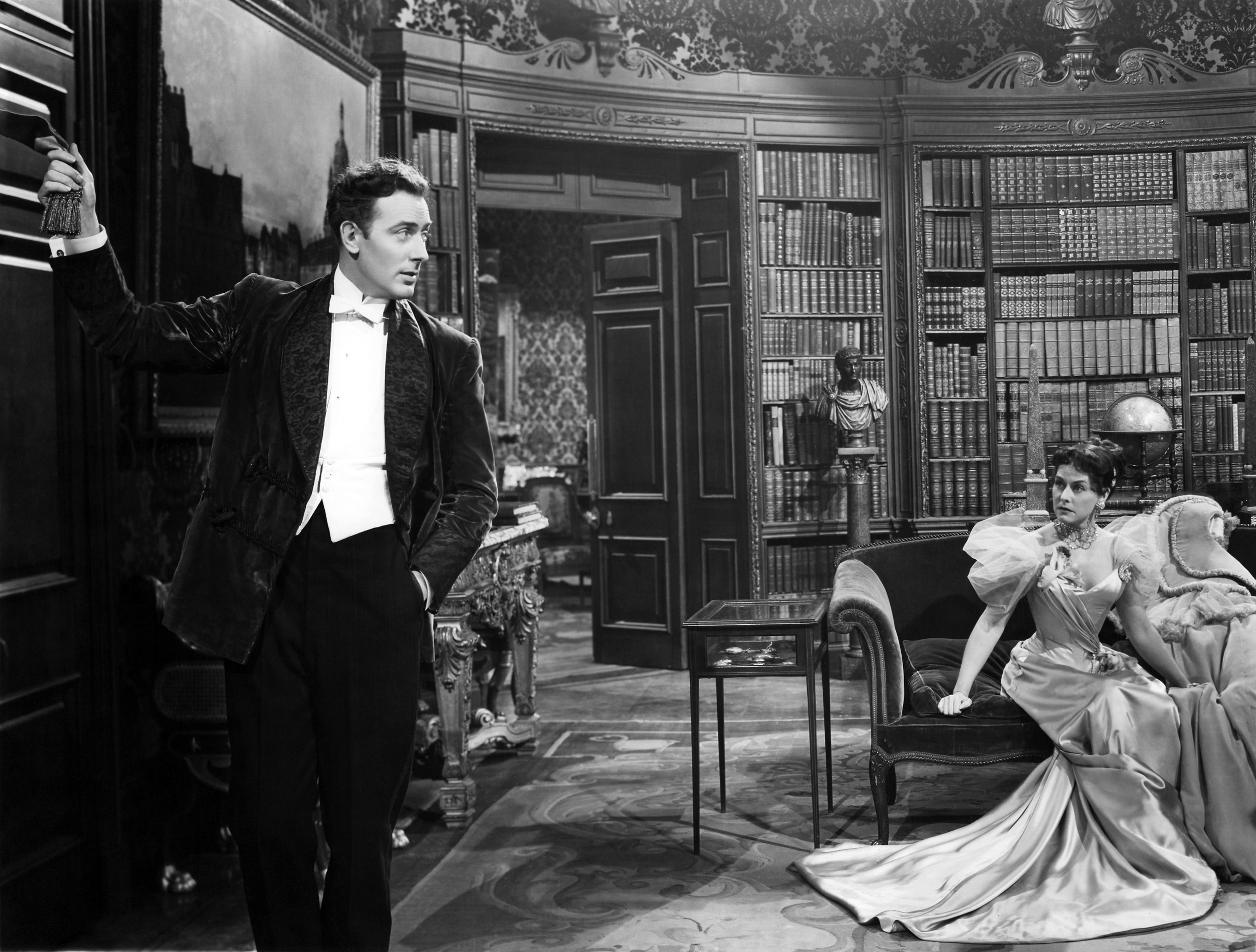
 |
| Leo Osborne. "Rumi K," burled maple wood sculpture, 14x15x6." |
But at the opening last night Osborne was showing paintings of animals that accompanied his sculptures. Most were acrylic and encaustic on gold leaf and very decorative. Each painting was accompanied by a handwritten short poem on lumpy handmade paper that was clearly meant to indicate the magical poetic meaning of each piece. But because I'm a weirdo who doesn't like most poetry (or maybe I just don't get it) I thought they were a little superfluous. The paintings themselves were already full of mystery and were deeply connected to storytelling.
 |
| Leo Osborne. "Silent Wisdom," acrylic painting. It's about 1.5 to 2 feet square, if I recall. The accompanying poem read, "In clutter and clamor/ our lives now entwined/ constant information/ no peace do we find/ / but sometimes/ between all that frazzled dumb noise/ a silent wisdom above/ speaks only to love." [Image: painting of an owl's head looking over its wing at the viewer like The Shadow peeking over his cape. Head takes up most of the frame. The background is a halo- or moon-like gold circle and the owl is thinly painted so you can see through the layers.] |
Tuesday, October 18, 2011
Redux: Before I die...
I'm sure the event for the new "Before I Die..." mural at Redux was a lot of fun. Unfortunately I got there 5 minutes before it was supposed to end. I arrived to find some hushed stragglers finishing up their last requests in a nearly empty parking lot. They went inside and I read the mural, alone: "Before I Die... I want to visit my grandchildren. ...I want to live forever. ...I want to visit [somewhere, I forget]."
The sun was almost completely down and abandoned pieces of chalk were ground into the pavement. Rainwater was puddled on the ground and in the seats of empty folding chairs, the year was almost over and the mural had been abandoned only two-thirds complete. Everyone had left to go do Saturday night stuff-- probably not what they'd written on the mural, but fun stuff they probably won't regret.
 |
| "Before I die..." mural at Redux. From Redux's website: "This project was organized by Nicole Diefenbach and inspired by Candy Chang’s Before I Die… project in New Orleans." [Image: the long low wall of the Redux building painted like a chalkboard. A large white stenciled heading reads, "Before I die...." Under that are around 20 columns each containing 8 repetitions in white stenciled text of the statement, "Before I die I want to" with a fill-in-the-blank line. People have written in all kinds of things in colored chalk but they're illegible in this photo.] |
The sun was almost completely down and abandoned pieces of chalk were ground into the pavement. Rainwater was puddled on the ground and in the seats of empty folding chairs, the year was almost over and the mural had been abandoned only two-thirds complete. Everyone had left to go do Saturday night stuff-- probably not what they'd written on the mural, but fun stuff they probably won't regret.
Not-A-Gallery
When I was in high school, if artists didn't want to sell their work in a traditional gallery, they had basically five options:
1. Set up a tent at a craft show.
2. Put it in a zine andXerox publish it.
3. Make friends with a band and do their art.
4. Check out Burning Man.
5. Complain.
Artists have always had good reason to avoid galleries. In an ideal world you'd submit your work to the right gallery, they'd do the legwork to sell it, and then take a cut from your profits for their trouble. But most gallery people are business people, and most artists are not. Artists often get screwed.
Some artists simply resent the elitism of galleries or their work just doesn't fit in that format. By the '90s artists had organized cooperative galleries owned and run by the artists they showed. These can be a blessing or a curse, mostly due to the group dynamic involved. Some artists had gained popularity with subcultures like goths, geeks, and bikers.
Then came the Internet. Now most artists have their own website to publicize their work and thus sell it themselves. There are also online galleries, but I haven't heard much about their success. Many young artists feel empowered to start collectives and businesses. Real galleries still matter (a lot) but here are some alternative marketplaces and art spaces I admire and that I hope will change "the system:"
1. Set up a tent at a craft show.
2. Put it in a zine and
3. Make friends with a band and do their art.
4. Check out Burning Man.
5. Complain.
Artists have always had good reason to avoid galleries. In an ideal world you'd submit your work to the right gallery, they'd do the legwork to sell it, and then take a cut from your profits for their trouble. But most gallery people are business people, and most artists are not. Artists often get screwed.
Some artists simply resent the elitism of galleries or their work just doesn't fit in that format. By the '90s artists had organized cooperative galleries owned and run by the artists they showed. These can be a blessing or a curse, mostly due to the group dynamic involved. Some artists had gained popularity with subcultures like goths, geeks, and bikers.
Then came the Internet. Now most artists have their own website to publicize their work and thus sell it themselves. There are also online galleries, but I haven't heard much about their success. Many young artists feel empowered to start collectives and businesses. Real galleries still matter (a lot) but here are some alternative marketplaces and art spaces I admire and that I hope will change "the system:"
What I Did On My Summer Vacation: Part 2
Next up we went to the Telfair building, a grand mansion from the
1800s housing mostly turn-of-the-century European and American paintings
plus Edgefield pottery and some contemporary art that was billed as
folk art but wasn't exactly. We drooled over the formal dining room that
was covered in wallpaper that created a mural of a Parisian toile-esque
landscape around the room and gleaming neoclassical furniture upon
which sat priceless silver serving pieces. A little sign described the
meals they would have had: first course, oysters 3 ways. Second course,
[something ridiculous], champagne. 3rd course, [something else
ridiculous 2 ways], [some fancy wine], caviar. 4th course, [some
delicate French dish involving fish], pastries, [hard liquor, like
brandy maybe?]...." etc. I tried and failed to picture myself dining
there, being waited on, entertaining important people. But it was nice
to dream.
Then we walked down the stairs and around the corner to the kitchen, if you can even call it that. It was like a hovel dug out of mud with rounded "shelves" molded into the walls. There was one rough wooden table. One fire pit that could barely pass as a fireplace. Enough room for two people reasonably, a crowded three. Dried herbs hanging from the ceiling. A pan. Bellows. Some mysterious thing with a wooden crank. A bucket. And a dumbwaiter where the food was transported to the elegant dining room.
I still try to imagine oysters 3 ways, caviar, delicate French crap and pastries coming out of that kitchen and it just does not compute. How do you make a croissant in a fucking fire pit?? I immediately felt foolish for having daydreamed upstairs about old-timey rich-lady-ness because the kitchen slapped me back to reality. For every 1 rich lady there are, what, 10 slaves? 15 servants? And you would rely on them for everything, someone is always waiting on you in the same room, and you know deep down they freaking hate you. I cannot even describe how uncomfortable that would make me. Knowing that kitchen is right below my slippered feet.
But
back to the art.

Then we walked down the stairs and around the corner to the kitchen, if you can even call it that. It was like a hovel dug out of mud with rounded "shelves" molded into the walls. There was one rough wooden table. One fire pit that could barely pass as a fireplace. Enough room for two people reasonably, a crowded three. Dried herbs hanging from the ceiling. A pan. Bellows. Some mysterious thing with a wooden crank. A bucket. And a dumbwaiter where the food was transported to the elegant dining room.
I still try to imagine oysters 3 ways, caviar, delicate French crap and pastries coming out of that kitchen and it just does not compute. How do you make a croissant in a fucking fire pit?? I immediately felt foolish for having daydreamed upstairs about old-timey rich-lady-ness because the kitchen slapped me back to reality. For every 1 rich lady there are, what, 10 slaves? 15 servants? And you would rely on them for everything, someone is always waiting on you in the same room, and you know deep down they freaking hate you. I cannot even describe how uncomfortable that would make me. Knowing that kitchen is right below my slippered feet.
 |
| An antique photograph of the wood paneled room in the Telfair. My butt was on that very sofa. |
What I Did On My Summer Vacation: Part 1
I went to Savannah, GA. I escaped this humid historic beach town on the marsh for another humid historic beach town on the marsh and I loved it! Actually I found Savannah surprisingly different from Charleston in that it felt more lived-in (less "preserved" than the Charleston Peninsula) and more socially liberal, probably because of all the SCAD kids. God I was jealous of the SCAD kids. I'm not tossing that off lightly, I mean to say that jealousy of the SCAD kids almost ruined my vacation. There they were in a glorious beautiful town whereas I went to school in DC, an oppressive ball-sac of a city. They were kids in art school and I'm... well... an adult.
But I managed to have a great time with my lovely husband anyway. Savannah's got a great museum called the Telfair, which is actually three centers: the Jepson (contemporary art; folk art), the Telfair (historic Western art in a mansion, plus more folk art), and the Someone-or-Other House, a beautiful historic home from 1809 (I think) with slave quarters and service basement (the most interesting part of the tour). You buy a ticket that gets you into all three places once any time over the course of a week, a great system because there is so much to see.
Jepson Center is an incredible building. I've seen a lot of big white minimalist museums in my time but this place was just big enough to be breathtaking but no bigger, white enough to be calming but not cold, and full of curves that created a soaring airy atmosphere without being hard to navigate. We unexpectedly spent the majority of our time messing around in the kid's educational section where my husband encountered an interactive music software table. Four measures of music bars are printed on the tabletop and you place wooden blocks where you want the beat to go. A thing above your head scans the bars repeatedly and plays the beats as you've arranged them in a loop in real time. You can scatter numerous beats across a measure and the tenor of the sound changes depending on where on the staff you place the block. It was addictive.
There were plenty more well-designed absorbing stations in the kid's area that really got me thinking about how one should teach kids about art. When I was a kid a museum educational area always had some state-of-the-art interactive station involving computers which was always broken and roped off, leaving the museum with no other funds for further "exploration" except some dubious station involving filthy chip-board cut-out shapes with rounded child-safe edges that you arranged in order to "discover" some concept that no one really cared about. And a fiberglass mascot of the particular area of study that you could climb on. But not at the Jepson.
The staff also had an exhibit up outside the museum offices and I'm just going to say it: the staff show was better than the content of most galleries in Charleston.
In one of the real galleries they were showing Betsy Cain: In Situ. She's a local artist who makes large abstract paintings by swirling acrylic paint over smooth surfaces with a squeegee. Oh man, they were gorgeous. Floor-to-ceiling huge, they were so big you really got a feeling for the way the painter's body moves as she applies the paint. Check out her work!
But I managed to have a great time with my lovely husband anyway. Savannah's got a great museum called the Telfair, which is actually three centers: the Jepson (contemporary art; folk art), the Telfair (historic Western art in a mansion, plus more folk art), and the Someone-or-Other House, a beautiful historic home from 1809 (I think) with slave quarters and service basement (the most interesting part of the tour). You buy a ticket that gets you into all three places once any time over the course of a week, a great system because there is so much to see.
 |
| [Image: the interior of the Jepson Center with white walls and sunlight streaming through the glass ceiling and creating a stripey effect on the walls that morpsa throughout the day depending on the light and weather.] |
Jepson Center is an incredible building. I've seen a lot of big white minimalist museums in my time but this place was just big enough to be breathtaking but no bigger, white enough to be calming but not cold, and full of curves that created a soaring airy atmosphere without being hard to navigate. We unexpectedly spent the majority of our time messing around in the kid's educational section where my husband encountered an interactive music software table. Four measures of music bars are printed on the tabletop and you place wooden blocks where you want the beat to go. A thing above your head scans the bars repeatedly and plays the beats as you've arranged them in a loop in real time. You can scatter numerous beats across a measure and the tenor of the sound changes depending on where on the staff you place the block. It was addictive.
 |
| [Image: my husband hunched over a table playing with the music thing I described.] |
The staff also had an exhibit up outside the museum offices and I'm just going to say it: the staff show was better than the content of most galleries in Charleston.
In one of the real galleries they were showing Betsy Cain: In Situ. She's a local artist who makes large abstract paintings by swirling acrylic paint over smooth surfaces with a squeegee. Oh man, they were gorgeous. Floor-to-ceiling huge, they were so big you really got a feeling for the way the painter's body moves as she applies the paint. Check out her work!
 |
| [Image: Betsy Cain, Indigofera #4. Vertical abstract composition with blackish indigo thick swirling marks smeared out or watered down to light indigo in some places on a white background. Lots of drips and visceral smearing.] |
Friday, October 14, 2011
China, IL
I think I was alerted to Brad Neely's new show, China IL, on Adult Swim through some sort of newfangled subliminal advertising because one day Creased Comics popped into my head for no reason, then I remembered how awesome it was and felt compelled to tell other people, then the George Washington and Wizard People things came up in conversations, then when I was strolling along some street in Atlanta I saw an awesome mural painted on the side of a shop advertising the show. But that is OK because I am SO EXCITED. If you've been reading this blog for a long time-- and you probably haven't-- I've had a link to Creased Comics as one of my favorites for EVAH. My husband and I are always whining to each other, "don't be a shit in my cut!" Sometimes when I am experiencing social anxiety I sing to my self, "be... agressive! B-E-agressive!" Yes, I said it.
The animation is a little smoother, and the pictures actually move. I miss the old animation, but that's probably really hard to do in large quantities so I forgive Neely. It's also not quite as strange, unfortunately, but it still has plenty of stream-of-consciousness near-logic and near-slang. Hulk Hogan plays the voice of the Dean. I don't have a TV, I don't have cable. But I saw a few clips of it on YouTube. I am cautiously hopeful that it will be the best thing ever.
 |
| [Image: Cartoon drawn crudely but with smooth thin lines and colored with mostly pastel solids except bright red blood. An anchorman with puffy yellow hair and a serious, bland expression reports live in front of what could be a sidewalk full of dead or injured blood-spattered people with a giant baby and a plume of smoke rising in the background. Image is very ambiguous.] |
The animation is a little smoother, and the pictures actually move. I miss the old animation, but that's probably really hard to do in large quantities so I forgive Neely. It's also not quite as strange, unfortunately, but it still has plenty of stream-of-consciousness near-logic and near-slang. Hulk Hogan plays the voice of the Dean. I don't have a TV, I don't have cable. But I saw a few clips of it on YouTube. I am cautiously hopeful that it will be the best thing ever.
Sunday, September 25, 2011
To Catch a Sparrow or Net a Fox
I stopped by the opening of To Catch a Sparrow or Net a Fox, a show on view at Oak Barrel Tavern with the work of Lisa Shimko, Hirona Matsuda, Sara Boyts Yoder, and Lisa Abernathy. I'd already seen Lisa Shimko's work since we both rented studios at Tivoli, and I'd already seen Lisa Abernathy's stuff at another show at Oak Barrel Tavern a month or so ago.
Lisa Shimko does fantastic paintings that are sometimes a mix of abstract and figurative, with birds often, and sometimes purely abstract colors and shapes. The abstract stuff is my favorite because they are freely expressive and loose and her colors are phenomenal. So I was surprised when she showed, instead, lots of index card-sized paintings of illustration-style animals on decorative backgrounds. She's very talented and they were priced very affordably, so... buy them now. While you can.

[Image: vertical rectangular layout on an index-card-sized burgundy paper with markings that has been painted over. Background is divided equally by horizon line, with sky a light dove grey with thick brushstrokes and ground a darker dove grey with little grey-green vertical marks creating a grass-like texture. In forground there's a yellow post silhouetted by the ground upon which a finch (??) is perched, silhouetted by the sky. It's a side view of a very realistically painted grey, black and white bird.]
I didn't get any photos of Lisa Abernathy's stuff because it was behind reflective glass, inside, at night, and I had a full beer in one hand. So, here's some photos from that older show that I'd intended to write about but never did.
She had more paper cutouts but this time they were more stark black paper on white backgrounds. There was a tiger face baring its fangs and inside its mouth a small peaceful figure beckoning to the viewer. Others were classic storytelling devices with unexpected twists-- not overwrought irony, I mean *actually* unexpected twists-- and a jungle-like feeling. Once you get past the rich texture and the impressive technique of the work the content is dreamy and imaginative. She uses vintage textiles or papers and silhouettes to tell stories but somehow, somehow avoids preciousness. She also evoked a little of that Southern tradition of antebellum, often racist silhouette scenery in her last show-- again with unexpected twists-- but this work seemed more African- and Southeast Asian- influenced.
I liked Sarah Boyts Yoder's paintings, so I'm glad she's got another showcoming up that opens Oct. 8 on view right now at Flagship. She had big abstract blue, white and black paintings on canvas with some collage and sharpie involved. There's not much to write about, as this is the kind of art that it's best to just look at. The mark-making was fluid and confident, the colors were deep and bold, the compositions were dynamic and lively... good stuff. I didn't notice the nautical theme until I glanced at the titles, which were all about boats and the sea. But once I did the paintings could all be read loosely as illustrations of wave motion and the waterline that, like the other work at the show, told a story.
I was primed by the storytelling theme to see Hirona Matsuda's shallow, almost 2-D wall-hanging sculptures as narratives too, even though if I'd seen them isolated on some white wall somewhere I'd have immediately thought of Joseph Cornell, Louise Nevelson, Modernism, and Abstract Expressionism. When I see more of Hirona Matsuda's work around Charleston I'll probably write a post about it, b/c I need a little time to think it over.
Go see the show, it's at Oak Barrel Tavern in Avondale, 825-B Savannah Highway, on view thru late October.
Lisa Shimko does fantastic paintings that are sometimes a mix of abstract and figurative, with birds often, and sometimes purely abstract colors and shapes. The abstract stuff is my favorite because they are freely expressive and loose and her colors are phenomenal. So I was surprised when she showed, instead, lots of index card-sized paintings of illustration-style animals on decorative backgrounds. She's very talented and they were priced very affordably, so... buy them now. While you can.
[Image: vertical rectangular layout on an index-card-sized burgundy paper with markings that has been painted over. Background is divided equally by horizon line, with sky a light dove grey with thick brushstrokes and ground a darker dove grey with little grey-green vertical marks creating a grass-like texture. In forground there's a yellow post silhouetted by the ground upon which a finch (??) is perched, silhouetted by the sky. It's a side view of a very realistically painted grey, black and white bird.]
I didn't get any photos of Lisa Abernathy's stuff because it was behind reflective glass, inside, at night, and I had a full beer in one hand. So, here's some photos from that older show that I'd intended to write about but never did.
 |
| [Image: greeting-card-sized collage behind glass with a thick black decorative frame. Background is covered with newspaper- or dictionary-like paper scattered and layered at odd angles. Foreground is a black paper cutout with a scalloped frame, as in a stage set, with a cartoonish or exaggerated female figure sitting at a crazy, unnatural angle, holding something-- a typerwriter?-- with a word bubble coming out of her mouth that I cannot read due to my own crap photography. Words are cut out of paper. Two more word bubbles float upward.] |
 |
| [Image: collage behind glass, framed in thick wood frame. Background is vintage whitish-pastel print of a cottage, country land and flowers. Foreground is black paper cutout with scalloped frame. Puffy clouds "hang" down from the top like a stage set, three sparse trees with hanging-down leaves or Spanish moss and some flowers and grass grow from the bottom of the frame. A female figure in a dress "flies" across, also suspended by strings, blowing puffs of air that look like swirls.] |
She had more paper cutouts but this time they were more stark black paper on white backgrounds. There was a tiger face baring its fangs and inside its mouth a small peaceful figure beckoning to the viewer. Others were classic storytelling devices with unexpected twists-- not overwrought irony, I mean *actually* unexpected twists-- and a jungle-like feeling. Once you get past the rich texture and the impressive technique of the work the content is dreamy and imaginative. She uses vintage textiles or papers and silhouettes to tell stories but somehow, somehow avoids preciousness. She also evoked a little of that Southern tradition of antebellum, often racist silhouette scenery in her last show-- again with unexpected twists-- but this work seemed more African- and Southeast Asian- influenced.
I liked Sarah Boyts Yoder's paintings, so I'm glad she's got another show
 |
| [Image: several of Yoder's paintings grouped on a wall, ranging from a 10 x 10 inch square canvas to a two-ish by three-ish foot canvas] |
 |
| [Image: smaller square canvas with collage and abstract painting. Top is a large blue scallop shape, like clouds. Middle-top swath is thickly textured bright white "sky," and bottom half is a jumble of blue, black and white shapes on grey "waves." The literal reading as a seascape is very iffy.The waves are filled with patterned markmaking, collage-ed paper and two black upside-down "U" shapes.] |
I was primed by the storytelling theme to see Hirona Matsuda's shallow, almost 2-D wall-hanging sculptures as narratives too, even though if I'd seen them isolated on some white wall somewhere I'd have immediately thought of Joseph Cornell, Louise Nevelson, Modernism, and Abstract Expressionism. When I see more of Hirona Matsuda's work around Charleston I'll probably write a post about it, b/c I need a little time to think it over.
 |
| [Image: several of Matsuda's sculptures hanging on a wall, one box long and vertical, about 1 x 3 feet, one smaller, maybe 8 x 10 inches, one maybe a foot square.] |
 |
| [Image: shallow 12-inch-square sculpture, like a shadow-box or diorama in a black frame. Inside is grey concrete-like texture with two shelves on the upper right and two black wires run vertically in front of the shelves. Rusted found objects are placed on the shelves and there's a rusted porcelain doorknob standing at the left of the shelves with an old skeleton key dangling above it from the top of the piece.] |
Go see the show, it's at Oak Barrel Tavern in Avondale, 825-B Savannah Highway, on view thru late October.
Thursday, September 15, 2011
Crazy stupid love
So I saw Crazy Stupid Love the other night. Aaaannnnd... I sorta liked it? Romantic comedies usually suck because they're generally not funny and because they aren't romantic. Like, usually the woman girl is knocked off her high horse (which I'm supposed to savor because I'm supposed to hate and pity successful women?) and humiliated by one thing after another. The guy and girl hate each other. That's not very romantic. The guy is usually cocky enough for this scene to be included: [Her:]"Oh yeah? Well you don't know anything about me!," [Him:]"Ok, [describes details of her life and outlines her insecurities in the most insulting patronizing way possible]," [Her face becomes shocked, then she makes a pitiful attempt at covering it:] "You think you're pretty smart, huh? [humiliation followed immediately by sex]."
Thursday, September 8, 2011
Helene Schjerfbeck
I'm linking to a great post about Finnish painter and avid self-portraitist Helene Schjerfbeck at Echidne's blog. Unfortunately I cannot figure out how to link to the post and not the entire weekly archive of posts, as the blog format is weird to me, but scroll down till you see Mademoiselles Who Dabble With Paints: Helene Schjerfbeck. If you don't feel like reading words scroll further down to see a very cool progression of self portraits throughout this woman's life that also chronicles early 20th century artistic movements.

[Image: a photograph of the painter from the 1890's or so dressed very modestly, sitting tall and looking a little wary of the photographer.]
[Image: a photograph of the painter from the 1890's or so dressed very modestly, sitting tall and looking a little wary of the photographer.]
Friday, August 26, 2011
Walter Knestrick & Red Grooms
Portraits by lifelong friends Red Grooms and Walter Knestrick:

Walter Knestrick, self portrait
[Image: realistic, though slightly primitive watercolor of man with grey hair, glasses, friendly smile, blue and white checked shirt, swirly dark blue background. Looks like a painting of a snapshot.]

Walter Knestrick by Red Grooms
[Image: scratchy, cartoon-y watercolor and pencil sketch of exaggeratedly emaciated, tall thin man with glasses consisting of two white circles and crazy hair. He stands off-kilter and wears a dark blue shirt. Piece is about five times as tall as it is wide, figure has giraffe neck and the arms and torso are about four times as long as they should realistically be. Brushstrokes are messy and expressive.]

Walter Knestrick, self portrait
[Image: realistic, though slightly primitive watercolor of man with grey hair, glasses, friendly smile, blue and white checked shirt, swirly dark blue background. Looks like a painting of a snapshot.]

Walter Knestrick by Red Grooms
[Image: scratchy, cartoon-y watercolor and pencil sketch of exaggeratedly emaciated, tall thin man with glasses consisting of two white circles and crazy hair. He stands off-kilter and wears a dark blue shirt. Piece is about five times as tall as it is wide, figure has giraffe neck and the arms and torso are about four times as long as they should realistically be. Brushstrokes are messy and expressive.]
Tuesday, August 9, 2011
Self Portrait today, by me.

[Image description: self-portrait of slack slouching head and shoulders in marker and charcoal on white paper. Kind of cubist, kind of cartoony, a little grotesque. Contoured shapes of pure fauvist (exaggerated) colors along the face and body, some lines descriptive of shoulder muscles, with spine and skeletal teeth showing through. Slightly unfinished looking.]
Monday, August 8, 2011
I'll be back tomorrow
I got really burnt out this past week or two but I'll be back blogging (and in contact with the outside world) tomorrow. I've half-written about the rest of the artist lectures: Greg Hart, Nina Garner and DH Cooper, and maybe an overview kind of thing too, and I want to get those up.
wet sponges and the dark abysm of pish
I was looking up the origins of "butt-hurt" on Urban Dictionary to prove a point when I ran across this:
"H.L. Mencken said of U.S. President Warren G. Harding, 'He writes the worst English that I have ever encountered. It reminds me of a string of wet sponges; it reminds me of tattered washing on the line; it reminds me of stale bean soup, of college yells, of dogs barking idiotically through endless nights. It is so bad that a sort of grandeur creeps into it. It drags itself out of the dark abysm of pish, and crawls insanely up the topmost pinnacle of posh. It is rumble and bumble. It is flap and doodle. It is balder and dash.'"
I wish that the pressure visual artists experience to prove their dedication to craft through slavish repetition or to make the same point continuously for a lifetime did not cause us to toss succinctness out the window. Also, "flap and doodle" is now my go-to private assessment of most things.
"H.L. Mencken said of U.S. President Warren G. Harding, 'He writes the worst English that I have ever encountered. It reminds me of a string of wet sponges; it reminds me of tattered washing on the line; it reminds me of stale bean soup, of college yells, of dogs barking idiotically through endless nights. It is so bad that a sort of grandeur creeps into it. It drags itself out of the dark abysm of pish, and crawls insanely up the topmost pinnacle of posh. It is rumble and bumble. It is flap and doodle. It is balder and dash.'"
I wish that the pressure visual artists experience to prove their dedication to craft through slavish repetition or to make the same point continuously for a lifetime did not cause us to toss succinctness out the window. Also, "flap and doodle" is now my go-to private assessment of most things.
Subscribe to:
Posts (Atom)